#15 New Bold Typography Templates in Swiper Studio
A few weeks back we shipped 25 commerce, hero, and editorial templates - photography-led, calm, tuned for adoption. Useful, but most slides looked like a thousand other sliders on the web because the image was doing the heavy lifting.
Today we are adding 15 new templates with the opposite brief. Less "drop this on a real site tomorrow," more "look what we can build." The slide is the design - typography, color, composition, layered cutouts. These are showpieces. A visitor to the gallery should stop scrolling.
The catalog is now 99 templates in total. Browse them at Templates or read on for a tour.
#What Makes This Batch Different
The previous batches leaned on photography. This one leans on type and layout.
- Type scale is the design. Default headline ranges run 56-80px on phone, 96-140px on tablet, and 140-280px on desktop. Genuinely massive.
- Blocks as shapes. Memphis squiggles, constructivist diagonals, Swiss grid columns, brutalist hard borders - all built from nested blocks with backgrounds and rotation.
- Cutouts that layer between text. A handful of templates use
ai_remove_backgroundto strip an athlete, a trophy, a chrome product, a magazine cover star - then sandwich them between a giant background headline and a small foreground label. The signature move that makes a slide stop reading as a slider and start reading as a poster. - Animations finally have something worth animating. Letter blur, letter scale, typewriter, number roll, all carrying the impact.
Image budget is roughly 70% lower than the last batch. Most of the work is done by Google Fonts, hex codes, and composition.
#Manifesto and Statement - Pure Type Firepower
Four templates with zero images. Color, type, conviction.
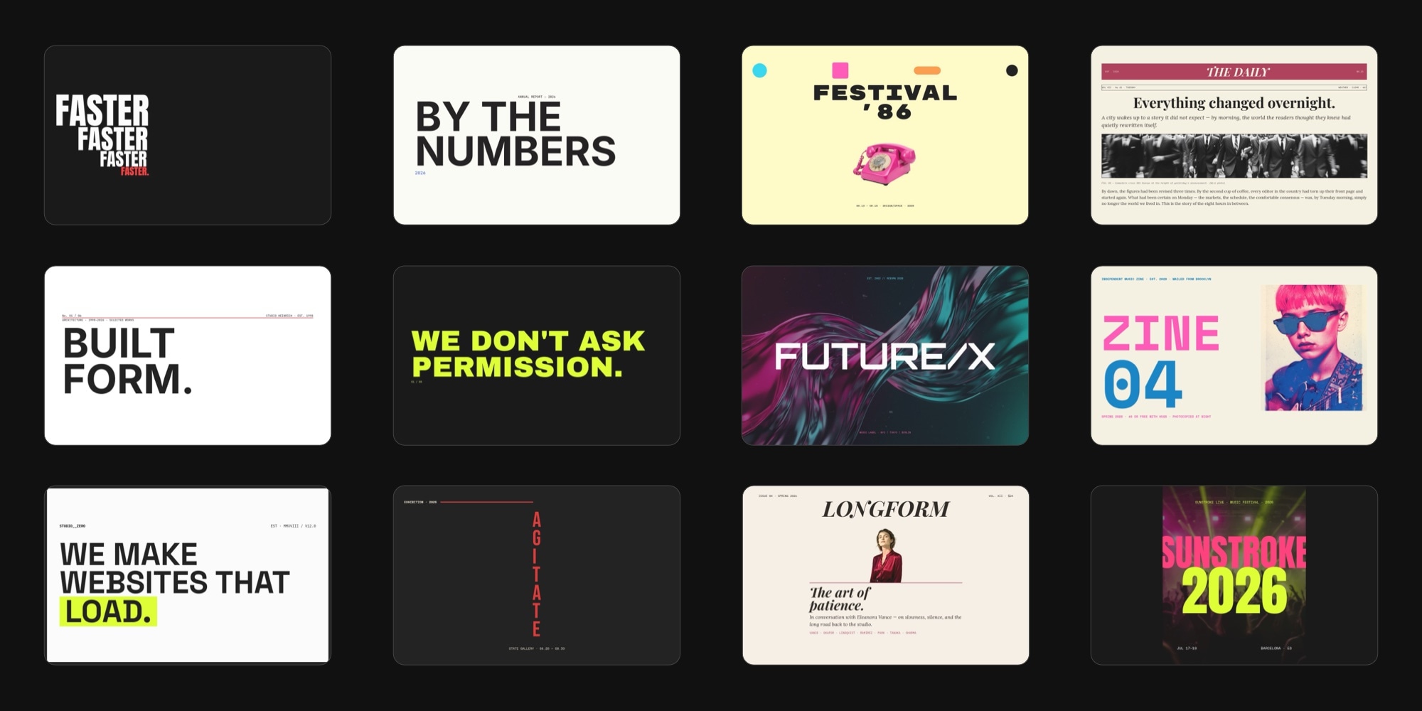
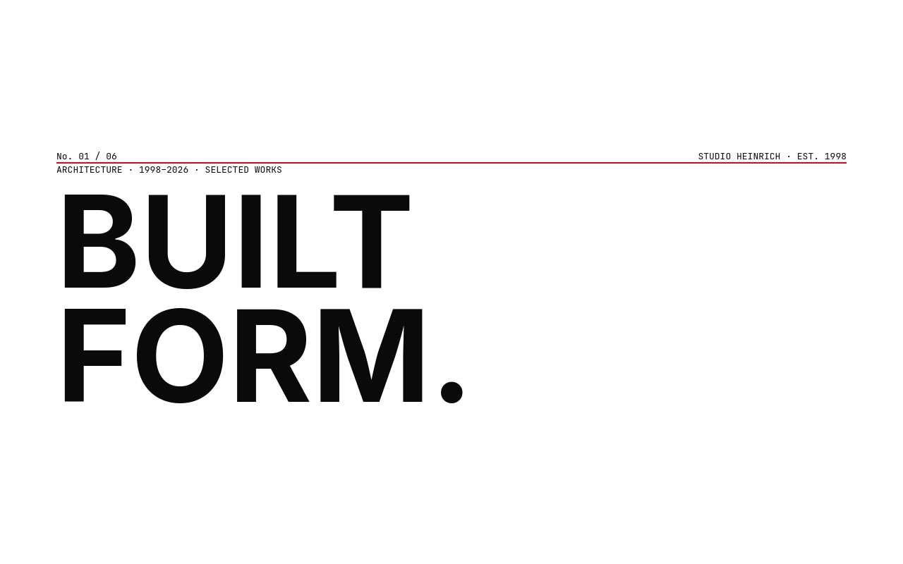
#Manifesto Wall
Manifesto Wall - Eight slides, eight statements, cycling color fields. Archivo Black at 220px on desktop, paired with a Space Mono slide counter. Black, electric lime, cinnabar red, paper white, signal blue, the same red again. Letter scale on every headline. No images, no decoration, no apologies.
#Kinetic Typography
Kinetic Typography - One word per slide, treated as if frozen mid-motion. Anton at extreme weight, repeated three to five times at progressively smaller scale, slightly offset. A single red period or red letter per slide. Looks like a kinetic type reel paused on the loudest frame.

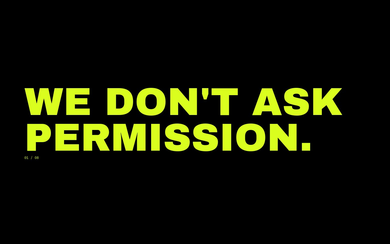
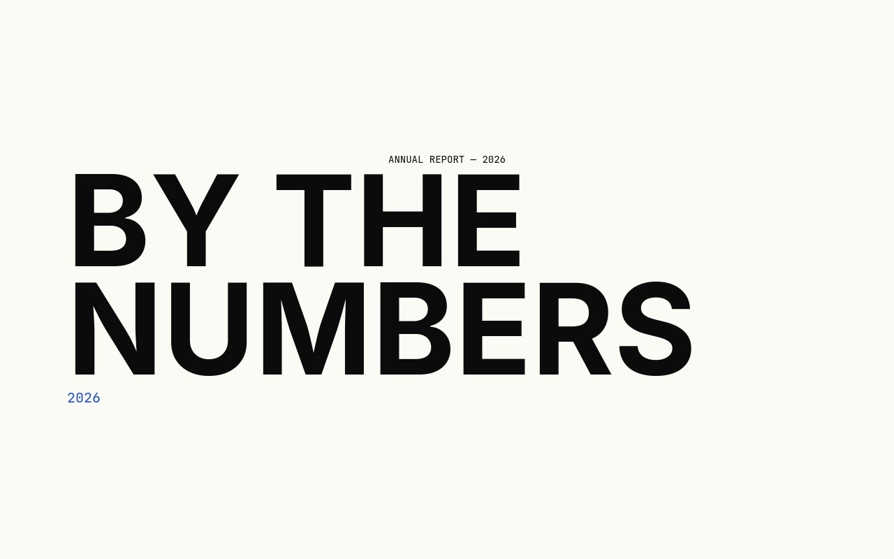
#Numbers
Numbers - Annual report energy. Seven slides, five massive stats, number roll animation on every numeric. Inter at weight 900 hitting 360-440px on desktop, JetBrains Mono labels. 94%. 12,847. 3.2s. 0. 47. Drop in your own metrics.
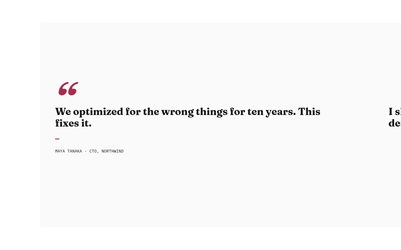
#Quotes Bold
Quotes Bold - Pull-quote carousel for testimonials that want to read like editorial pull quotes, not five-star cards. Oversized claret quotation marks, Fraunces italic at hero scale, IBM Plex Mono attribution. Six quotes that actually have something to say.
#Design Movements - Visual Language Pulled From Poster History
Five templates that borrow directly from the canon - Swiss modernism, brutalism, constructivism, Memphis, Y2K chrome.
#Swiss Modernist Grid
Swiss Modernist Grid - Müller-Brockmann energy applied to an architecture studio portfolio. Strict grids, asymmetric layouts, generous whitespace, single Swiss red accent. Inter at weight 700 plays the role of Helvetica. Six slides cover a masthead, three projects, a numbers slide, and a contact dot.
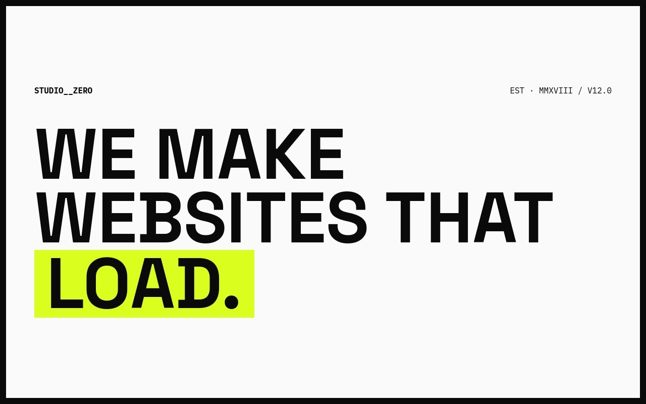
#Brutalist Web
Brutalist Web - Hard borders, monospace and grotesk clash, volt yellow accents, deliberate raw-HTML look. Space Grotesk and IBM Plex Mono. A 300ms transition with linear timing makes it feel like a page click, not a slide. For independent studios who want their site to look made, not generated.
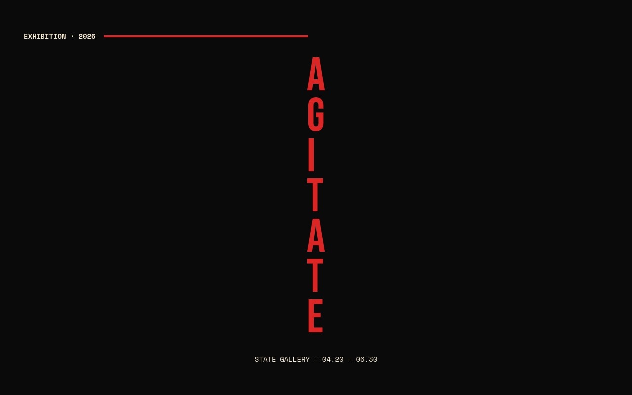
#Constructivist Posters
Constructivist Posters - Red, black, parchment. Diagonal stripes built from rotated blocks. El Lissitzky energy applied to a contemporary art exhibition. Bebas Neue stacks vertically, Space Mono handles the dates. Letter scale with a fast stagger on every title.
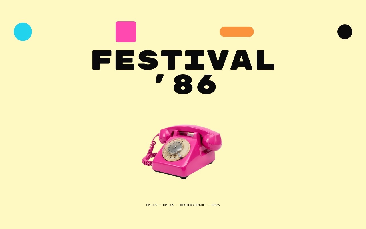
#Memphis Postmodern
Memphis Postmodern - 80s Memphis at full volume. Hot pink, cyan, butter cream, orange, black. Squiggles and color blocks scattered across every slide, with cutout vintage objects floating among the shapes - a rotary phone, oversized sunglasses, a cassette tape. Rubik Mono One title type with bouncy animations. For a design conference or festival that wants its identity to feel made by hand.
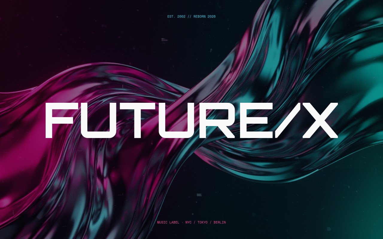
#Y2K Chrome
Y2K Chrome - Early-2000s chrome bevel done modern, not parody. Magenta and cyan gradients on deep void, chrome Orbitron titles, glossy 3D objects floating in front of names. Coverflow effect gives the chrome surfaces depth. For a music label rebrand or a fashion drop.
#Editorial Bold - Magazine and Newsprint, Cranked Up
Three templates that take editorial conventions and push the scale and contrast.
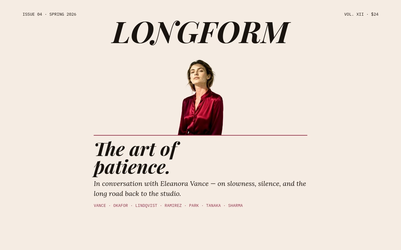
#Editorial Magazine Spread
Editorial Magazine Spread - Two-column magazine spread with drop caps, pull quotes, and a cutout cover star whose head crosses in front of the masthead - the classic Vogue and Harper's cover move. Playfair Display italic, Lora body, IBM Plex Mono folios, claret accent. Five spreads for a fictional issue.
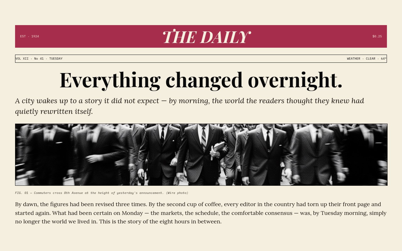
#Newspaper Front Page
Newspaper Front Page - Old-school newsprint front pages. Red masthead bar, mono datelines, Playfair Display at weight 900, three columns of Lora body, single grainy black-and-white press photo. Five issues of a fictional daily.
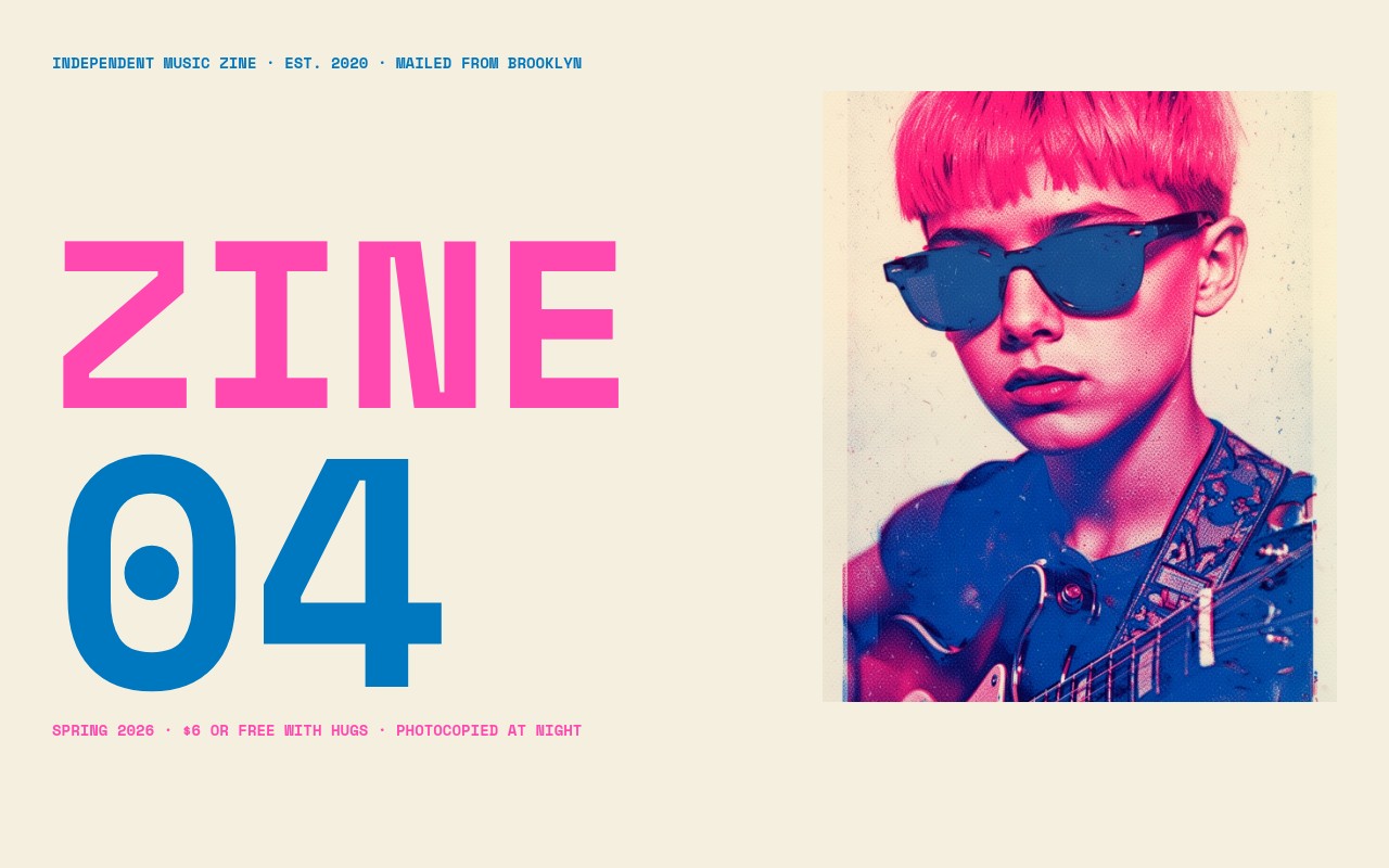
#Riso Zine
Riso Zine - Two-color risograph aesthetic. Fluorescent pink and blue inks on cream paper. Posterized portraits and band photography, hand-collaged feel, monospaced display type. Six pages of an independent music zine. For brands that want their site to feel printed.
#Loud and Specific - Niches Where Bold Type Really Sings
Three templates aimed at use cases where impact is the whole point - festival posters, athletic campaigns, awards reveals.
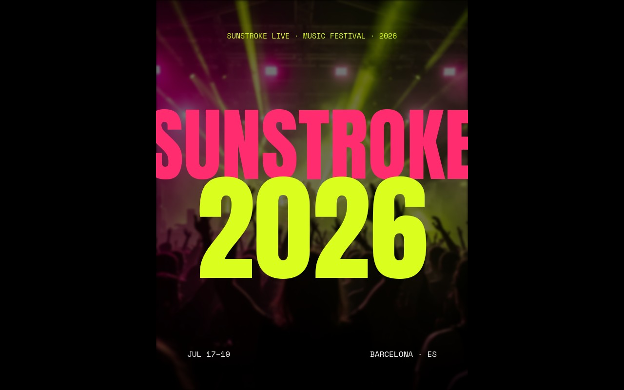
#Festival Lineup
Festival Lineup - Multi-day festival lineup with brutal hierarchy. Headliner at 280px in electric lime, tier two at 90px, tier three at 32px in two mono columns. Cutout headliner portraits float in front of the name type so the slide reads like a printed festival poster. Anton condensed and Space Mono. Hot magenta and lime on black.
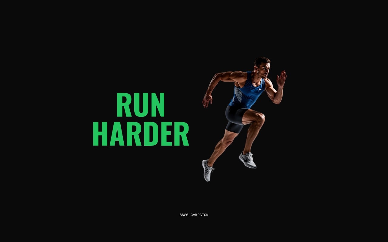
#Athletic Italic
Athletic Italic - The most aggressive layering project in the batch. Oswald italic forward-leaning at 280px filling the slide, then a cutout sprinter mid-stride bursting through the type, then a small mono campaign label in front. Three-layer sandwich. Number roll on stats, letter blur on the italic titles. Sport green and white on black. For a pro running league or a sneaker campaign that wants the slider to feel like a brand film.
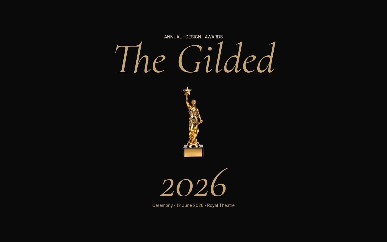
#Awards Nominees
Awards Nominees - Industry awards ceremony layout. Black, champagne gold, cream. A cutout gold trophy in a soft radial spotlight anchors the cover, then five category reveals with Cormorant Garamond italic nominees, then a Lifetime category where the winner is revealed at hero scale. Letter fade slow, ceremonial.
#Why This Batch
The previous batches were image-led and tuned for adoption. A designer or marketer could drop one of those templates onto a real site with minor edits. Useful, but quiet.
This batch is showpiece-led on purpose. The goal is not "I could plug this into my e-commerce store tomorrow." The goal is "wait, that is a slider?" - the screenshot, the GIF on Twitter, the moment a visitor to the gallery stops scrolling.
That means a few things in practice. Type scale was the design. Cutout subjects layered between text - the Memphis cassette tape floating among shapes, the Athletic Italic sprinter breaking through 280px display type, the Awards trophy sitting in its own spotlight - did most of the visual work. Effects like cards, creative, and coverflow got more play here because the slide itself is the thing, not a photo inside it.
Restraint was the last batch's job. This one pushes the dial.
#Only About Thirty Generated Images
A typical photography-led batch in the previous three rounds spent 100 to 170 AI image credits. This one came in around 32 generations plus 15 background removals - roughly a third of the prior cost. The reduction is the point. When the design is type and color, the only AI imagery you need is the occasional cutout subject or atmospheric backdrop.
For the cutouts specifically, the workflow was generate with AI image tools, strip the background with ai_remove_background, then place the transparent PNG into a slide so it sits between two text layers. That sandwich is the move you can borrow into your own template builds.
#How to Use a Template
- Open your dashboard at /projects
- Click New Project and choose one of the 15 new templates to start from
- Swap content, adjust colors, regenerate images, tune the breakpoint type scale
- Export to React, Vue, Next.js, HTML, Web Components, or Webflow - or publish to CDN
A few of these templates put real weight on responsive type. The breakpoints panel is the friend here. Set your hero font size at phone, tablet, and desktop so a 240px headline does not show up at 240px on a 375px screen.
#Works With AI Agents
If you have connected an agent through the MCP server, templates pair beautifully with prompt-driven customization. Open Manifesto Wall, ask the agent to rewrite the eight statements as your company values. Open Athletic Italic, ask it to swap the sport green for your brand color and regenerate the sprinter with a tighter prompt. Open Festival Lineup, point the agent at your own artist list and watch it cascade across the hierarchy. Templates plus agents is the fastest path from a blank idea to a finished slider.
#What Is Next
99 templates feels like a real catalog. Next we are looking at a small final batch to round it out to 100, plus a few data-driven sliders, longer-form storytelling layouts, and motion-led designs that lean on video. If there is a template you would like to see, let us know.
Explore the full catalog at Templates and start building.
#Related
- 25 New Commerce, Hero, and Editorial Templates in Swiper Studio
- 10 New Editorial and Brutalist Templates in Swiper Studio
- 25 Ready-Made Use Case Templates Now in Swiper Studio
- Introducing AI Image Tools in Swiper Studio
- Element Animations in Swiper Studio
- Responsive Style Breakpoints
- MCP Server - Let AI Agents Build Your Sliders