Kinetic Typography Slider Template
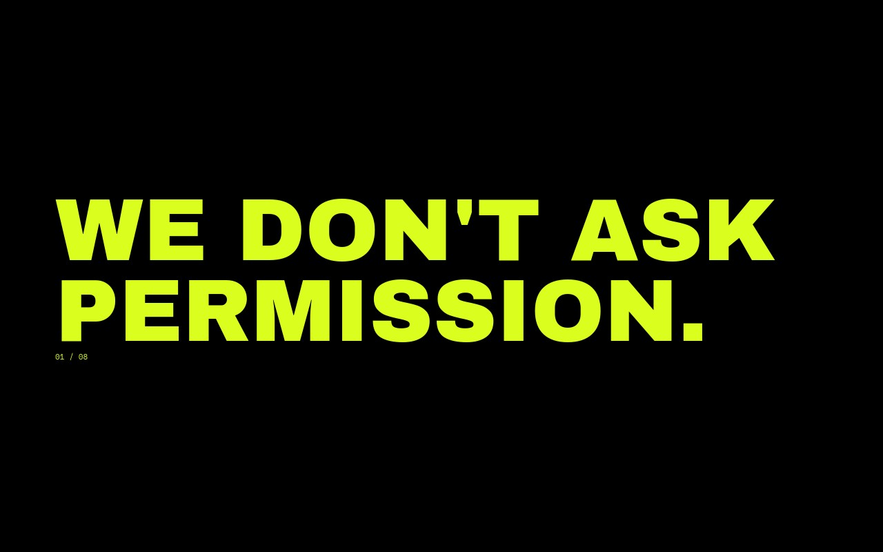
A kinetic type reel paused mid-motion. Eight slides treat single words as if they were stretched, repeated, and layered by a motion designer, then frozen for the screenshot. Anton handles the display weight at 280px on desktop, Space Mono drops in for the small labels, and a single warning red accent burns through exactly when the rhythm needs a punch. The fade transition is almost a cut - 400ms - so swiping feels like jumping between frames of an animation, not paging through a slider.
The built-in sequence runs "FASTER" cascading diagonally, "LOUDER" stacked with a red L, "MORE" with a tiny mono row underneath, "NOW" overlapping with slight rotation, "AGAIN" left-aligned at decreasing scale, "STOP" with a single red period, "GO" in three rotated copies, and "YES" repeating seven times down a column with the last one in red. Rewrite the words, swap the accent color, change the rhythm - the structure stays intact and the result still reads as type-as-motion.
#What Makes This Template Stand Out
Single Words at Hero Scale
Every slide is one word, then the same word repeated. Anton renders at 280px on desktop with stacked copies at descending sizes, so each slide reads as a single emphatic gesture instead of a sentence. The slider becomes a kinetic poster series.
Stacked Repeats as Composition
Three to seven copies of the same word build the layout - vertical columns, diagonal cascades, tight stacks, rotated triples. The repetition is the design, achieved with real text children rather than CSS effects, so every copy stays editable and exportable.
One Red Letter Per Slide
The accent rule is strict on purpose: a single L in claret on "LOUDER", a red period on "STOP", the final "YES" in red. The restraint is what makes the color land - viewers register the punch even when they cannot say why.
Anton at Extreme Weight
Anton is the condensed, almost-tabloid display face that motion designers reach for when they need type that can carry a frame on its own. The proportions hold from 80px on phone to 280px on desktop, and the tight tracking makes stacked repeats line up without gaps.
Letter-Blur and Letter-Scale Animations
The dominant copy on each slide uses letter-blur or letter-scale entries to land the word, while the smaller repeats fade in on a stagger. The cascade reads as motion settling into stillness - exactly the feeling kinetic typography is built to deliver.
#Who Should Use This Template
Design studios and motion designers building reels or pitch decks will recognize the visual language immediately. Drop this template onto a homepage, a case study, or a studio about page and it signals craft and confidence before a visitor reads the first word. The pure-type approach means there is no photography budget to manage, just typography and accent color doing the work.
Ad creatives and type-led brand campaigns can use this as the hero loop on a launch site or as a campaign cover slider. The single-word format makes it ideal for tagline campaigns, brand mantras, or product positioning that needs to land in one beat. Swap the eight built-in words for campaign keywords and the kinetic rhythm carries the message.
Independent typographers, lettering artists, and creative coders can use this template as a portfolio cover or a process-page header. The stacked-repeat layouts double as a showcase of how the typeface behaves at scale, and the structure leaves room to feature custom letterforms if you want to swap Anton for your own work.
#Best Use Cases
- ✓Design studio homepage hero loops with a kinetic identity
- ✓Motion designer portfolio reels and case study openers
- ✓Tagline-led ad campaigns and product launch microsites
- ✓Type-foundry showcase pages featuring a single display family
- ✓Brand mantra and positioning sequences for creative agencies
- ✓Title sequences and intro reels for conference talks or films
- ✓Lettering and typography portfolio covers
- ✓Music label and merch drop announcements with single-word energy
#How to Customize
- Open the Kinetic Typography template in Swiper Studio. You will see eight slides, each with a hero word and stacked repeats in Anton, plus a single accented copy in red.1
- Replace the eight words with your own campaign terms or brand keywords. Each slide is plain text - retype the word and every stacked repeat updates together if you keep them in sync.2
- Decide which letter, word, or punctuation mark carries the red accent on each slide. The rule is one accent per slide - keep it tight to preserve the kinetic punch.3
- Adjust the stacking pattern if you want a different rhythm. Reorder the repeats, change their font sizes, or switch from a vertical column to a diagonal cascade by adjusting the slide content direction and gap.4
- Swap the accent color if claret red is not your brand. Hot magenta, electric cyan, or safety orange all hold up against the jet and paper palette - update the hex on the accent text element and it propagates.5
- Restyle the Space Mono labels if you want a different small-text voice. The labels are independent text children and accept any size, weight, or color change without touching the headlines.6
- Tune the breakpoints so the 280px desktop type scales down to around 160px on tablet and 80px on phone. Stacked repeats inherit the ratio, so adjusting the hero word handles the rest.7
- Publish to CDN for an instant embed or export to React, Vue, HTML, or Webflow if you want to drop the kinetic reel into a portfolio site or campaign page.8
#Frequently Asked Questions
- How are the stacked word repeats actually built?
- Each slide stacks three to seven copies of the same word as Anton text children in a tight vertical or diagonal column, with progressively smaller font sizes and matching line heights. The composition reads as kinetic motion paused mid-frame, but there is no JavaScript animation loop running - every repeat is a real, editable text element.
- Can I swap the words for my own campaign or brand?
- Yes. The eight slides ship with "FASTER", "LOUDER", "MORE", "NOW", "AGAIN", "STOP", "GO", and "YES", but every one is plain editable text. Retype the word, decide which copy gets the red accent, and the stacked repeats and animations stay in place.
- Why use Anton instead of a more neutral display font?
- Anton is condensed, extreme-weight, and almost editorial in its proportions, which is exactly what kinetic typography reels need. The tight letter spacing means stacked repeats line up without gaps, and the heavy strokes hold their shape at 280px desktop and 80px phone alike.
- Is the red accent required or can it be a different color?
- The single red accent is the design rule, but the hex itself is editable. Select the red letter, word, or punctuation mark on any slide and set a new color in the style panel. Hot magenta, electric cyan, and safety orange all hold up against the jet-and-paper base.
- Will the 280px headline scale cleanly to mobile?
- Yes. The hero word is registered at three breakpoints - around 80px on phone, 160px on tablet, and 280px on desktop - and the stacked repeats inherit a matching ratio. Every slide stays one to three rows tall on every screen, so nothing crashes off the edges.
#Related Templates
#Related Resources
- Swiper Studio for Hero Sections
- Swiper Studio for Agencies
- Swiper Studio for Web Designers
- Swiper Studio for Portfolios
Ready to Build Your Slider?
Pick a template, customize it visually, and export production-ready code to React, Vue, Next.js, HTML, Webflow, and more. No coding required.