Swiss Grid Architecture Studio Slider Template
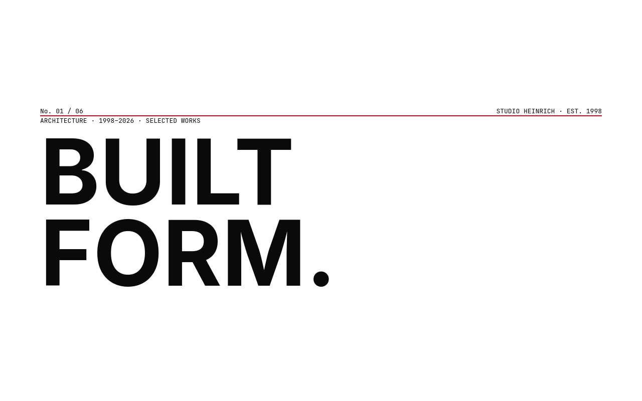
A disciplined architecture studio portfolio built on a strict 12-column grid, neutral grotesk type, and a single Swiss red accent. Six slides walk you from a cover plate with a "BUILT FORM." display headline and a thin red rule, through three featured projects laid out in mirrored asymmetric compositions, a studio index slide showing 28 projects, 14 countries, and 4 major awards, and a contact slide with the studio address and a "BEGIN A PROJECT" call to action. The palette stays paper white, ink black, and Swiss red #e30613 throughout - nothing decorates, everything informs.
Inter at 700 weight carries the display work as the closest open-source neutral grotesk to Helvetica, while IBM Plex Mono handles the small labels - project numbers, locations, years, and the mono dateline on the cover. Photography is rendered in stark black and white so the buildings hold their own against the type. The transitions run 600ms on slide, clean and deliberate, with letter-fade entry animations staggered across the headlines so each project lands like a turning page in a monograph.
#What Makes This Template Stand Out
True Müller-Brockmann Grid Discipline
A strict 12-column grid runs under every slide. Headlines, mono labels, images, and the Swiss red accent rule all snap to the same vertical rhythm. The result is a portfolio that reads as a continuous publication instead of a sequence of unrelated cards, which is the whole point of Swiss design and the reason it still anchors architecture studio identity work.
Single Swiss Red Accent
One #e30613 hue lives on the cover rule, the project number underline, a highlighted statistic on the studio index, and the contact dot plus arrow. Nothing else competes. The restraint is what makes the red read as deliberate punctuation rather than decoration, and swapping it to a brand red or any single confident hue updates the whole system in one place.
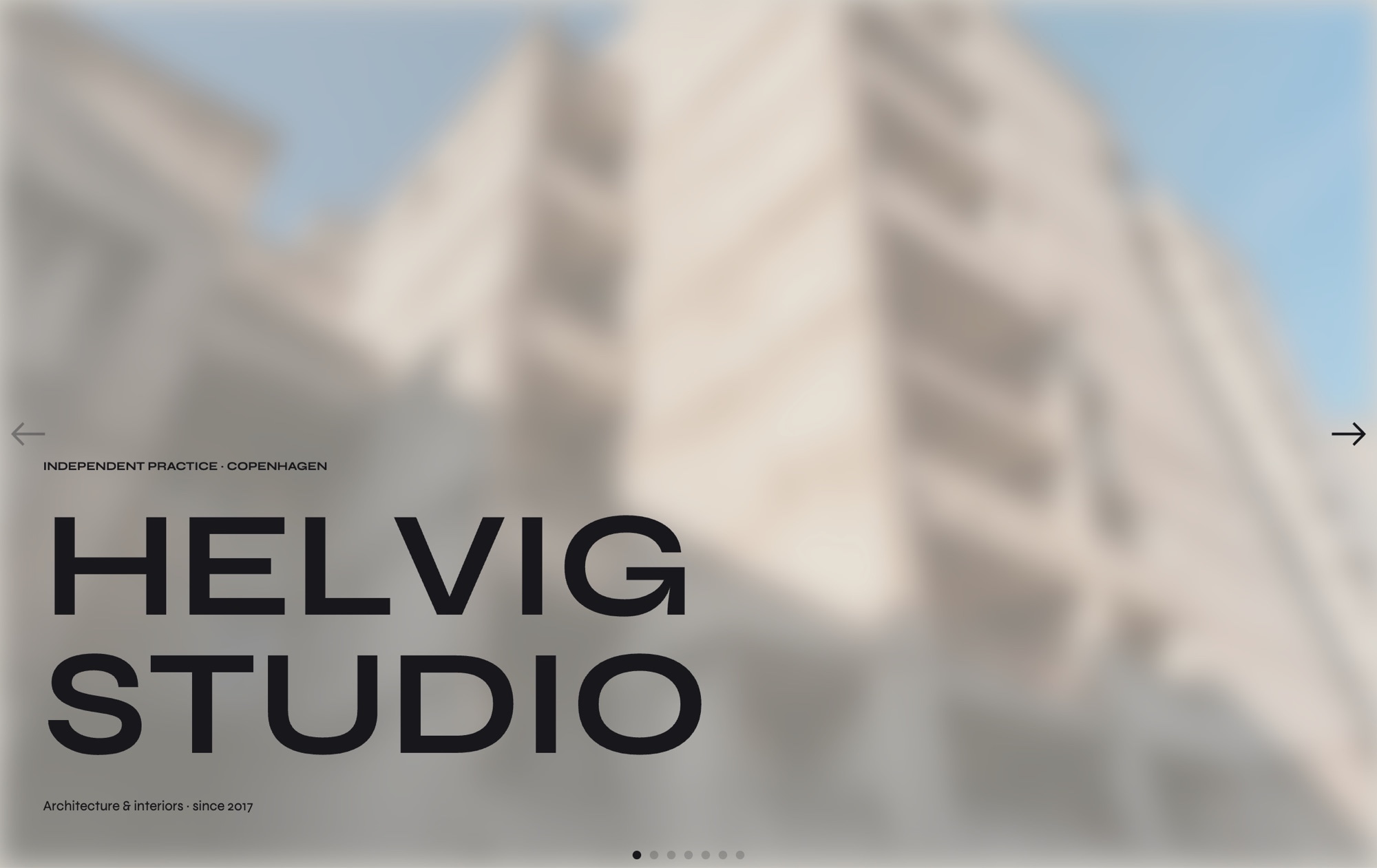
Mirrored Asymmetric Project Slides
Project 01 places the image left and the title block right, project 02 mirrors it, and project 03 takes the image full-bleed across the lower half with the title floating above. The varied compositions keep the sequence from feeling like a repeating template, while the underlying grid keeps every slide visually related.
Stark Black and White Architectural Imagery
High-contrast monochrome photography lets concrete, glass, and steel render as form rather than color. The Swiss-red accent then reads as the single voice of the studio against the architectural work. Drop your own black-and-white or muted-color imagery in and the palette discipline stays intact.
Numeric Studio Index
A dedicated index slide displays studio statistics - 28 projects built, 14 countries worked, 4 major awards - as oversized grotesk numerals with a single red statistic highlighting the most important metric. It works as a credentials moment between project showcases without falling back on a logo wall or a vague mission statement.
#Who Should Use This Template
Architecture firms and design studios that already think in plans, sections, and grids will recognize the layout language immediately. The asymmetric project slides, monochrome photography, and single accent are the visual vocabulary of architectural monographs and studio identity systems from Müller-Brockmann onward. If your work is documented in disciplined photography, this template lets the buildings speak first and the studio brand follow.
Brand consultancies, identity studios, and editorial designers can adapt the same structure for case study presentations. Replace the architectural photography with brand work, swap "BUILT FORM." for a positioning statement, and the grid carries every project page. The Swiss design lineage signals taste to clients who recognize it and reads as quietly confident to clients who do not.
Industrial designers, furniture studios, and product architects working in spaces where craft and material dominate the story will find this template a better fit than a typical e-commerce or portfolio carousel. The mirrored compositions and large image areas suit object photography at the same scale they suit buildings, and the mono labels handle technical metadata - dimensions, materials, year - without needing extra layout work.
#Best Use Cases
- ✓Architecture studio portfolios presenting residential, commercial, civic, and cultural projects
- ✓Brand and identity consultancies showing case studies in a publication-style sequence
- ✓Industrial and product design studios documenting objects with editorial photography
- ✓Interior design and spatial practices pitching to galleries, museums, and institutional clients
- ✓Furniture and lighting studios showcasing collections with technical metadata
- ✓Urban planning and landscape architecture practices documenting long-form civic work
- ✓Editorial design studios and typographers presenting print and digital portfolios
- ✓Cultural institutions and museums building section microsites for exhibitions and programs
#How to Customize
- Open the Swiss Grid template in Swiper Studio - the six slides load directly into the visual editor with the grid system pre-configured.1
- Replace the studio name on the cover slide. The "BUILT FORM." display headline and the "STUDIO HEINRICH · EST. 1998" mono label both edit inline without breaking the grid alignment.2
- Swap the three featured project images for your own architecture or design work. Each slide accepts a high-resolution photograph and keeps the asymmetric two-column composition intact.3
- Update the project metadata - number, title, location, year, and short description - on each project slide. The IBM Plex Mono labels and Inter 700 titles stay synced to the same grid.4
- Edit the studio index numbers on slide 4 to reflect your real projects built, countries worked, and awards count. Pick the most important metric and apply the Swiss red color to it for the single accent moment.5
- Update the contact slide with your studio address, email, and "BEGIN A PROJECT" link. Point the link to your contact form, email, or scheduling URL.6
- Adjust the Swiss red accent if you want a different brand color. The rule, dot, project number underlines, and statistic highlight all share the same hue, so updating the color token applies it everywhere.7
- Publish to CDN for an embeddable studio portfolio, or export to React, Vue, HTML, Next.js, a Web Component, or Webflow to ship the sequence inside a larger studio site.8
#Frequently Asked Questions
- What is a Swiss-style grid and why does it work for portfolios?
- Swiss-style or International Typographic Style design uses strict columnar grids, neutral grotesk type, generous white space, and a single accent color to organize information without decoration. It became the dominant language for architecture, museum, and design-studio identity work because it lets the work itself carry the page. This template applies that discipline to a portfolio carousel, so your buildings and projects do the talking.
- Can I replace the architecture photography with my own projects?
- Yes. Every project slide accepts a high-resolution photograph in any aspect ratio, and the grid will adapt around it. Upload your own black-and-white or color imagery, update the project number, title, location, and year, and the asymmetric two-column composition stays intact. The mirrored layouts on adjacent slides keep the sequence visually varied.
- Why Inter 700 instead of Helvetica?
- Helvetica is not available on Google Fonts and cannot be embedded freely in exports. Inter at 700 weight is the closest neutral grotesk that ships with an open license, holds up at display sizes, and supports the wide Latin and Cyrillic glyph sets a global architecture practice usually needs. You can swap Inter for any other grotesk in the style panel if your studio standard is Neue Haas, Suisse, or another licensed face.
- How do I change the Swiss red accent color?
- The Swiss red #e30613 appears on the thin horizontal rule on the cover slide, the underline under each project number, the highlighted statistic on the studio index slide, and the dot plus arrow on the contact slide. Select any of those elements and update the color in the style panel. A black, gold, or deep navy accent works just as well against the neutral palette if your brand calls for it.
- Will the asymmetric grid hold up on mobile?
- Yes. Each project slide has a configured breakpoint for mobile, tablet, and laptop that restacks the asymmetric two-column layout into a single column with the image above the text block. The display headlines scale down independently, the mono labels stay readable, and the Swiss-red accent rule keeps marking the rhythm between slides.
#Related Templates
#Related Resources
- Swiper Studio for Portfolios
- Swiper Studio for Web Designers
- Swiper Studio for Agencies
- Swiper Studio for Photographers
Ready to Build Your Slider?
Pick a template, customize it visually, and export production-ready code to React, Vue, Next.js, HTML, Webflow, and more. No coding required.