Products - Tech Devices - Buttons Template
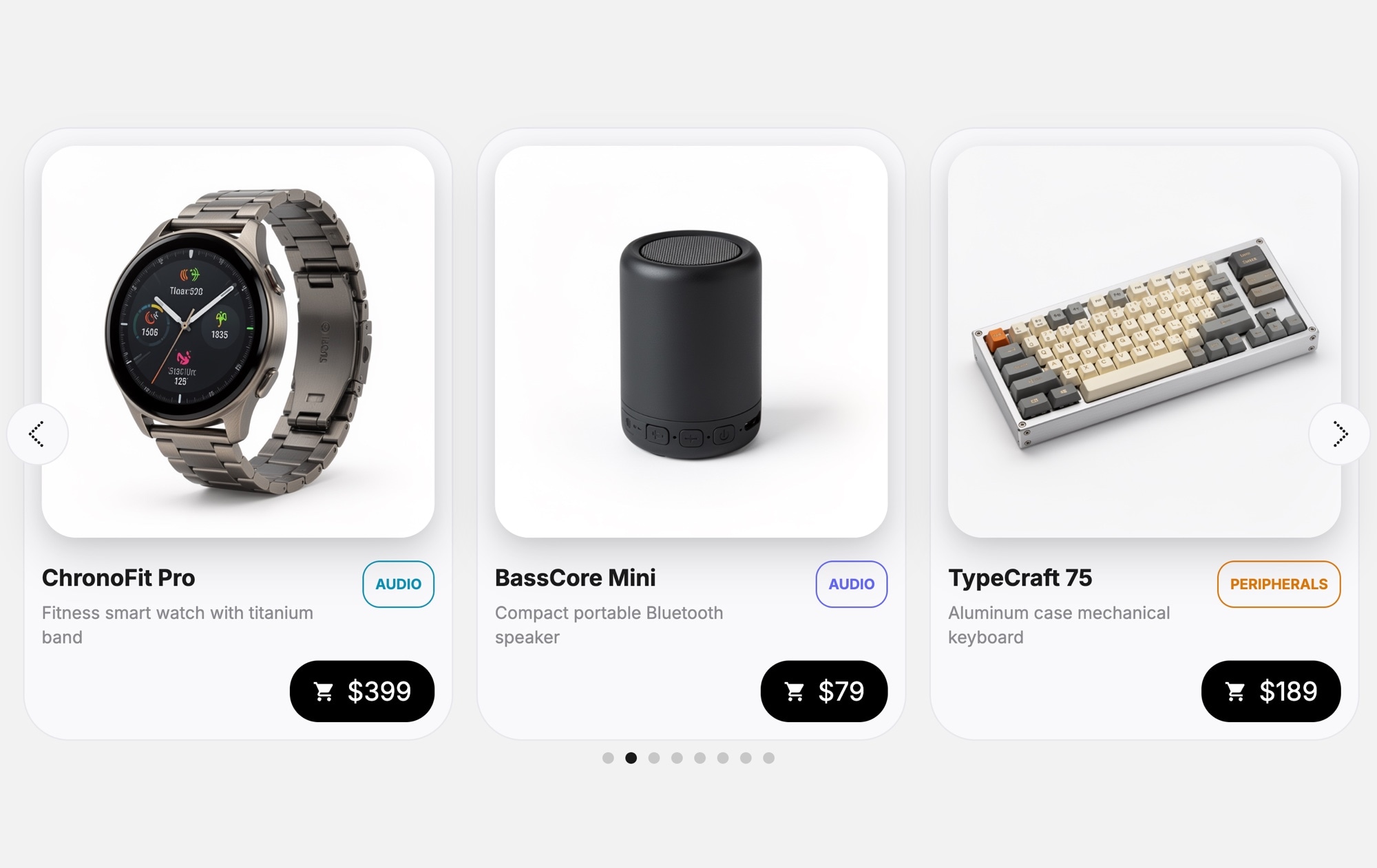
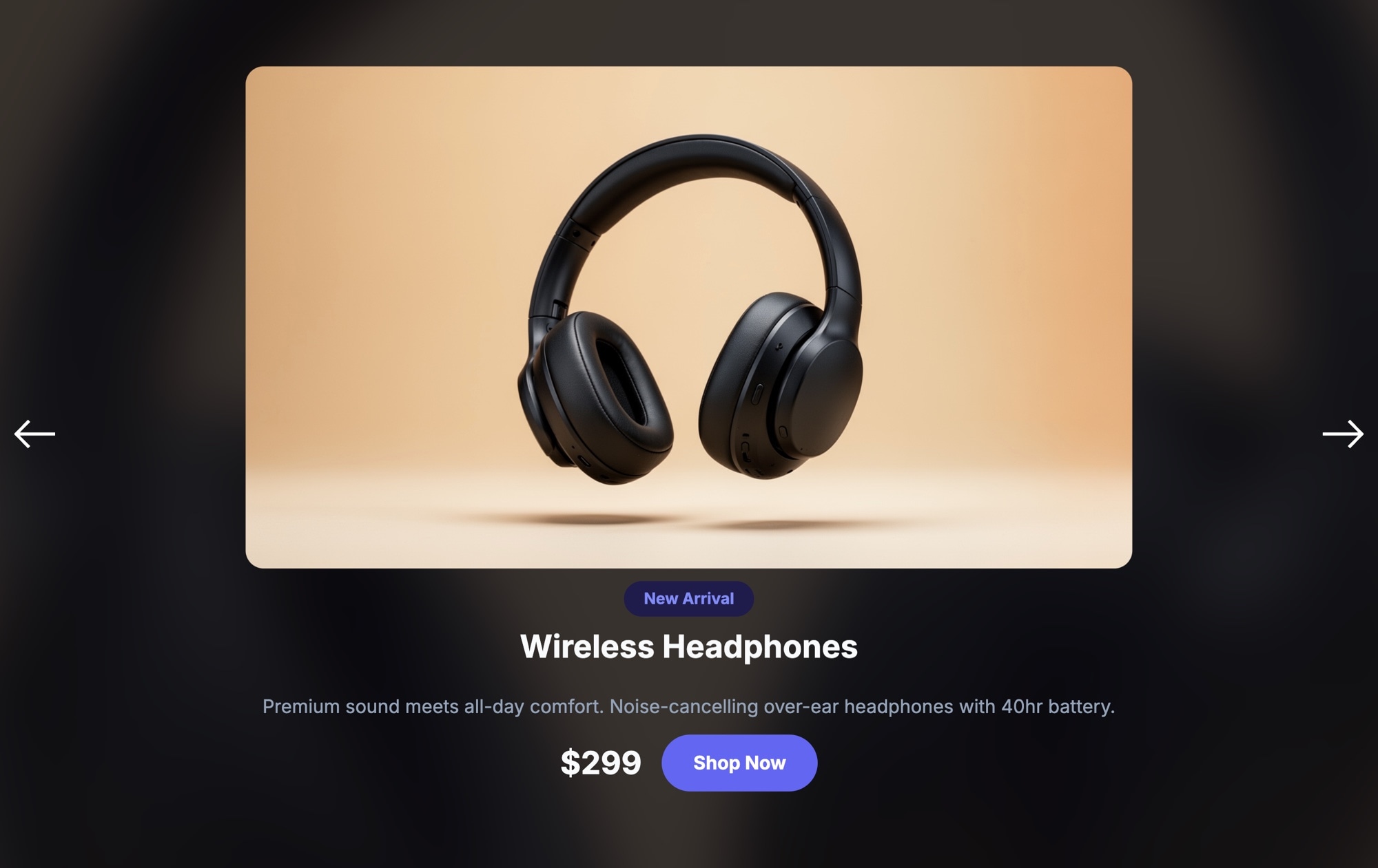
Sometimes shoppers do not need a paragraph of description — they need to see the product, check the price, and add it to the cart. The Products - Tech Devices - Buttons template strips the product card down to what matters most: a clear device photo, a category badge, the product name, a short description, the price, and a prominent cart button. It is the fastest path from browsing to buying.
The compact card format means you can show more products in less space. Three cards fit comfortably on desktop with room to breathe, and each one gives shoppers enough information to make a quick decision. The light background keeps the focus on the product images, and the cart icon on every card makes the purchase intent unmistakable. This is a product carousel built for conversion, not just display.
#What Makes This Template Stand Out
Compact, Action-Oriented Cards
Each card is designed to drive a purchase decision fast. The layout prioritizes the product image, name, price, and an add-to-cart button — no filler content, no unnecessary whitespace. Shoppers can scan, decide, and act without extra clicks or page loads.
Add-to-Cart Button on Every Card
The cart icon button on each product card eliminates the extra step of navigating to a product page before purchasing. For stores where products are straightforward and do not require deep consideration, this pattern can significantly shorten the buying journey.
Category Badges for Organization
Each card displays a colored category badge — Wearable, Audio, Peripherals — that helps shoppers quickly identify product types as they swipe. This visual categorization adds structure and makes the carousel feel curated rather than random.
Clean Light Aesthetic
The light background and minimal card styling create a modern, trustworthy look that aligns with how consumers expect tech products to be presented. The design does not compete with your product photography — it frames it.
Space-Efficient Multi-Card Layout
The compact card size means you can display three or more products simultaneously on desktop, giving shoppers a broader view of your catalog without scrolling. On mobile, the cards adapt to a single-card view with touch swiping for a smooth browsing experience.
#Who Should Use This Template
This template is ideal for e-commerce stores selling tech products where quick add-to-cart behavior is the goal. If your products are familiar enough that shoppers do not need a full product page to make a decision — phone cases, cables, small gadgets, accessories, peripherals — the compact card with a cart button removes friction and gets them to checkout faster. It works as a featured products section, a "frequently bought together" row, or a category-specific carousel on any store page.
Shopify, WooCommerce, and BigCommerce store owners can embed this carousel directly into their existing theme. Instead of relying on a theme's built-in product slider — which often lacks customization options and looks generic — you get a polished, on-brand product carousel with add-to-cart buttons that you fully control. Publish from Swiper Studio, grab the embed code, and place it wherever you want more product visibility and higher click-through rates.
Product marketers and growth teams running promotions, flash sales, or new product launches will find this template valuable for landing pages and campaign microsites. The compact card format lets you feature a larger selection of products above the fold, and the cart button on every card means every product impression has a direct path to conversion. Pair it with urgency messaging or sale badges for maximum impact.
#Best Use Cases
- ✓E-commerce product carousels with quick add-to-cart functionality for tech accessories and gadgets
- ✓Shopify and WooCommerce featured product sections that drive direct purchases from the homepage
- ✓Flash sale and promotion landing pages where multiple products need to be visible with pricing and buy buttons
- ✓Category browsing carousels for tech product stores — wearables, audio, peripherals, smart home devices
- ✓Cross-sell and upsell sections like 'You might also like' or 'Frequently bought together'
- ✓Compact product showcases for stores with large catalogs that need to display many items in limited space
#How to Customize
- Open the Products - Tech Devices - Buttons template in Swiper Studio by clicking 'Use This Template' above1
- Replace the product images — select each card's device photo and upload your own product images or choose from the built-in library2
- Update the product details — edit category badges, product names, short descriptions, and prices on each card3
- Customize the cart button — change its color, icon, size, or replace it with a text-based button like 'Add to Cart' or 'Buy Now'4
- Add or remove product slides — duplicate existing cards for consistent styling and swap in new product information5
- Adjust carousel settings — configure slides per view, spacing, navigation arrows, autoplay, and loop behavior from the editor panel6
- Optimize for all screen sizes — preview and adjust the layout at each responsive breakpoint so cards look sharp on mobile, tablet, and desktop7
- Export to your preferred format (HTML, React, Vue, Next.js, Web Component, or Webflow) or publish to CDN and embed on your store8
#Frequently Asked Questions
- Can I customize the add-to-cart button?
- Yes. The cart icon button is fully editable — you can change its icon, color, size, and shape. You can also replace it with a text button like "Add to Cart" or "Buy Now" if that fits your store better. The button can link to a product page, cart, or any URL.
- How many product cards can I include in the carousel?
- There is no limit. You can add as many product slides as you need. The carousel handles any number of cards smoothly, and you can configure how many are visible at each breakpoint — for example, three on desktop, two on tablet, and one on mobile.
- Can I change the light background to a dark theme?
- Yes. All colors in the template are customizable through the visual editor. You can switch to a dark background, adjust card colors, change text contrast, and modify badge colors to create a completely different look while keeping the same card structure.
- Does this template support touch swiping on mobile?
- Yes. Touch swiping is enabled by default on mobile and tablet devices. The carousel also supports mouse dragging on desktop. You can configure additional navigation options like arrows, pagination dots, and autoplay from the editor settings.
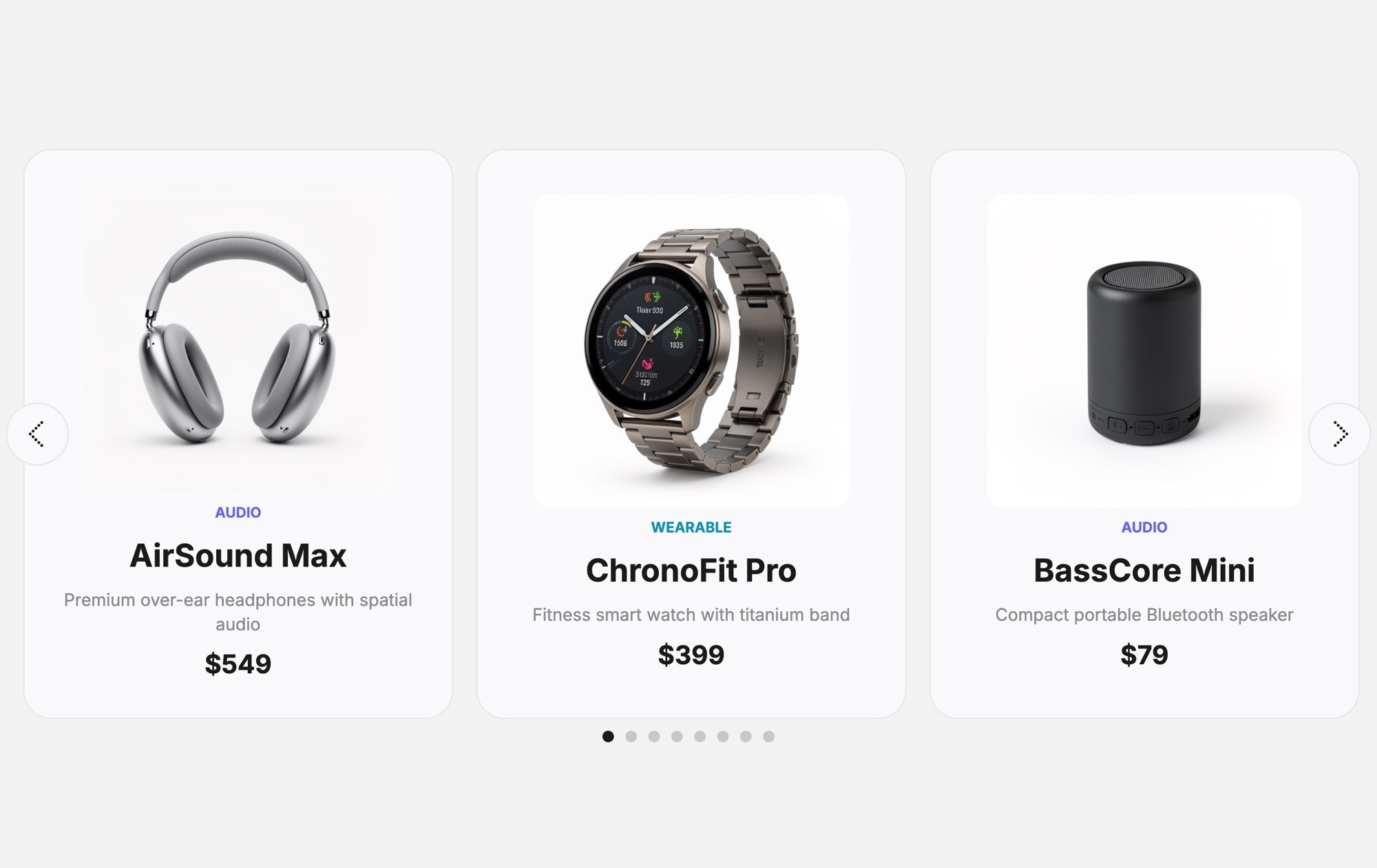
- What is the difference between this template and the Tech Devices template?
- This template uses a more compact card layout with an add-to-cart button icon on each card, making it action-oriented and suited for quick purchasing. The standard Tech Devices template uses larger cards with more description text and pagination dots, making it better for product discovery and browsing.
#Related Templates

#Related Resources
Ready to Build Your Slider?
Pick a template, customize it visually, and export production-ready code to React, Vue, Next.js, HTML, Webflow, and more. No coding required.