Related Products
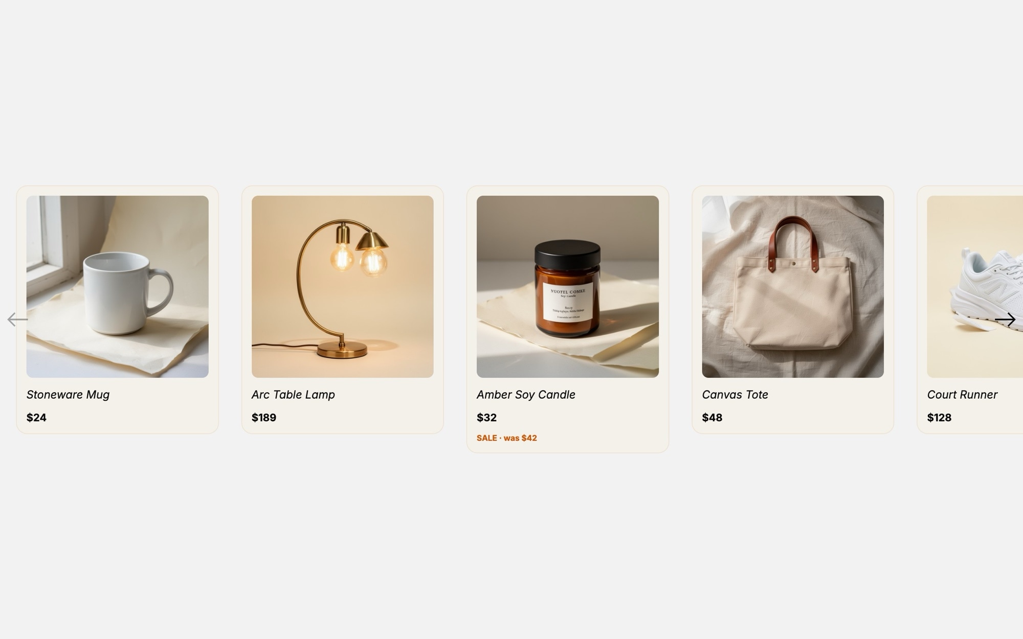
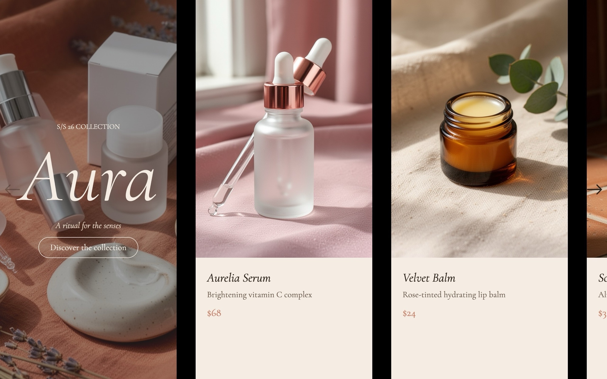
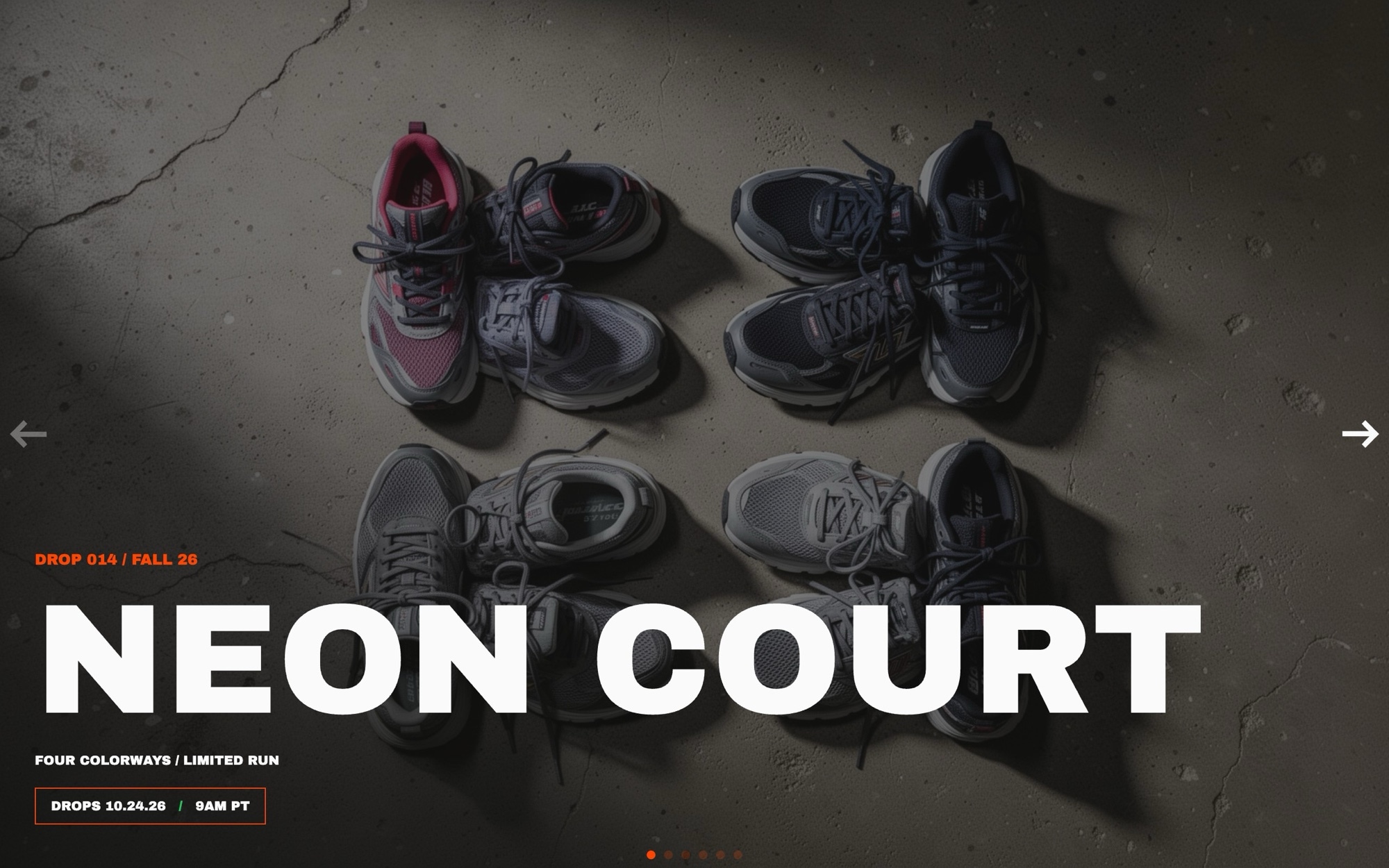
A compact "You may also like" carousel built for the bottom of product detail pages, search results, and category landing zones. The template ships with eight product cards covering a deliberately mixed catalog - ceramic mug, brass lamp, soy candle, canvas tote, white sneaker, oatmeal hoodie, water bottle, and waffle-knit throw - so you can see how the layout handles different categories before swapping in your own inventory.
Each card pairs a square product photo on a soft cream backdrop with the product name in Fraunces, the price in Inter, and an optional sale tag in a warm orange accent. The slide effect keeps things calm and predictable, with 2.2 cards on mobile, 3.5 on tablet, and 4.5 on desktop so shoppers always see a partial edge that invites the next swipe.
#What Makes This Template Stand Out
Eight Cross-Category Product Cards
The default eight slides span home goods, apparel, and accessories, so the layout is proven against very different product silhouettes before you drop in your own catalog. Add or remove cards in seconds to match the length of your related-products feed.
Cream Card Background That Flatters Photography
Cards sit on a #f4f0ea cream background against a clean white page. The neutral surface lets product colors stay true and gives the carousel a boutique-catalog feel rather than the flat white of a generic grid.
Sale Tag Accent in Warm Orange
The optional sale tag in #d35400 is restrained enough to feel premium and warm enough to actually draw the eye. Use it to flag price drops, limited stock, or new arrivals on the cards that need it without lighting up the whole carousel.
Multi-Slide Breakpoints With Partial-Card Hint
Slides per view scale from 2.2 on mobile to 3.5 on tablet to 4.5 on desktop, with a 24px gap throughout. The partial card visible at every breakpoint is a deliberate cue that more products are waiting to the right.
Inter and Fraunces Typography Pairing
Inter handles the UI labels and prices in 400 and 600 while Fraunces in 500 carries the small product names. The combination feels modern and considered, and both are Google Fonts so swapping in your brand typefaces is straightforward.
#Who Should Use This Template
This template is built for e-commerce stores and DTC brands that want to reuse the same related-products component across product detail pages, search results, and home page recommendations. The compact card format keeps the carousel out of the way while still giving each item enough room to breathe, which is exactly what a "You may also like" section needs to do its job.
Shopify, WooCommerce, and BigCommerce store owners can drop this in as a polished alternative to a default theme recommendation widget. On Shopify, our official app adds the slider as a native theme block and can map it to a collection so cards render from your live catalog. On WooCommerce and BigCommerce, paste the CDN embed into a Custom HTML block, and your product pages instantly look more curated. The same embed approach works on Squarespace and any platform that accepts embed code.
Web designers and agencies working on retail clients will find this useful as a production-ready starting point for cross-sell modules. The card structure, breakpoint behavior, and information hierarchy follow e-commerce conventions, so you can move straight to art direction and content rather than rebuilding the layout.
#Best Use Cases
- ✓Related products section on product detail pages across Shopify, WooCommerce, and headless stores
- ✓Recently viewed or recommended-for-you carousels on the home page
- ✓"Complete the look" or accessory cross-sell modules below the add-to-cart button
- ✓Search and category page widgets surfacing items that did not match the filters
- ✓Email campaign landing pages featuring a curated sale or new arrivals
- ✓Boutique and DTC brand sites that want a calmer alternative to dense product grids
- ✓Gift guide and edit pages that pair items by occasion, season, or recipient
- ✓Bundle promotion modules that highlight items frequently purchased together
#How to Customize
- Open the Related Products template in Swiper Studio by clicking 'Use This Template' above1
- Replace the eight default product images with your own catalog photography or pull from the built-in demo image library2
- Update each card with your real product name, price, and optional sale tag - hide the tag entirely on cards that should not flag a discount3
- Adjust the cream card background and orange sale-tag accent in the project style panel to match your brand colors4
- Swap Inter and Fraunces for your store typefaces if you already have a typography system in place5
- Tune slides per view, gap, and autoplay behavior - 2.2 / 3.5 / 4.5 across 375 / 768 / 1024 is the default but every value is editable per breakpoint6
- Wrap each card in a link block pointing to the matching product detail page on your store7
- Export to HTML, React, Vue, Next.js, Web Component, or Webflow, publish to CDN for an embed snippet, or add it to your Shopify store with our official app8
#Frequently Asked Questions
- Can I swap the eight default products for my own catalog?
- Yes. Every card image, name, price, and sale tag is editable in the visual editor. Replace the demo product photography (mug, lamp, candle, tote, sneaker, hoodie, bottle, throw blanket) with your own product shots, update the names and prices, and toggle the sale tag on or off per card. You can also add or remove cards to match the size of your related-products feed.
- How does the carousel adapt to mobile and tablet?
- The template ships with breakpoints at 375, 768, and 1024 that show 2.2, 3.5, and 4.5 cards per view respectively, with a 24px gap between them. The partial card edge on mobile signals there is more to swipe, and the card count, gap, and font sizes are independently editable at every breakpoint in the editor.
- Can I link each card to its product detail page?
- Yes. Wrap each card in a link block and point it to the corresponding product URL on your store. The sale tag accent in #d35400 can also be linked or restyled, and you can add a hover state for the entire card if your platform supports it.
- Will the typography pairing work with my existing site?
- The template uses Inter for UI labels and prices and Fraunces for the small product names, which is a clean pairing that sits well alongside most modern store designs. Both are Google Fonts and easy to swap. Open the project style panel and replace either family with the typeface your store already uses.
- How do I embed this on Shopify or my e-commerce platform?
- On Shopify, install our official Shopify app and add the published slider to any page as a native theme block - you can even map it to a collection so it renders one card per product with live titles, prices, and images. On WooCommerce, paste the CDN embed snippet into a Custom HTML block; the same snippet works on any platform that accepts embed code. You can also export the slider as React, Vue, HTML, Next.js, a Web Component, or use the Webflow plugin for native integration.
#Related Templates
#Related Resources
- Swiper Studio for Product Carousels
- Swiper Studio for E-commerce Stores
- Swiper Studio for Shopify
- Swiper Studio for Small Businesses
Ready to Build Your Slider?
Pick a template, customize it visually, and export production-ready code to React, Vue, Next.js, HTML, Webflow, and more. No coding required.