Beauty & Cosmetics
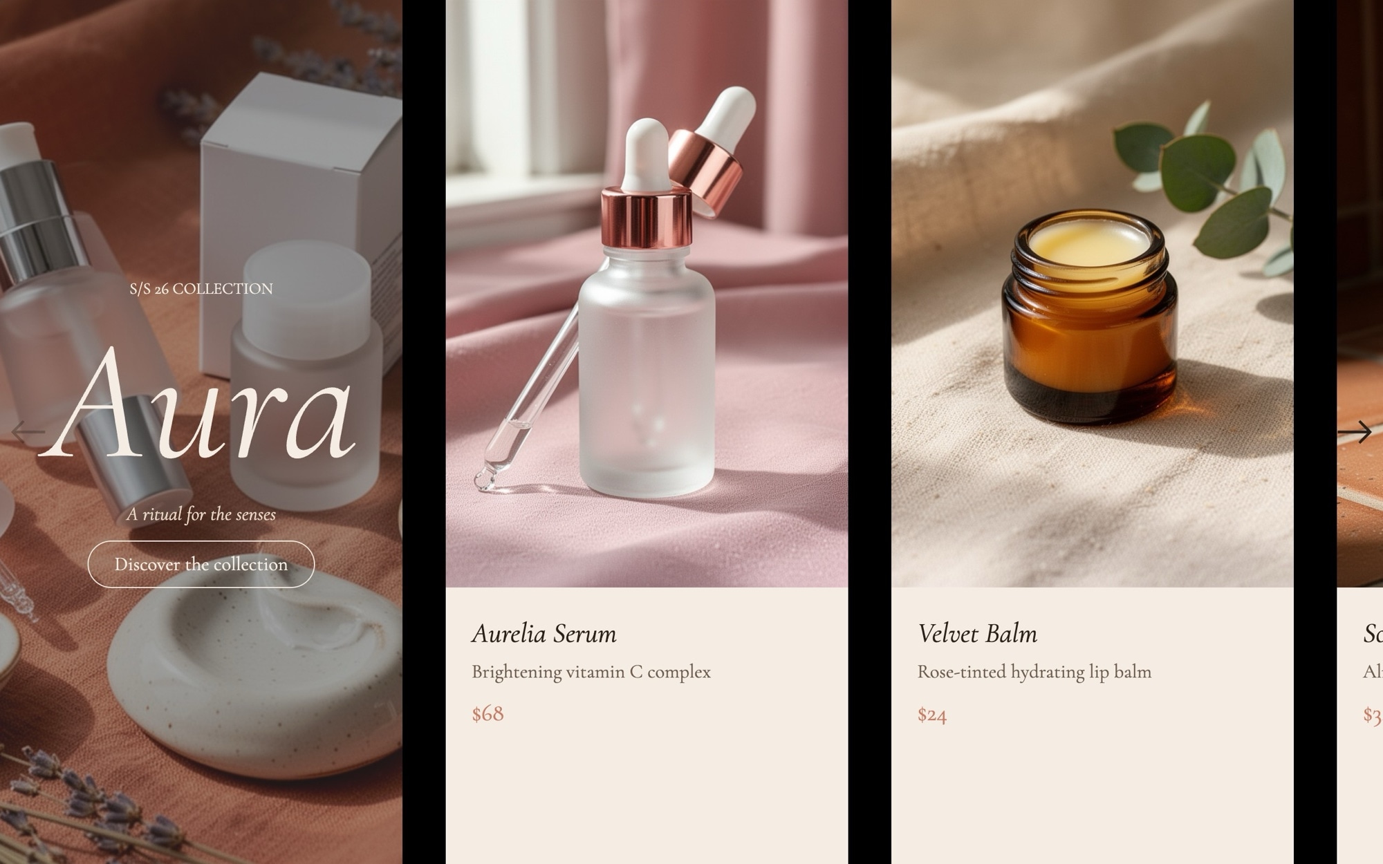
An editorial cosmetics carousel built for the kind of brand that publishes essays alongside its product pages. The cover slide opens with "AURA - S/S 26 collection" set in italic Cormorant Garamond, then the sequence walks through five product cards - serum, lip balm, hand cream, face oil, and fragrance roll-on - each pairing a soft product still life with a name, single-line description, and price.
The palette runs powder #f5ede4, espresso #2a201a, and terracotta #c97b63, which is warm enough to feel like a clean-beauty brand and quiet enough to never compete with the photography. A standard slide effect with 32px gaps and 1.2 / 2.2 / 3.2 cards per view keeps the pace gentle and the partial card edge always visible.
#What Makes This Template Stand Out
Editorial Cover With Collection Tag
The opening slide pairs an italic Cormorant Garamond wordmark with a small season tag, set on a powder backdrop. It introduces the collection like the first page of a print catalog and frames everything that follows as part of a curated drop rather than a random list.
Powder, Espresso, and Terracotta Palette
The #f5ede4 powder background, #2a201a espresso text, and #c97b63 terracotta accent are tuned for warm, natural-leaning beauty brands. The neutrals flatter glass dropper bottles and ceramic dishes, and the terracotta carries enough warmth to feel like a brand color rather than a generic accent.
Italic Cormorant Garamond and Inter
Cormorant Garamond italic at 400 handles the display type and product names while Inter handles UI labels and prices. The pairing has been used across luxury beauty and skincare for a reason - it reads editorial without ever feeling stiff.
Six-Slide Collection Narrative
Cover plus five product cards is the right shape for a small-batch capsule or a seasonal hero range. The structure is pre-wired - duplicate a card slide to extend the line, or trim a slide to highlight a tighter edit.
Multi-Card Layout With Partial Edge
Slides per view scales from 1.2 on mobile through 2.2 on tablet to 3.2 on desktop with a 32px gap. The partial card visible at every breakpoint signals the rest of the collection is one swipe away, which is the right cue for a browse-driven beauty section.
#Who Should Use This Template
This template is built for clean beauty, indie skincare, and natural cosmetics brands that want their product pages to read as editorial rather than as a stockroom feed. The italic display type, powder palette, and gentle pacing match the way these brands already photograph and write about their products, so the carousel slots into an existing visual system without much rework.
Spa, apothecary, and wellness retailers can use the same structure for ritual sets, body care lines, and home fragrance. Replace the cover wordmark with your brand and the five cards with your hero range, and the sequence works as a homepage introduction or a category landing module.
Web designers and creative agencies working with beauty clients will find this useful as a production-ready starting point. The palette, typography, and card composition are dialled in for the category, so most of your time goes into photography selection and copy rather than rebuilding the layout from scratch.
#Best Use Cases
- ✓Indie beauty and clean cosmetics homepages introducing a seasonal capsule or hero range
- ✓Skincare brand collection pages featuring serums, oils, and treatment products
- ✓Apothecary and natural body care storefronts that need an editorial alternative to a product grid
- ✓Spa and ritual set landing pages on Shopify, Squarespace, and WooCommerce
- ✓Press and influencer landing pages for beauty product launches and PR seeding kits
- ✓Subscription-box marketing pages introducing the items in the next monthly drop
- ✓Clean-beauty marketplace category pages curating a particular brand or theme
- ✓About and brand-story pages where a product range is part of the founder narrative
#How to Customize
- Open the Beauty & Cosmetics template in Swiper Studio by clicking 'Use This Template' above1
- Replace the cover wordmark and season tag with your brand name and the launch window for the collection2
- Swap the five product images with your own dropper bottles, balms, oils, and fragrance shots, keeping the soft natural-light treatment if it matches your photography3
- Update each card with your real product name, one-line description, and price in the visual editor4
- Adjust the powder, espresso, and terracotta palette in the project style panel to match your brand colors5
- Swap Cormorant Garamond and Inter for your house typefaces if you already have a typography system in place6
- Tune slides per view, gap, and the breakpoint sizes for the italic display type so the carousel stays in rhythm at every device width7
- Export to HTML, React, Vue, Next.js, Web Component, or Webflow, or publish to CDN for embedding into a Shopify or Squarespace beauty collection page8
#Frequently Asked Questions
- Can I rebrand the AURA collection title and product names?
- Yes. The cover slide reads "AURA - S/S 26 collection" and the five product cards cover a serum, lip balm, hand cream, face oil, and fragrance roll-on. Every word is editable - swap the collection name, season tag, product names, and one-line descriptions in the visual editor without touching code.
- Will the powder, espresso, and terracotta palette work for my brand?
- The default palette of #f5ede4 powder, #2a201a espresso, and #c97b63 terracotta is tuned for warm, considered cosmetics brands, but every color is editable. Open the project style panel and adjust backgrounds, text, and accent fills to your brand guidelines - the slide layouts and product card composition stay intact.
- How does the carousel adapt to mobile?
- Slides per view scales from 1.2 on mobile through 2.2 on tablet to 3.2 on desktop with a 32px gap, so a partial card is always visible to invite the next swipe. The italic Cormorant Garamond display type also has its own font sizes per breakpoint so the editorial rhythm holds on small screens.
- Can I add more products to the collection?
- Absolutely. Duplicate one of the existing five product card slides, swap the image and the name and description, and the new card inherits the same typography, padding, and breakpoint behavior. Keep the cover slide first so the collection introduction always opens the sequence.
- How do I integrate this into a Shopify or headless storefront?
- For Shopify, install our official Shopify app and add the published slider to any page as a native theme block from the theme editor. For headless setups, export the project as a React or Vue component. The Webflow plugin also gives you a native element you can drop into a Beauty collection page without touching code.
#Related Templates

#Related Resources
- Swiper Studio for E-commerce Stores
- Swiper Studio for Product Carousels
- Swiper Studio for Shopify
- Swiper Studio for Landing Pages
Ready to Build Your Slider?
Pick a template, customize it visually, and export production-ready code to React, Vue, Next.js, HTML, Webflow, and more. No coding required.