Black Friday Deal Grid
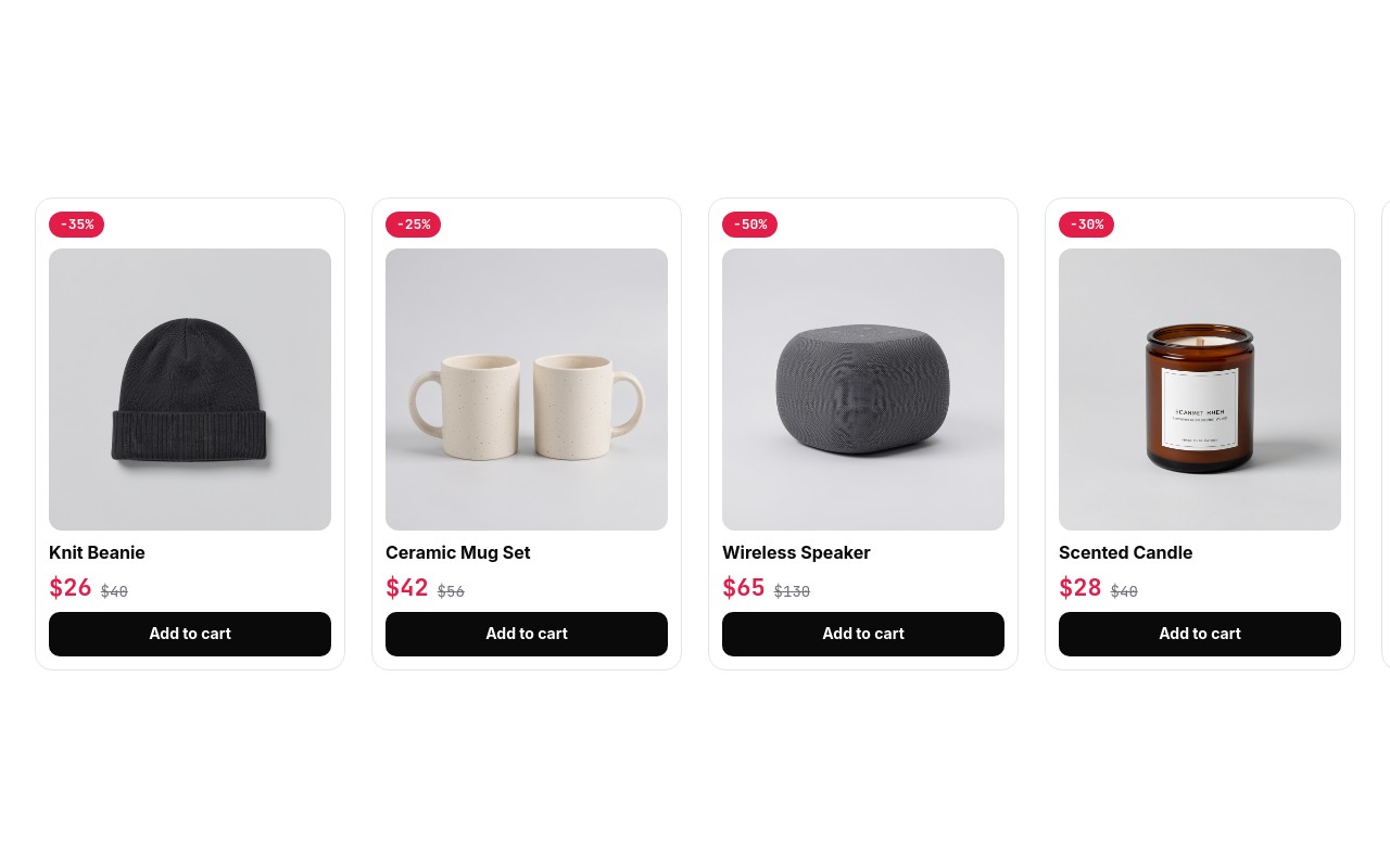
A product deal carousel that looks like it came with your store theme. Eight white cards, each with a square product photo on a light grey backdrop, a red discount pill above it, the product name, the sale price in red next to the original price struck through, and a full-width black "Add to cart" button. It is the most copy-paste-ready commerce layout in the Black Friday set: drop it under a "Black Friday Deals" heading and swap in your products.
The cards use Inter for names and buttons and JetBrains Mono for prices and badges. Colors stay close to a standard storefront: white #ffffff cards with a 1px #e4e4e7 border and 16px corners, near-black #0a0a0a type and buttons, sale red #e11d48 for badges and new prices, and muted #71717a for the old price. The carousel slides at 500ms with no autoplay and no loop, so shoppers browse at their own pace.
#What Makes This Template Stand Out
Standard Product Card Anatomy
Discount pill, square photo, name, price pair, and Add to cart - the same order shoppers already know from product grids. Nothing to learn, nothing to explain, and it sits next to your theme's own collection pages without looking out of place.
Varied Discounts From 20% to 60%
The eight example deals cover the full range: Knit Beanie -35% ($26 / $40), Ceramic Mug Set -25% ($42 / $56), Wireless Speaker -50% ($65 / $130), Scented Candle -30% ($28 / $40), Leather Wallet -20% ($68 / $85), Running Shoe -40% ($84 / $140), Desk Lamp -60% ($60 / $150), and Cashmere Scarf -45% ($99 / $180).
Responsive Cards per View
1.2 cards per view on phones, 2.5 from 768px, and 4 from 1024px, with gaps growing from 16px to 24px. The peeking card on smaller screens invites a swipe, and the desktop row reads like a four-column product grid.
Sale Price With Struck-Through Original
The new price is JetBrains Mono bold in sale red #e11d48 at 22px, and the original price sits beside it at 14px in muted grey with a strikethrough. It is the clearest way to show a discount at a glance, and the badge repeats the percentage above the photo.
Built for Browsing, Not Autoplay
Autoplay and loop are off, auto height is on, arrows show from 1024px, and bullets show everywhere. It behaves like a product shelf: shoppers scroll through the deals, compare prices, and click through when something fits.
#Who Should Use This Template
This template is built for Shopify and ecommerce merchants who need a Black Friday deals row on the homepage or a sale landing page. It fits general stores, home goods, accessories, and apparel - anywhere a shopper wants to scan several discounted products at once instead of watching one banner rotate.
Small businesses without a designer get a card layout that already matches common storefront conventions. Replace eight photos, retype eight names and prices, link each button, and the Black Friday section is done in an afternoon.
Agencies and Webflow designers can reuse the same carousel far beyond November 27, 2026: Cyber Monday picks, a holiday gift shelf, a "last chance" clearance row, or a related-products strip on product pages, just by changing the badges and prices.
#Best Use Cases
- ✓Black Friday deals rows on store homepages below the hero banner
- ✓Cyber Monday and holiday sale landing pages with shoppable cards
- ✓Shopify collection highlights added as a theme block through the Swiper Studio app
- ✓Gift guide shelves grouped by price or recipient
- ✓Clearance and last-chance product carousels after the holidays
- ✓Related products or "complete the look" rows on product pages
- ✓Email landing pages that list every product featured in a campaign
- ✓Agency ecommerce builds that need a reusable deal card component
#How to Customize
- Open the Black Friday Deal Grid template in Swiper Studio - you will see eight product cards, one per slide.1
- Replace each product photo in the media panel with your own square image. Similar backgrounds across all eight keep the grid even.2
- Retype the product names, the red sale prices, and the struck-through original prices.3
- Update the discount pills (-35%, -25%, -50% and so on) so they match the new prices.4
- Point each "Add to cart" link block at the product page, cart link, or collection you want.5
- Add or remove cards by duplicating or deleting slides - the carousel handles any number.6
- Adjust cards per view (1.2 / 2.5 / 4) and spacing per breakpoint, or change the sale red #e11d48 to your own accent.7
- Publish to CDN and add it to Shopify with the Swiper Studio app, paste it into Webflow, or export to HTML, React, Vue, Next.js, or a Web Component.8
#Frequently Asked Questions
- How many cards show at once on each screen size?
- The carousel shows 1.2 cards on phones, 2.5 cards from 768px, and 4 cards from 1024px, with 16px, 20px, and 24px gaps. The partial card at the edge on mobile and tablet tells shoppers there is more to swipe. Navigation arrows appear from 1024px, and bullet pagination runs at every size.
- Can I link "Add to cart" to my real products?
- Yes. Each "Add to cart" button is a link block, so you can point it at any URL - a product page, a Shopify cart permalink, or a collection. The template ships with eight example products (beanie, mug set, speaker, candle, wallet, running shoe, desk lamp, scarf); replace the photos in the media panel and retype the names and prices.
- Why is there no title slide or countdown?
- This is a product carousel, not a hero banner. In most stores the section heading ("Black Friday Deals", "Up to 60% off") sits above the carousel in your theme, so every slide is a shoppable card. Autoplay is off on purpose because people browse deals at their own pace. If you want a countdown, pair it with a banner like Black Friday Blackout or Doorbusters above it.
- Do the cards keep a consistent height?
- Yes. The slider uses auto height, so it sizes to the natural height of the cards instead of stretching to fill a fixed box. Keep product names to one line and use square product photos on a similar light backdrop, and the grid stays even.
- How do I put it on Shopify, Webflow, or WordPress?
- On Shopify, install the official Swiper Studio Shopify app and add the published slider to any page as a native theme block from the theme editor. In Webflow, use Paste into Webflow to add it as native elements. On WordPress, Squarespace, Wix, or any other site, publish to CDN and paste the embed snippet, or export to HTML, React, Vue, Next.js, or a Web Component.
#Related Templates


#Related Resources
- Swiper Studio for Product Carousels
- Swiper Studio for Ecommerce Stores
- Swiper Studio for Shopify
- Swiper Studio for Small Businesses
Ready to Build Your Slider?
Pick a template, customize it visually, and export production-ready code to React, Vue, Next.js, HTML, Webflow, and more. No coding required.