News & Blog Cards - Light
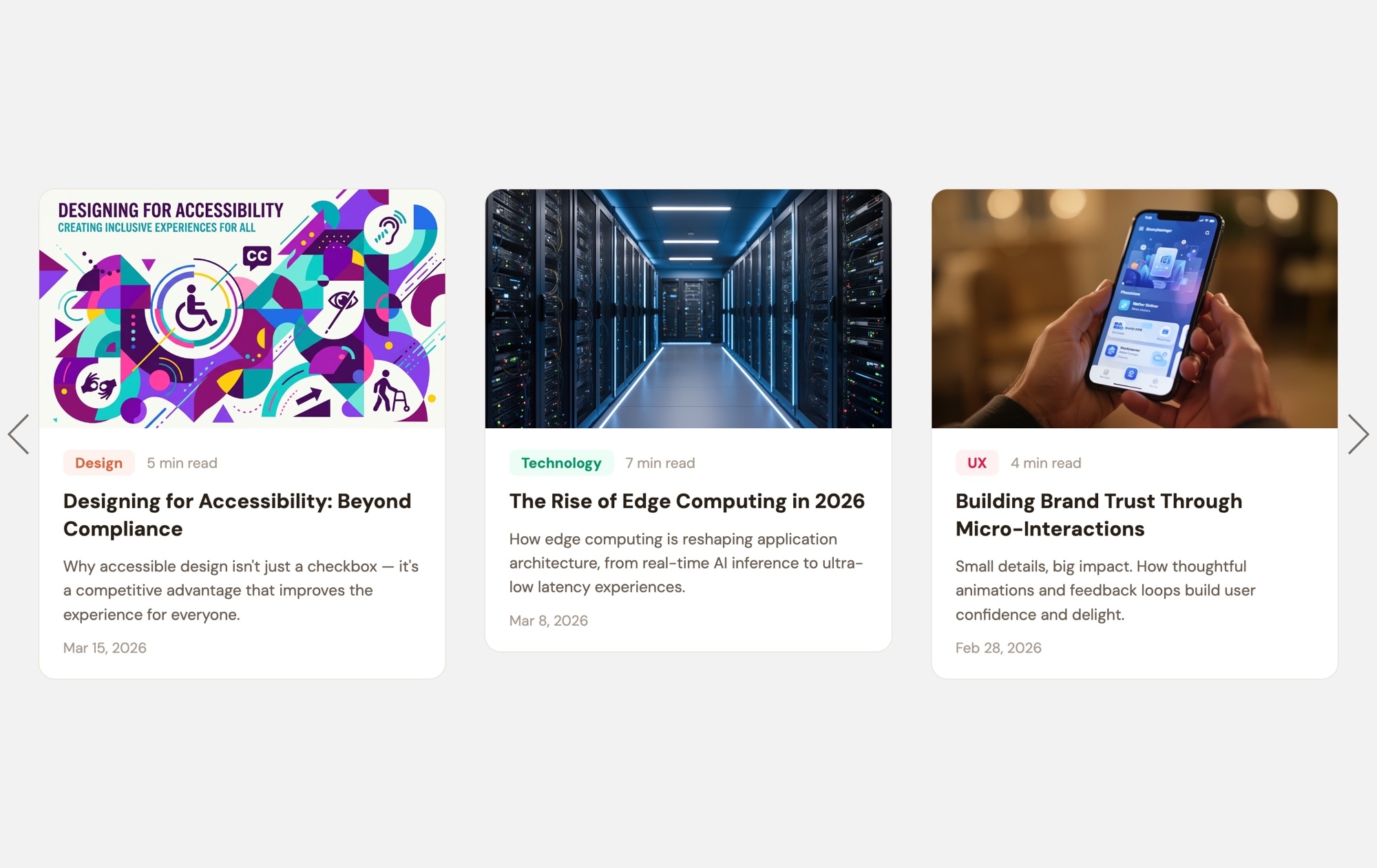
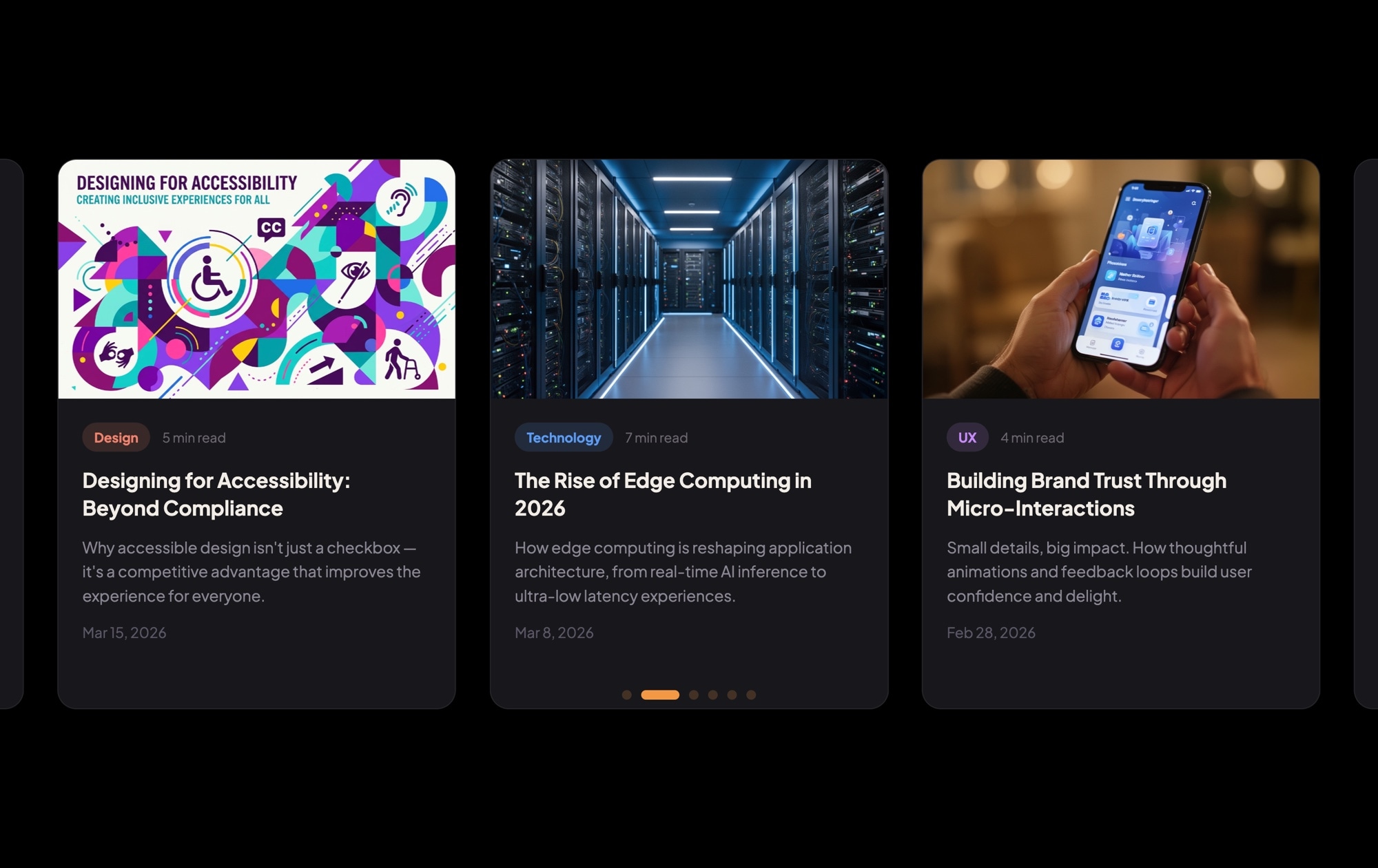
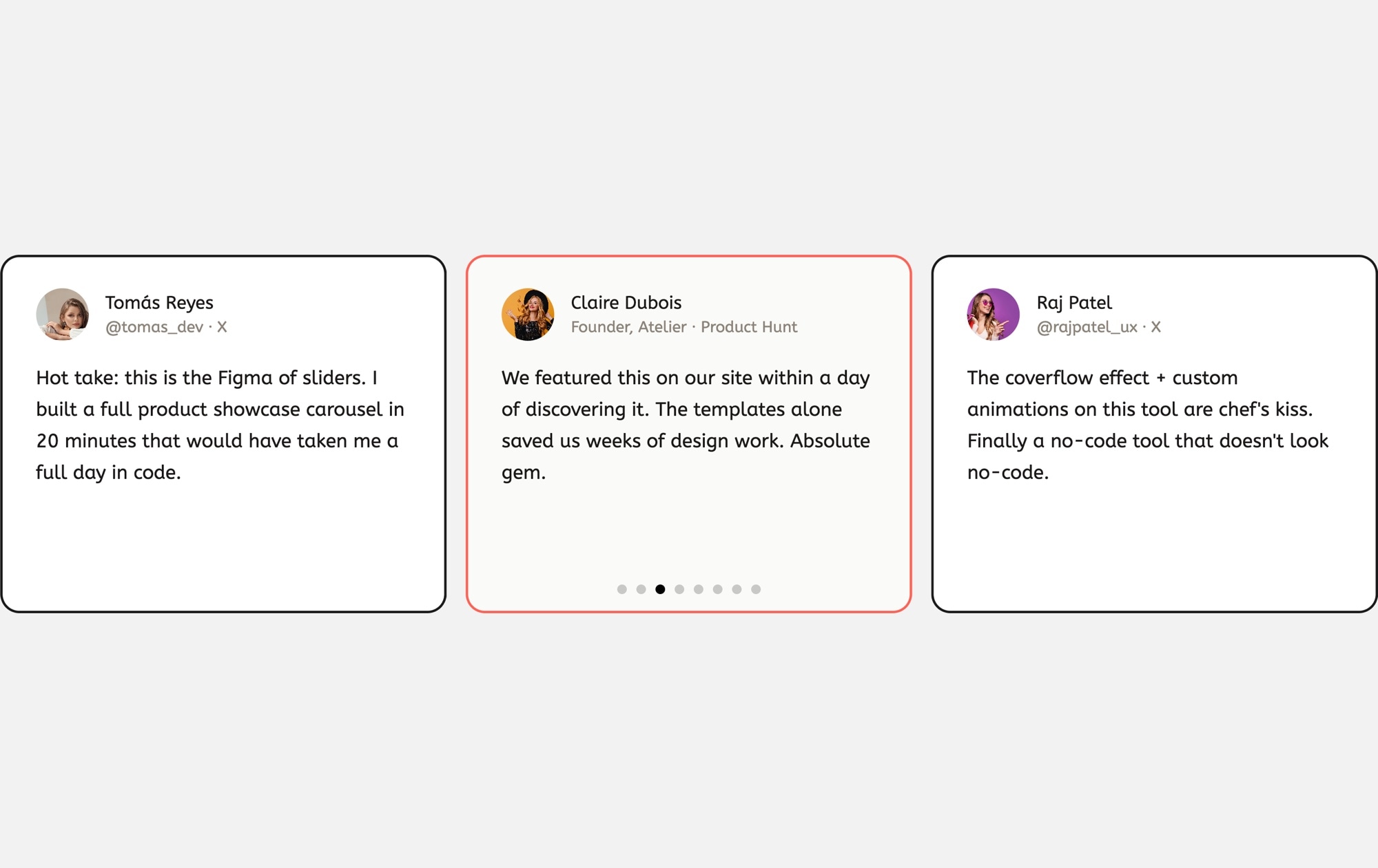
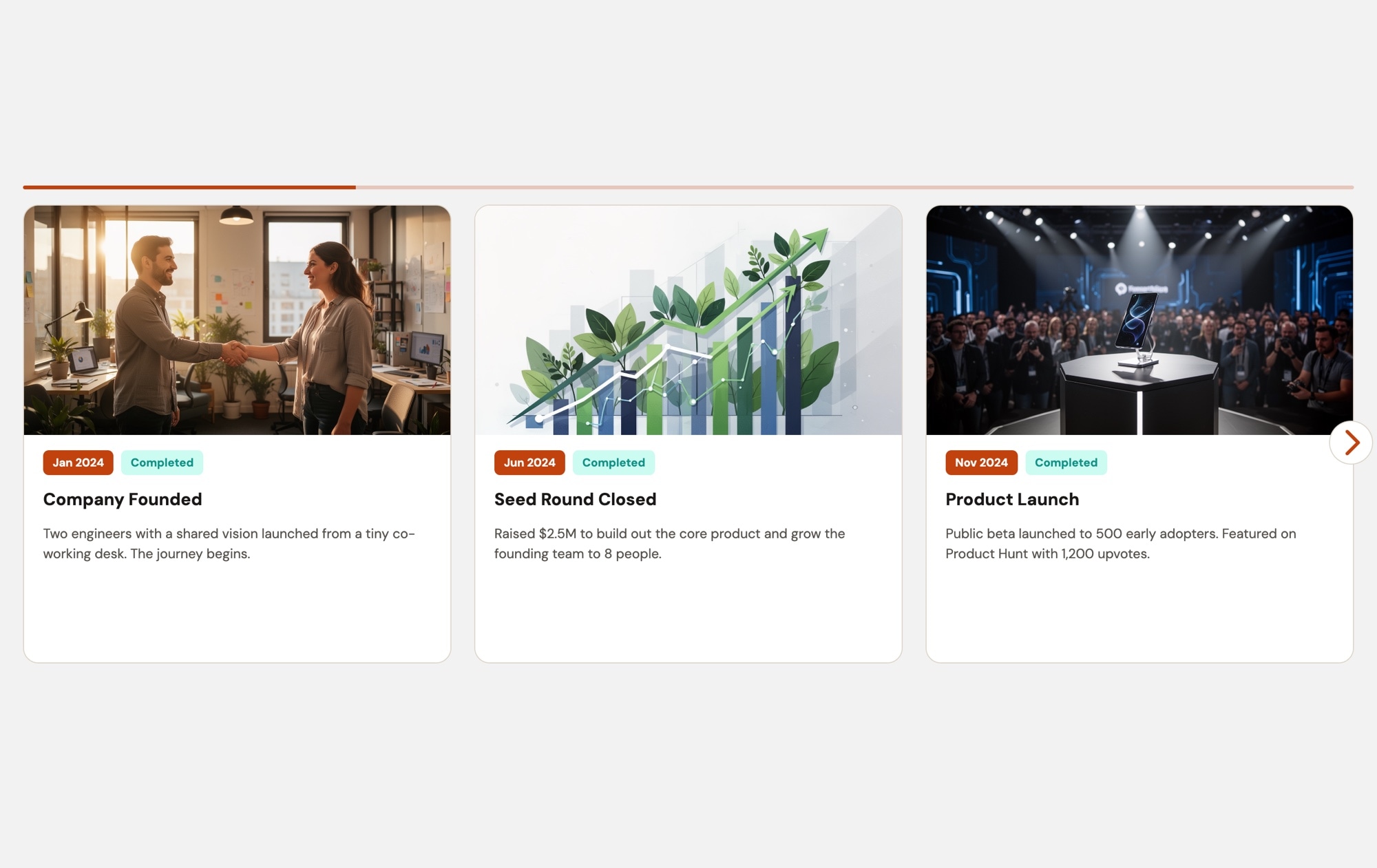
A clean, light-themed blog card carousel that presents your latest articles in an airy, readable layout. Each card features a cover image, a colored category badge, estimated read time, an article title, a short excerpt, and a publication date — all set against a crisp white background that feels open and inviting. Three cards are visible on desktop, creating a magazine-style content section that encourages visitors to explore your blog.
#What Makes This Template Stand Out
Clean, Light Aesthetic
The white background and generous spacing give the layout a fresh, editorial feel. Content breathes, images stand out naturally, and the overall design conveys clarity and professionalism — ideal for brands that prioritize readability and a clean user experience.
Color-Coded Category Badges
Each card includes a category badge with a distinct background color — Design, Technology, UX, or whatever categories you define. These colored markers help visitors scan the carousel quickly and click into topics they care about.
Read Time and Publication Date
Estimated read time and date metadata on every card help visitors decide what to read next. Short read times encourage clicks on quick articles, and recent dates signal that your content is fresh and actively maintained.
Cover Images That Draw the Eye
Large cover images at the top of each card create visual variety and give every article a distinct identity. On a light background, photography appears natural and true to color, making your content imagery look its best.
Responsive Multi-Card Layout
Three cards on desktop, two on tablet, one on mobile — the layout adapts automatically. Breakpoints are pre-configured so the carousel looks polished on every device. Export to HTML, React, Vue, Next.js, Web Component, or Webflow and ship it anywhere.
#Who Should Use This Template
This template is perfect for blogs, magazines, and content-heavy websites that use a light color scheme and want their articles section to match. If your site has a white or light-toned design, this carousel drops in seamlessly as a "Latest Posts" or "Featured Articles" section without any visual clash. The clean aesthetic keeps the focus on your content, not the container.
Content marketers and editorial teams will appreciate how easy it is to keep the carousel current. Duplicate a card, replace the image and text, and publish — no developer required. The category badges and metadata fields are already structured, so updating the carousel with a new article takes minutes. It is a practical, low-maintenance way to surface your best content on high-traffic pages like the homepage or landing pages.
Web designers and agencies working on client projects with light brand guidelines can use this template as a polished starting point. The card structure, typography hierarchy, and responsive behavior are already built to best practices. Adjust the colors, fonts, and spacing to match the client's design system, export the code, and integrate it into any front-end stack or CMS.
#Best Use Cases
- ✓Homepage 'Latest Posts' or 'Featured Articles' sections on light-themed websites
- ✓Company blogs and knowledge bases with categorized content across multiple topics
- ✓Content marketing landing pages designed to drive deeper site engagement and time on page
- ✓News and media sites featuring editorial content with cover imagery and publication metadata
- ✓Educational platforms and documentation sites showcasing recent tutorials, guides, or courses
- ✓Personal blogs and writer portfolio sites displaying recent work with a clean, minimal aesthetic
#How to Customize
- Open the News & Blog Cards Light template in Swiper Studio by clicking 'Use This Template' above1
- Replace the cover images on each card — select the image element and upload your own article thumbnails or browse the built-in demo image library2
- Update the text content — edit category badge labels, article titles, excerpts, read times, and publication dates to reflect your actual articles3
- Customize badge colors to match your content categories — select each badge and set a distinct background color for Design, Technology, UX, or your own categories4
- Add or remove cards by duplicating slides for consistent styling or deleting cards you don't need5
- Adjust responsive breakpoints — configure how many cards display on mobile, tablet, and desktop, and fine-tune font sizes, spacing, and card widths at each size6
- Export to your preferred format (HTML, React, Vue, Next.js, Web Component, or Webflow) or publish to CDN for instant embedding on your blog, CMS, or landing page7
#Frequently Asked Questions
- What is the difference between the light and dark blog card templates?
- The content structure and card layout are identical — cover images, category badges, read time, titles, excerpts, and dates. The difference is the color scheme: the light template uses a white or light gray background with dark text, while the dark template uses a deep dark background with light text. Choose whichever matches your site design, or customize the colors entirely.
- Can I change the light background to a custom color?
- Yes. The background color is fully customizable. Change it to any hex value — off-white, cream, light blue, or any brand color — directly in the visual editor. Card backgrounds, text colors, and badge colors are all independently adjustable.
- How do I connect the cards to my actual blog posts?
- Wrap each card or its title in a link block element and set the href to your blog post URL. You can make the entire card clickable or just specific elements like the title or a "Read More" link. After export, integrate the slider into your CMS template so it pulls content dynamically.
- Can I display more or fewer than three cards at once?
- Yes. The slides-per-view setting is configurable at each responsive breakpoint. You can show four or five cards on wide screens, two on tablets, and one on mobile — or any combination that fits your layout needs.
- What export formats does this template support?
- All Swiper Studio export formats are available: standalone HTML, React component, Vue component, Next.js project, Web Component, and native Webflow element. You can also publish to CDN for instant iframe or script embed on WordPress, Ghost, Squarespace, or any other platform.
#Related Templates
#Related Resources
Ready to Build Your Slider?
Pick a template, customize it visually, and export production-ready code to React, Vue, Next.js, HTML, Webflow, and more. No coding required.