News & Blog Cards - Dark
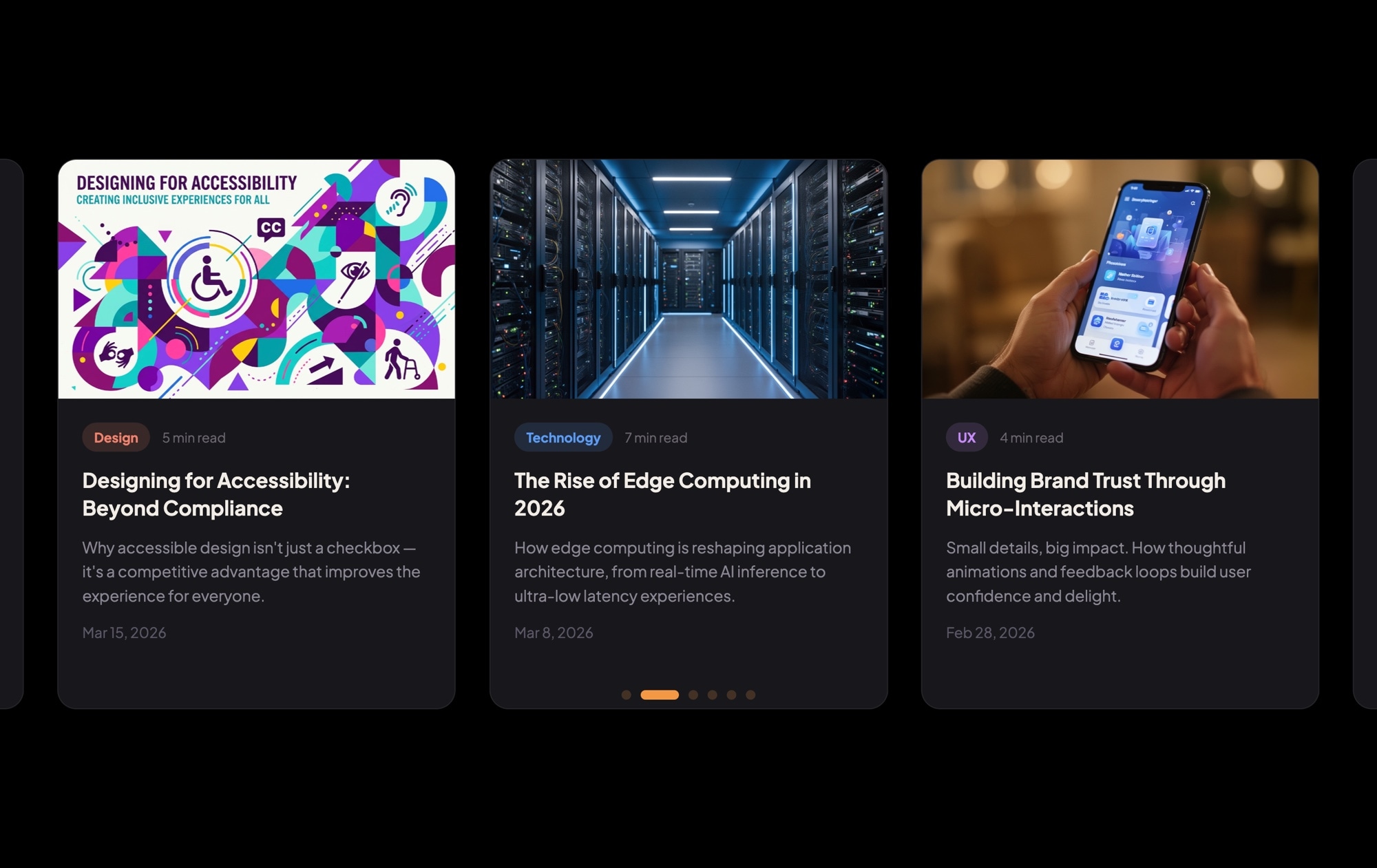
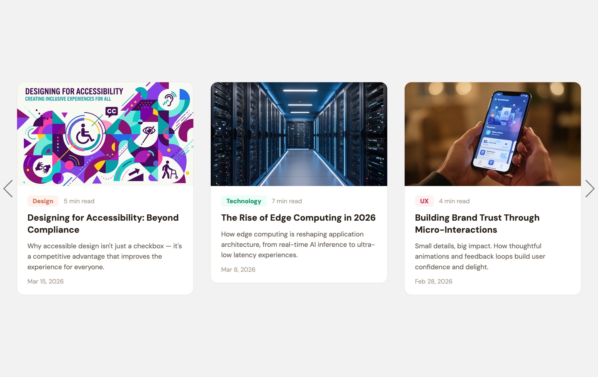
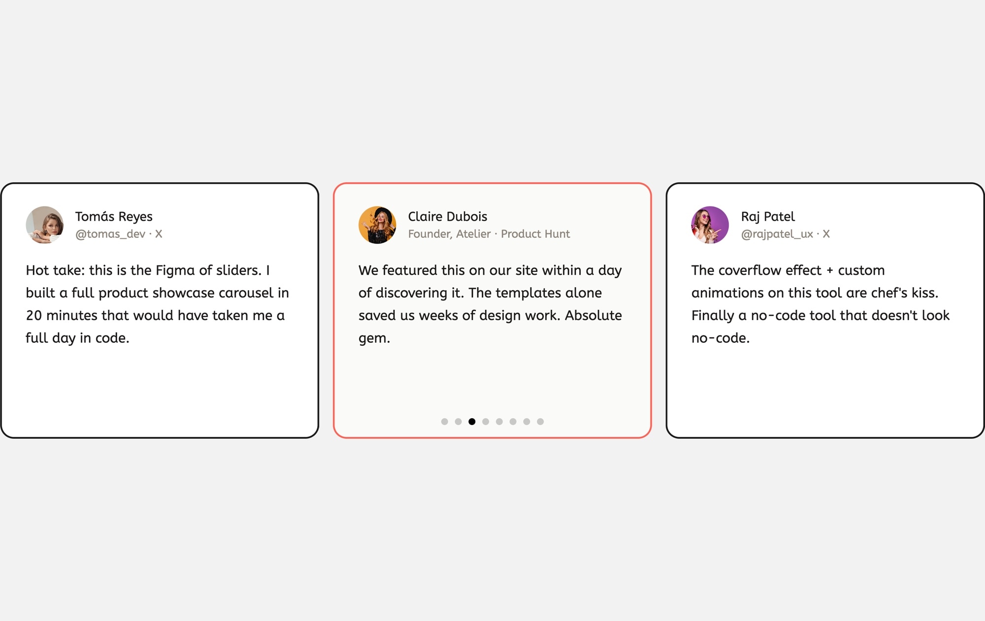
A dark-themed blog card carousel that turns your latest articles into a browsable, visually rich content section. Each card features a cover image, a colored category badge (Design, Technology, UX), estimated read time, an article title, a short excerpt, and a publication date — all laid out on a deep dark background that makes the content pop. Three cards sit side by side on desktop, inviting visitors to explore your content without leaving the page.
#What Makes This Template Stand Out
Dark Background With Vivid Cover Images
The deep dark backdrop creates strong contrast against the cover images and white text, drawing the eye directly to your content. Article photography looks richer and more cinematic against dark surroundings, elevating the perceived quality of your blog.
Color-Coded Category Badges
Each card includes a colored category badge — Design in one hue, Technology in another, UX in a third. These visual markers let readers scan the carousel and instantly find topics that interest them, improving engagement and click-through rates.
Read Time and Date Metadata
Estimated read time and publication date are displayed on every card. Read time sets expectations and encourages clicks on shorter articles, while the date signals freshness — both proven patterns from top publishing platforms like Medium and Substack.
Multi-Card Browsable Layout
Three cards are visible simultaneously on desktop, giving visitors an overview of your recent content. The carousel format encourages swiping and discovery, exposing more articles than a traditional blog grid without requiring the visitor to scroll.
Responsive and Export-Ready
Breakpoints for mobile, tablet, and desktop are pre-configured. Cards scale gracefully from three across on large screens to one on mobile. Export to HTML, React, Vue, Next.js, Web Component, or Webflow, or publish to CDN for instant embedding on any site.
#Who Should Use This Template
This template is designed for content-driven websites that want their blog or news section to feel modern and engaging rather than like a plain list of links. If your site uses a dark color scheme — or you want the blog section to create a visual break from lighter content — this carousel adds polish and interactivity without any custom development.
Marketing teams and content strategists will find this template especially valuable for homepage "Latest Articles" sections, newsletter landing pages, and content hub layouts. The category badges make it easy for visitors to self-select into topics, and the read time metadata encourages clicks by setting clear expectations. Updating the carousel with new articles is fast: duplicate a card, swap the content, and publish.
Agencies building client sites can use this template as a production-ready blog component. The dark aesthetic pairs well with corporate, SaaS, and creative brand identities. Customize the colors, typography, and card structure to match the client's design system, export the code, and integrate it into any CMS or static site. No front-end development needed for the slider itself.
#Best Use Cases
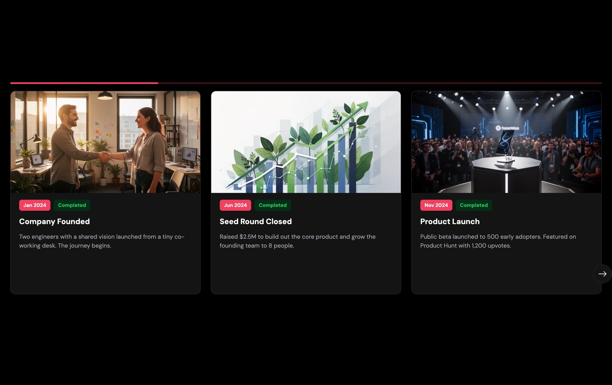
- ✓Homepage 'Latest Articles' sections that surface recent blog posts with rich visual previews
- ✓Content marketing landing pages where browsable article cards drive deeper engagement
- ✓SaaS and tech company blogs with categorized content across product, engineering, and design topics
- ✓Digital magazine and media sites featuring editorial content with cover imagery and metadata
- ✓Agency portfolio sites combining case study summaries with category-based filtering
- ✓Newsletter landing pages showcasing recent issues or featured stories to encourage signups
#How to Customize
- Open the News & Blog Cards Dark template in Swiper Studio by clicking 'Use This Template' above1
- Replace the cover images — select each card's image element and upload your own article thumbnails or choose from the built-in demo image library2
- Edit the text content on each card — update the category badge text, article title, excerpt, read time, and publication date to match your real articles3
- Customize the category badge colors — select each badge and change the background color to create a consistent color-coding system across your content categories4
- Add or remove cards by duplicating existing slides for consistent styling or deleting slides you don't need5
- Fine-tune responsive settings — adjust how many cards display on mobile (1), tablet (2), and desktop (3), and tweak font sizes and spacing at each breakpoint6
- Export to your preferred format (HTML, React, Vue, Next.js, Web Component, or Webflow) or publish to CDN for instant embedding on your blog or CMS7
#Frequently Asked Questions
- Can I add more blog cards to the carousel?
- Yes. There is no fixed limit on the number of slides. Duplicate an existing card to keep the styling consistent, then swap in your own cover image, category, title, excerpt, and date. The carousel handles any number of cards and you can configure how many are visible at each breakpoint.
- How do I change the category badge colors?
- Each category badge is a text element with a background color. Select the badge in the visual editor and change the background color to any hex value. You can assign different colors per category — for example, blue for Technology, green for Design, purple for UX — to create a clear visual taxonomy.
- Can I link each card to a full blog post?
- Yes. Wrap the card content in a link block element and set the href to your blog post URL. You can also make just the title or a "Read More" button clickable. Link targets, hover states, and styling are all configurable in the editor.
- Does the dark theme affect page performance?
- Not at all. The dark background is a CSS color value, not an image, so it adds zero weight to your page. The template is lightweight by design — only the cover images contribute to file size, and those can be optimized through your own image pipeline.
- What export formats are available?
- You can export the blog cards carousel as standalone HTML, a React component, a Vue component, a Next.js project, a Web Component, or a native Webflow element. You can also publish to CDN for instant iframe or script embed on any platform, including WordPress and Ghost.
#Related Templates
#Related Resources
Ready to Build Your Slider?
Pick a template, customize it visually, and export production-ready code to React, Vue, Next.js, HTML, Webflow, and more. No coding required.