Hero - Editorial Minimal Template
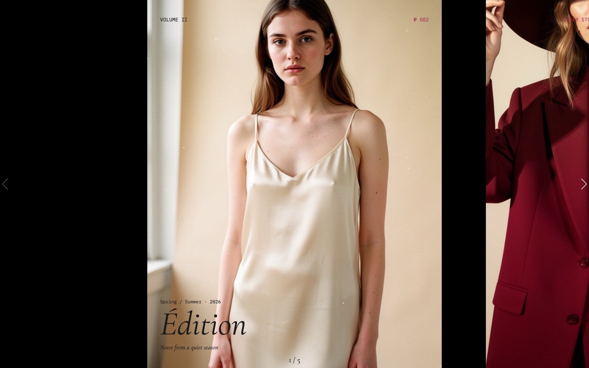
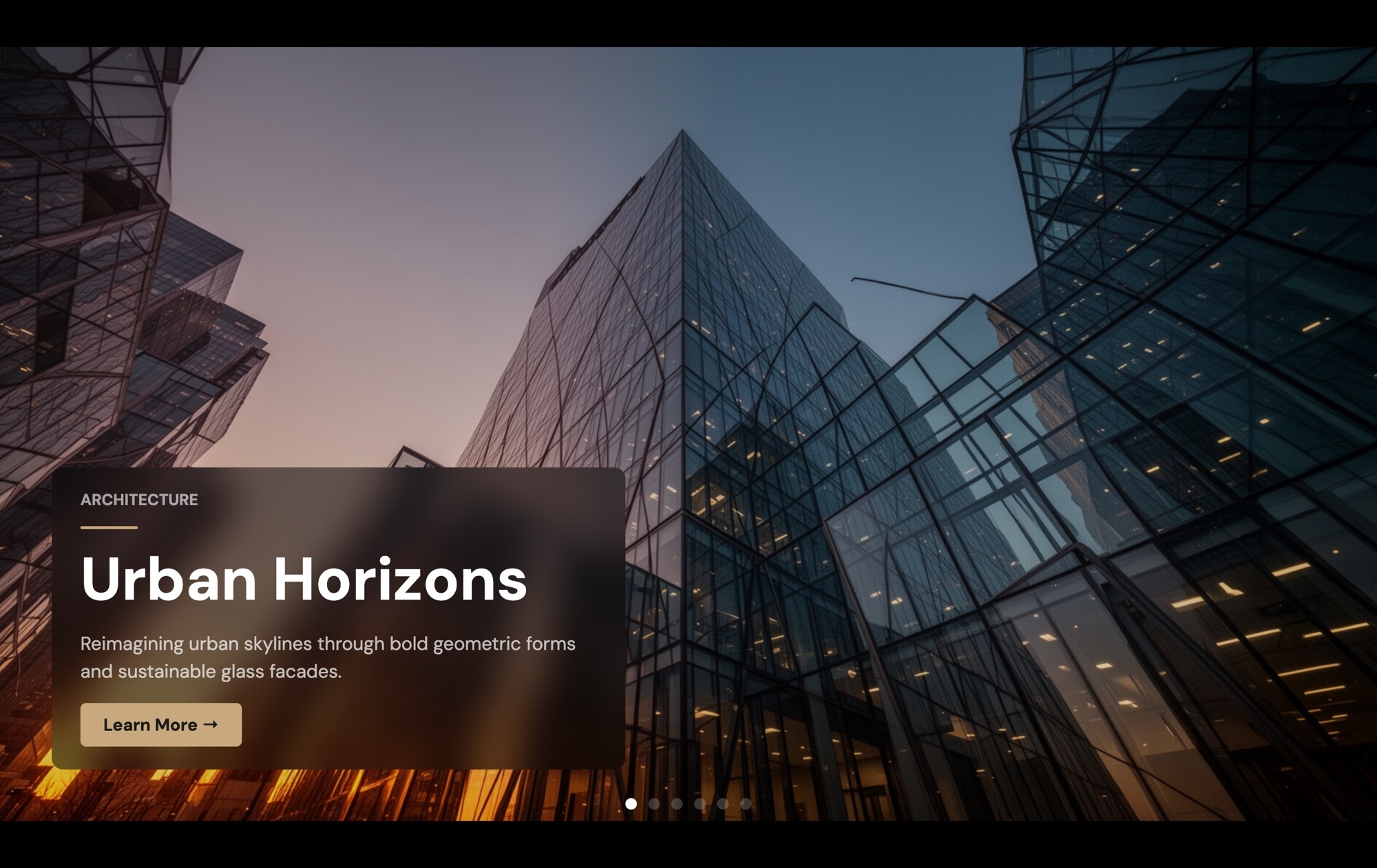
The Hero - Editorial Minimal template is the format pulled directly from print fashion magazines - a slim slide width that previews the next spread on the right, italic Cormorant Garamond display headlines, IBM Plex Mono small labels for issue numbers and credits, and a claret accent that sits like printed ink on bone-colored paper. It is built for fashion brands, lifestyle publications, photographers, and creative studios where the homepage needs to read like a magazine cover, not a sales page.
The slider opens on an issue cover ("VOLUME II - Spring/Summer 26"), runs through a cover story preview and two featured shoots, and closes on a subscribe link. The slide effect is a clean horizontal slide with parallax on the images so the editorial portraits shift subtly behind the type during transitions. The peek-through to the next slide is the defining detail - readers see there is more without being told.
#What Makes This Template Stand Out
Partial-Preview Slide Width for Magazine Pacing
Slides per view is set at 1.15 on mobile, 1.4 on tablet, and 1.6 on desktop. The active slide dominates while a slim slice of the next slide stays visible on the right edge - the visual cue that says 'this is a magazine, not a single landing page.' The 60px gutter between slides reinforces the print feel.
Cormorant Garamond Italic Display
Italic Cormorant Garamond at 400 weight is the workhorse display face of contemporary fashion editorial. It carries cover lines like 'VOLUME II - Spring/Summer 26' with the quiet sophistication the format needs. Pair it with IBM Plex Mono for small labels and the entire hero reads like a printed publication.
IBM Plex Mono Small Labels
IBM Plex Mono handles every small label - issue numbers, section markers, credit lines, photographer attribution. The mono cuts a precise contrast against the soft serif display, mirroring the typography hierarchy of magazines like The Gentlewoman, Document Journal, and Apartamento.
Parallax on Editorial Portraits
Parallax is enabled on the slide images. As readers move between spreads, the portraits shift at a different rate than the type overlay, producing the layered depth that makes editorial scrolling feel cinematic instead of mechanical. The effect is subtle - present, but never distracting.
Bone and Claret Palette
Bone #f1ece1, ink #1a1a1a, and a claret accent at #a72d4d. The bone backdrop gives the hero its warmth and print-magazine feel, the claret carries every accent (issue tags, links, the subscribe CTA), and the ink type stays restrained throughout. It is the palette version of editorial restraint.
#Who Should Use This Template
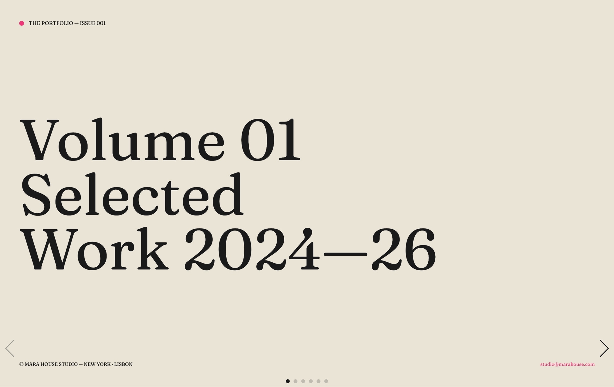
This template is built for fashion brands, lifestyle magazines, and editorial publications that want a homepage with the pacing of a printed issue. The partial-preview slide width is the visual signal that this is a publication, not a generic landing page. Drop in your cover photography and issue copy, and the homepage instantly reads like a magazine front cover that just landed on a coffee table.
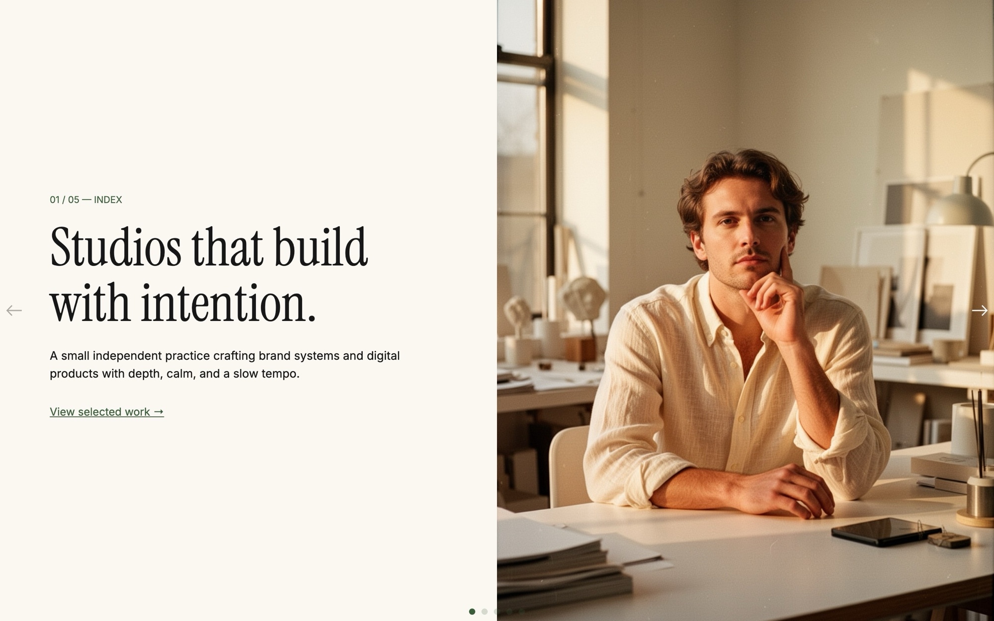
Photographers, art directors, and creative studios with portrait-led portfolios will find the format especially useful. The template is built around vertical portraits with parallax, so any fashion editorial, beauty, or portrait series drops in cleanly. The mono credit lines handle photographer, stylist, and model attributions in the typographic register magazines actually use.
Slow-luxury brands, perfumeries, and small-batch product makers can use the editorial format to signal craft and restraint. When the competition is loud product carousels with neon CTAs, a quiet bone-and-claret hero with italic serif headlines is how you stand apart. The format reads as considered, expensive, and intentional.
#Best Use Cases
- ✓Fashion magazine and editorial publication homepages
- ✓Photographer and art director portfolio openers with cover-story pacing
- ✓Slow-luxury brand homepages where restraint signals quality
- ✓Lifestyle and culture publication issue covers
- ✓Independent magazine and zine landing pages with subscribe CTAs
- ✓Beauty and perfumery brand sites with editorial portraiture
- ✓Creative agency case-study openers presented as editorial spreads
- ✓Designer and stylist personal sites with seasonal cover updates
#How to Customize
- Click "Use This Template" to open the Hero - Editorial Minimal slider in Swiper Studio1
- Edit the issue cover - replace "VOLUME II - Spring/Summer 26" with your publication name, issue number, and season2
- Swap the editorial portraits on each slide - upload your own photography, pick from the demo image library, or generate new images with the AI tool3
- Rewrite the cover lines and featured shoot titles using italic Cormorant Garamond as the display face4
- Update the IBM Plex Mono labels - section markers, photographer credits, issue numbers - to match your editorial structure5
- Adjust the bone #f1ece1, ink #1a1a1a, and claret #a72d4d palette if your publication uses different colors6
- Re-set the slides-per-view values at every project breakpoint (375, 768, 1024) so the partial-preview format holds across viewports - this is set up by default but worth checking after any major edit7
- Publish to CDN for an instant embed, or export to HTML, React, Vue, Next.js, Web Component, or Webflow8
#Frequently Asked Questions
- How do I edit the issue title, cover lines, and labels?
- Every text element is editable inline. The default issue cover ("VOLUME II - Spring/Summer 26") and the IBM Plex Mono small labels are starting points. Click any text in the visual editor and rewrite it. The italic Cormorant Garamond display type carries headlines while the mono labels handle issue numbers, credits, and section markers.
- How do I swap the editorial portrait images?
- Click any image element and either upload your own portrait, choose from the built-in demo image library, or generate a new one with the AI image tool. The portrait orientation is built into the template, so any 4:5 or 3:4 fashion editorial photo drops in cleanly. Parallax is enabled by default, so images shift subtly during transitions.
- What does the partial-preview slide width do?
- Slides per view is set to 1.15 on mobile, 1.4 on tablet, and 1.6 on desktop. That means each slide shows the active editorial spread plus a slim slice of the next slide on the right. The peek-through is what makes the hero feel like a magazine - readers can see there is more content without committing a click. The 60px space between slides creates the gutter that defines the format.
- Can I change the bone and claret palette?
- Absolutely. The default palette is bone #f1ece1 with ink #1a1a1a text and a claret accent at #a72d4d. The bone backdrop is what gives the hero its print-magazine warmth. Swap any color in the project style panel - the format works equally well with cream and oxblood, ivory and rust, or any restrained editorial palette.
- How do I export or embed this hero on my site?
- Publish to CDN for an instant embed snippet that pastes into Webflow, WordPress, Shopify, Squarespace, or any HTML page. Or export as standalone HTML, a React component, a Vue component, a Next.js project, or a Web Component. The Webflow plugin handles native integration.
#Related Templates

#Related Resources
- Swiper Studio for Hero Sections
- Swiper Studio for Photographers
- Swiper Studio for Portfolios
- Swiper Studio for Web Designers
Ready to Build Your Slider?
Pick a template, customize it visually, and export production-ready code to React, Vue, Next.js, HTML, Webflow, and more. No coding required.