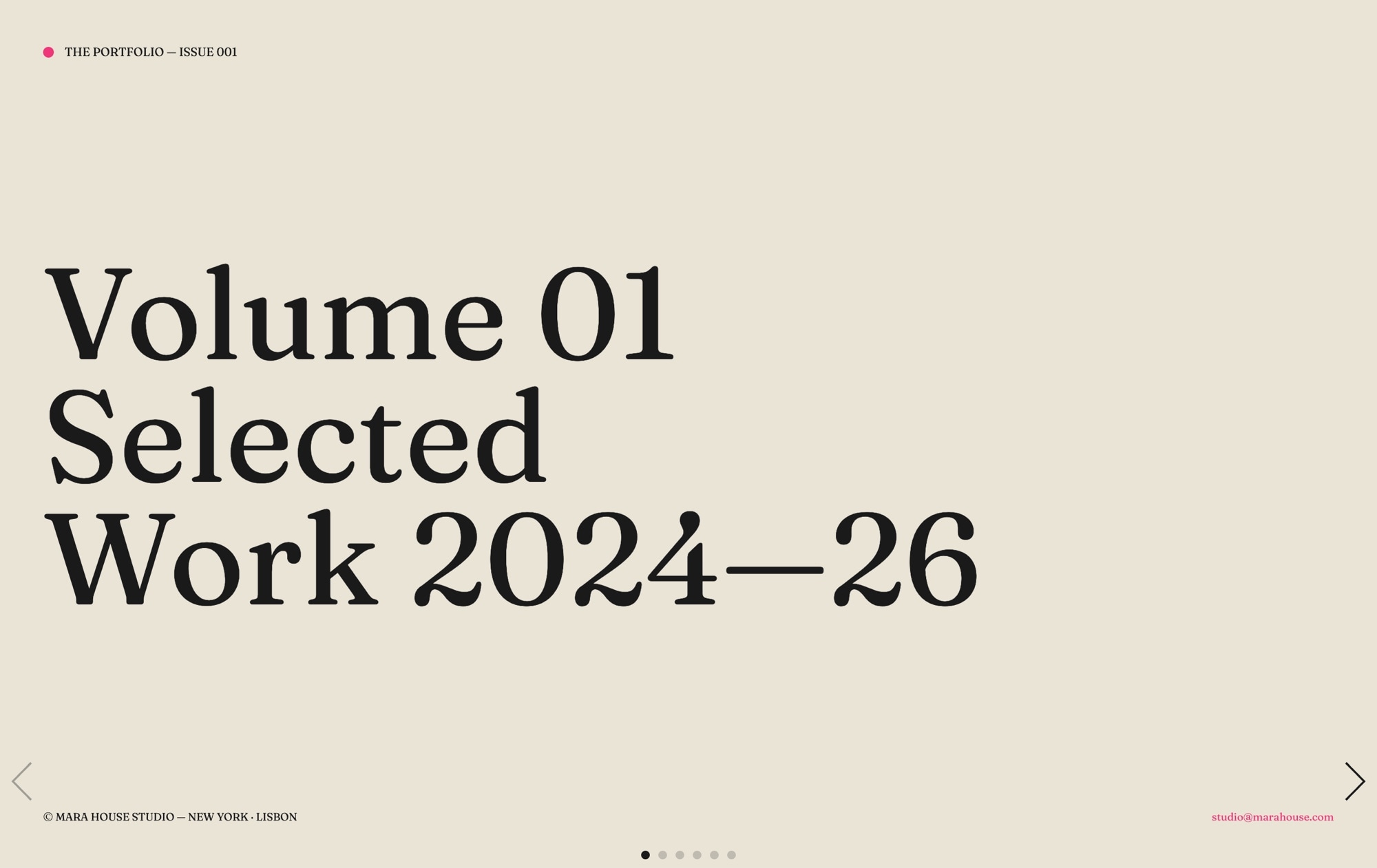
Hero - Split Screen Template
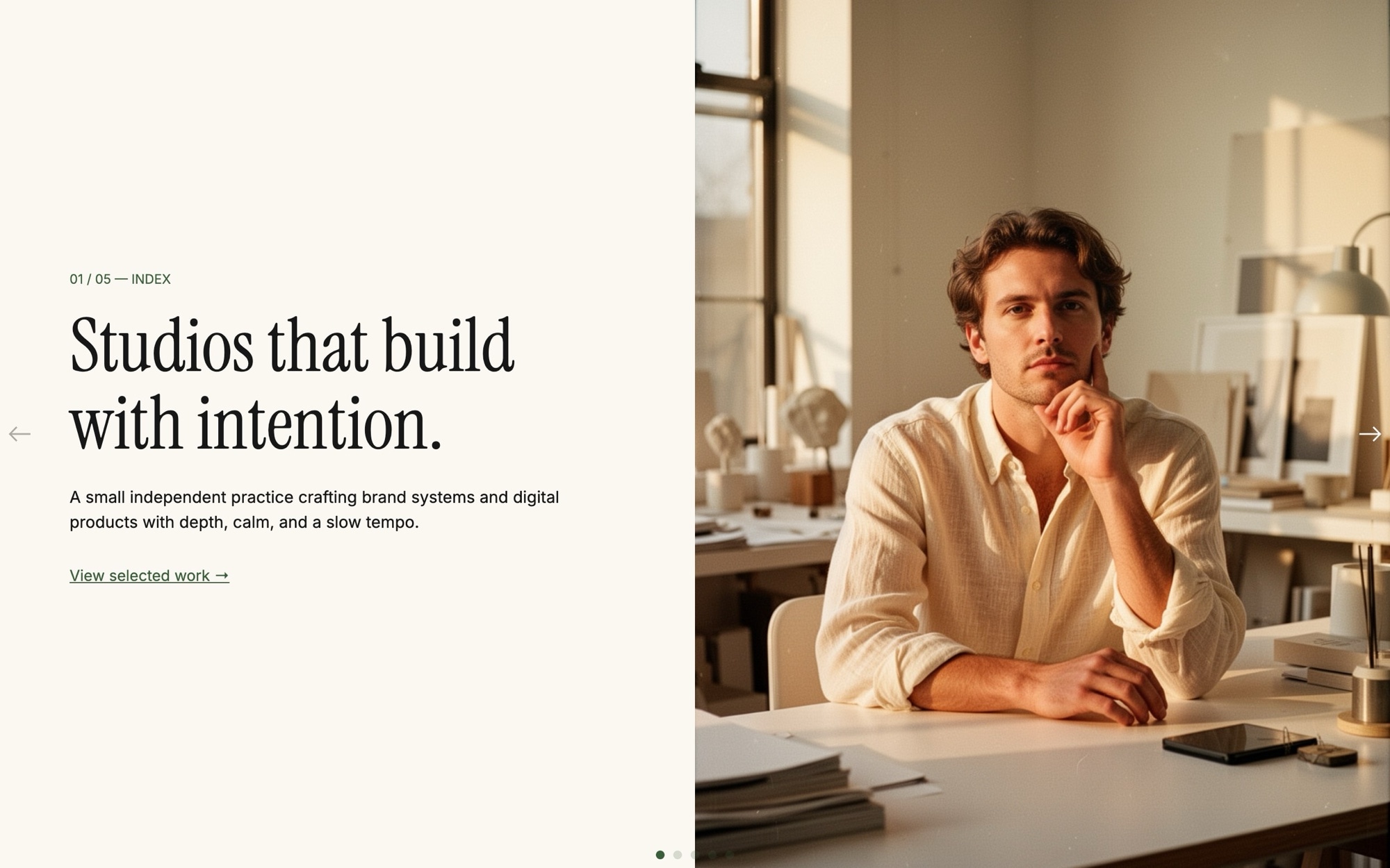
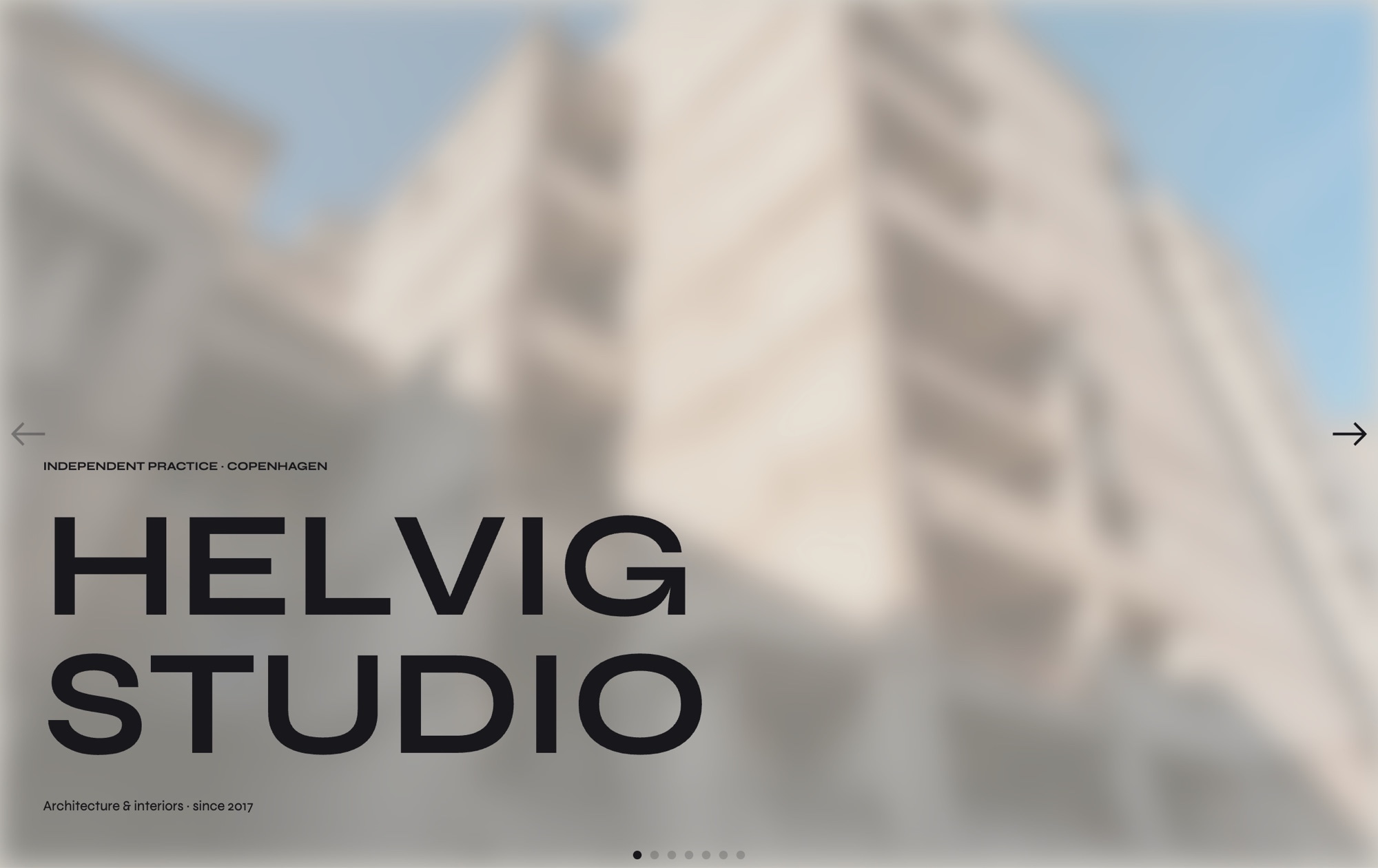
A split-screen hero is the editorial format that signals craft. Half the slide is text - serif headline, body copy, a single quiet CTA. The other half is image - a portrait, an architectural detail, a quiet object. The Hero - Split Screen template uses that pattern across five slides built for studios, design agencies, and independent practitioners who want the homepage to feel considered rather than loud.
Display type is Instrument Serif. UI text is Inter. The accent is forest green #3b5e3a sitting against an off-white #fbf8f3 backdrop. The slide effect is a clean horizontal slide at 800ms - no parallax, no flashy transition - because the format itself does the work.
#What Makes This Template Stand Out
50/50 Column Layout, Cohesive Across Slides
Every slide uses the same row layout - text block left at 50% width, image right at 50% width - so transitions feel like turning pages of the same magazine. The structure is set at the slide level with content_direction row and content_position center, and re-set at every breakpoint so the layout holds at 768, 1024, and 1280.
Instrument Serif Display Headlines
Instrument Serif is the workhorse modern serif of editorial design - it carries headlines like 'Studios that build with intention' with the quiet confidence the format needs. Pair it with Inter at small sizes for body and labels, and the entire hero reads like a printed publication.
Forest Green Accent on Off-White
The palette is intentionally restrained. Off-white #fbf8f3 keeps the page warm rather than clinical. Forest green #3b5e3a accents the CTA, status pills, and links - it is grown-up, calm, and works equally well for a design studio, a law firm, or an architecture practice.
Five-Slide Brand Arc
The default slides walk a visitor through a complete brand introduction - mission, values, selected work, current availability, and contact. You can keep the arc as-is or remix it by duplicating slides and rewriting copy.
No Parallax, No Distraction
The slide effect is pure horizontal slide at 800ms. No parallax. No fade. No scale. The format is already doing the design work - text on one side, image on the other - so the transition stays out of the way. The result is a hero that feels editorial, not animated.
#Who Should Use This Template
This template is built for independent studios, design agencies, and creative practices that want a homepage with a magazine sensibility. The split layout is the visual shorthand for "we are thoughtful about the work" - clients reading a studio site for the first time pick up that signal in seconds. If your competition is using big bold marketing heroes with stock photography, the editorial split is how you stand apart.
Architects, interior designers, and product designers will recognize the format from the publications their clients read. The 50/50 column is the same structure as a design magazine spread. Drop in your project portraits and the homepage instantly feels closer to a print feature than a website.
Consulting firms, boutique law practices, and high-end service businesses can use the same restraint to signal seriousness. Forest green on off-white with serif headlines reads as established, calm, and considered - a natural fit for businesses where trust is the entire pitch.
#Best Use Cases
- ✓Independent design and creative studio homepages
- ✓Architecture and interior design practice introductions
- ✓Boutique consulting and professional services landing pages
- ✓Photographer and director portfolio openers with single hero portraits
- ✓Author, editor, and journalist personal sites with editorial pacing
- ✓Brand campaign pages where every slide tells one part of a story
- ✓Currently-booking or availability pages for freelancers and contractors
- ✓Slow-luxury and craft brand homepages where restraint is the message
#How to Customize
- Click "Use This Template" to open the Hero - Split Screen slider in Swiper Studio1
- Edit the headlines on each slide - replace the default editorial copy with your studio name, mission, and values2
- Swap the right-side images - upload your own portraits, project shots, or pick from the built-in demo image library3
- Update the CTA on the final slide to point at your contact form, calendar, or email4
- Adjust the forest green accent #3b5e3a if your brand uses a different color, and update the off-white page background to match5
- Pick alternative Google Fonts if Instrument Serif and Inter do not match your identity6
- Re-set the row layout at every project breakpoint (768, 1024, 1280) so the 50/50 split holds across viewports - this is set up by default but worth checking after any major edit7
- Publish to CDN, or export to HTML, React, Vue, Next.js, Web Component, or Webflow8
#Frequently Asked Questions
- Can I edit the headlines and switch to my own copy?
- Yes. Every headline, subhead, and CTA on each slide is editable inline. Click the text in the visual editor and type. The default headlines ("Studios that build with intention", "Independent. Calm. Considered.", and so on) are starting points - replace them with your own brand voice and the template still reads cohesively.
- How do I swap the portrait images on the right side?
- Click the image element on any slide and either upload your own portrait, choose from the built-in demo image library, or generate a new one with the AI image tool. The image panel takes 50% width on desktop and stacks below the text on mobile, so any portrait or editorial photo works as a drop-in replacement.
- Does the split layout adapt for mobile?
- Yes. On mobile the text column and image column stack vertically so the headline always reads first, then the image. On tablet and desktop they sit side by side at 50/50. You can adjust the breakpoint behavior in the editor if you want a different mobile arrangement.
- Can I change the typography and accent color?
- Absolutely. Display type is Instrument Serif and UI text is Inter by default. The accent is forest green #3b5e3a and the page color is off-white #fbf8f3. Swap any of those from the project style panel without touching code. Both fonts are loaded from Google Fonts so any Google Font is a valid replacement.
- How do I export this hero or embed it on my site?
- Publish to CDN for an instant embed snippet you can paste into Webflow, WordPress, Shopify, Squarespace, or any custom HTML page. Or export as standalone HTML, a React component, a Vue component, a Next.js project, or a Web Component. The Webflow plugin handles native integration.
#Related Templates
#Related Resources
- Swiper Studio for Hero Sections
- Swiper Studio for Web Designers
- Swiper Studio for Agencies
- Swiper Studio for Freelancers
Ready to Build Your Slider?
Pick a template, customize it visually, and export production-ready code to React, Vue, Next.js, HTML, Webflow, and more. No coding required.