Credit Cards Slider with Vertical Cards Effect
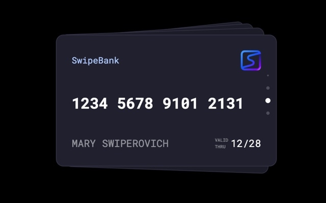
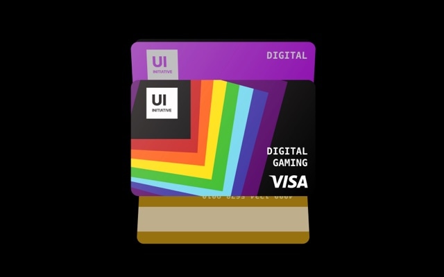
A vertical credit cards slider where stacked cards transition from top to bottom, mimicking the way you would flip through a wallet full of cards. Each card features a sleek gradient design with a chip icon, card number, cardholder name, and expiration date — the classic credit card layout rendered as an interactive, swipeable deck. The vertical cards effect gives the interaction a fresh feel that stands apart from horizontal carousels, and it maps perfectly to the physical shape and orientation of a credit card.
The stacked vertical layout creates an immediate sense of depth and collection. The top card sits at full prominence while cards behind it peek out below, hinting at more options to discover. Swiping up dismisses the current card with a smooth animation and brings the next card into focus. It is the kind of polished, app-like interaction that users expect from fintech products and premium brand experiences — and you can build it without writing a single line of code.
#What Makes This Template Stand Out
Vertical Cards Effect
Cards stack and transition vertically instead of the typical horizontal swipe. This top-to-bottom motion feels fresh and distinctive, and it aligns with the natural portrait orientation of credit cards, ID badges, and membership cards. The vertical gesture also avoids conflicts with horizontal page scrolling on mobile devices.
Realistic Credit Card Design
Each card is styled to look like a real credit card — gradient background, chip icon, masked card number, cardholder name, and expiration date. The design is immediately recognizable and communicates professionalism and trust. It is ready to use as-is for fintech demos, or you can restyle it for loyalty programs, gift cards, or branded membership tiers.
Stacked Depth Cues
Cards behind the active card are slightly offset and scaled, creating visible edges that communicate how many cards are in the deck. This depth illusion gives users a clear mental model of the collection — they can see at a glance that there are more cards to browse, which drives engagement and exploration.
Smooth Dismissal Animation
Swiping the top card triggers a physics-based animation where the card slides away vertically with natural momentum. The next card rises smoothly into the top position. The motion has weight and polish — it feels like handling real cards rather than clicking through a slideshow.
Responsive Card Proportions
The card dimensions are preconfigured with responsive breakpoints so the credit card proportions remain correct on desktop, tablet, and mobile. Cards scale down gracefully on smaller screens without distortion, and all text elements resize proportionally to stay legible at every viewport width.
#Who Should Use This Template
If you are building a fintech product, banking dashboard, or payment interface, this template gives you a production-ready card browsing component. The vertical cards interaction is a pattern users already understand from Apple Wallet and Google Pay — stacked cards, swipe to browse, tap to select. It communicates that the user has multiple cards or accounts to manage, and the interaction model is intuitive without any onboarding.
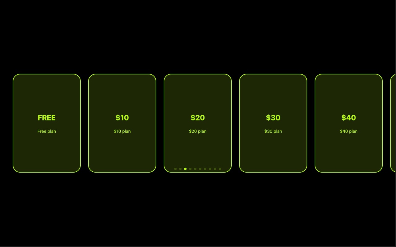
Marketing teams and designers at financial services companies, insurance providers, and subscription businesses will find this template ideal for product comparison pages and feature showcases. Each card can represent a different plan tier, account type, or product offering. The stacked presentation naturally communicates choice and variety, and the swipe interaction keeps visitors engaged instead of overwhelming them with a static grid of options.
Developers and agencies building client dashboards, e-commerce checkout flows, or loyalty program interfaces can use this as a polished starting component. Export to React or Vue, wire it up to your data layer, and you have a card selection interface that looks and feels like a native mobile app. The vertical cards effect is distinctive enough to make the UI memorable while remaining familiar enough that users know exactly how to interact with it.
#Best Use Cases
- ✓Fintech and banking apps displaying a user's credit cards, debit cards, or virtual cards in a swipeable wallet
- ✓Product comparison pages where each card represents a pricing tier, plan, or subscription level
- ✓Loyalty and membership program showcases presenting different reward tiers or card designs
- ✓Gift card and voucher galleries for e-commerce platforms with branded card artwork
- ✓Onboarding flows for payment apps introducing users to their available cards and accounts
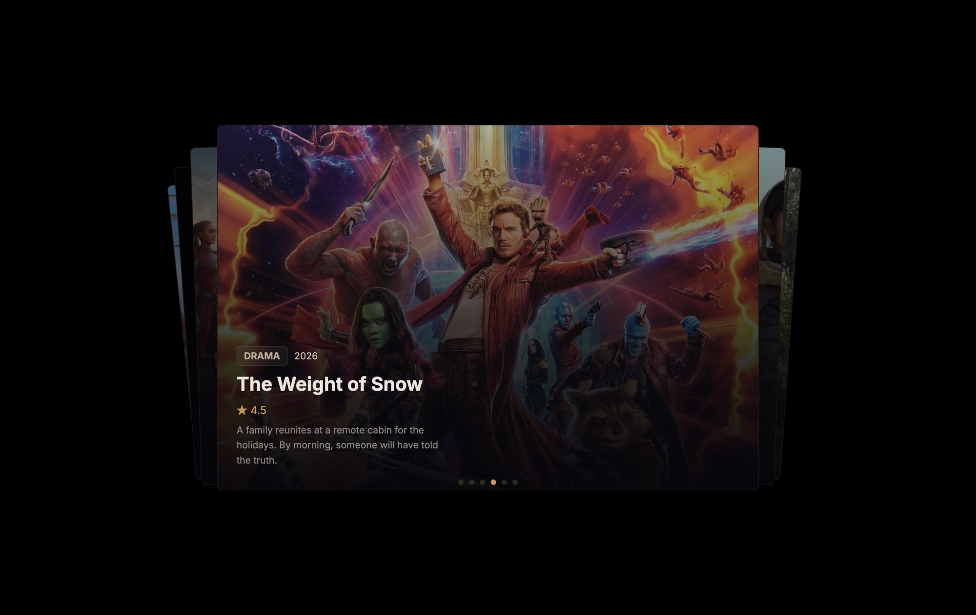
- ✓Portfolio or showcase sections styled as collectible cards for creative agencies and personal brands
#How to Customize
- Click "Use This Template" to open the credit cards slider in Swiper Studio's visual editor1
- Replace the card backgrounds — click each card and change the gradient colors, upload a custom background image, or apply a solid brand color2
- Edit the card details — update the card number, cardholder name, expiration date, and chip icon to match your design or use placeholder data3
- Adjust the vertical cards effect settings — modify the stack offset, scale, and rotation to control how tightly or loosely the cards are stacked4
- Add or remove cards by duplicating slides to expand the deck or deleting cards you do not need5
- Fine-tune responsive breakpoints to ensure the card proportions and text sizes look correct on mobile, tablet, and desktop6
- Export to HTML, React, Vue, Next.js, Webflow, or publish to CDN and embed the credit cards slider on your site with a single snippet7
#Frequently Asked Questions
- How does the vertical cards effect differ from the standard cards effect?
- The standard cards effect swipes left and right, dismissing cards horizontally. The vertical cards effect stacks and transitions cards from top to bottom instead. This changes the gesture direction — you swipe up to dismiss the top card and reveal the one beneath it. The vertical orientation feels natural for content shaped like credit cards, ID badges, or tickets, and it creates a distinct visual rhythm compared to horizontal swiping.
- Can I customize the card design to match my brand?
- Yes. Every element on each card is fully editable in the visual editor. Change the background gradient or solid color, update the card number placeholder, swap the chip icon, edit the cardholder name and expiration date, and adjust typography, spacing, and border radius. You can make the cards look like debit cards, loyalty cards, gift cards, or any branded card format.
- Does the vertical cards effect work well on mobile devices?
- Yes. Vertical swiping is one of the most natural touch gestures on mobile — it matches the scroll direction users are already accustomed to. The cards effect is hardware-accelerated and delivers smooth 60fps performance on all modern devices. The card dimensions adapt to screen width through responsive breakpoints, so the cards remain proportional on phones and tablets.
- Can I add more cards to the deck?
- There is no limit. Duplicate an existing slide to maintain the card layout, then customize the new card with different colors, branding, or content. Each new card automatically joins the vertical stack and inherits the cards effect behavior.
- What export formats does this template support?
- You can export as standalone HTML, a React component, a Vue component, a Next.js project, a Web Component, or a native Webflow element. CDN publishing lets you embed the credit cards slider on any website, fintech dashboard, or banking app with a single code snippet.
#Related Templates


#Related Resources
Ready to Build Your Slider?
Pick a template, customize it visually, and export production-ready code to React, Vue, Next.js, HTML, Webflow, and more. No coding required.