
Cards Swiper with Stacked Deck Effect
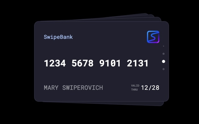
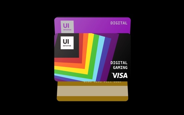
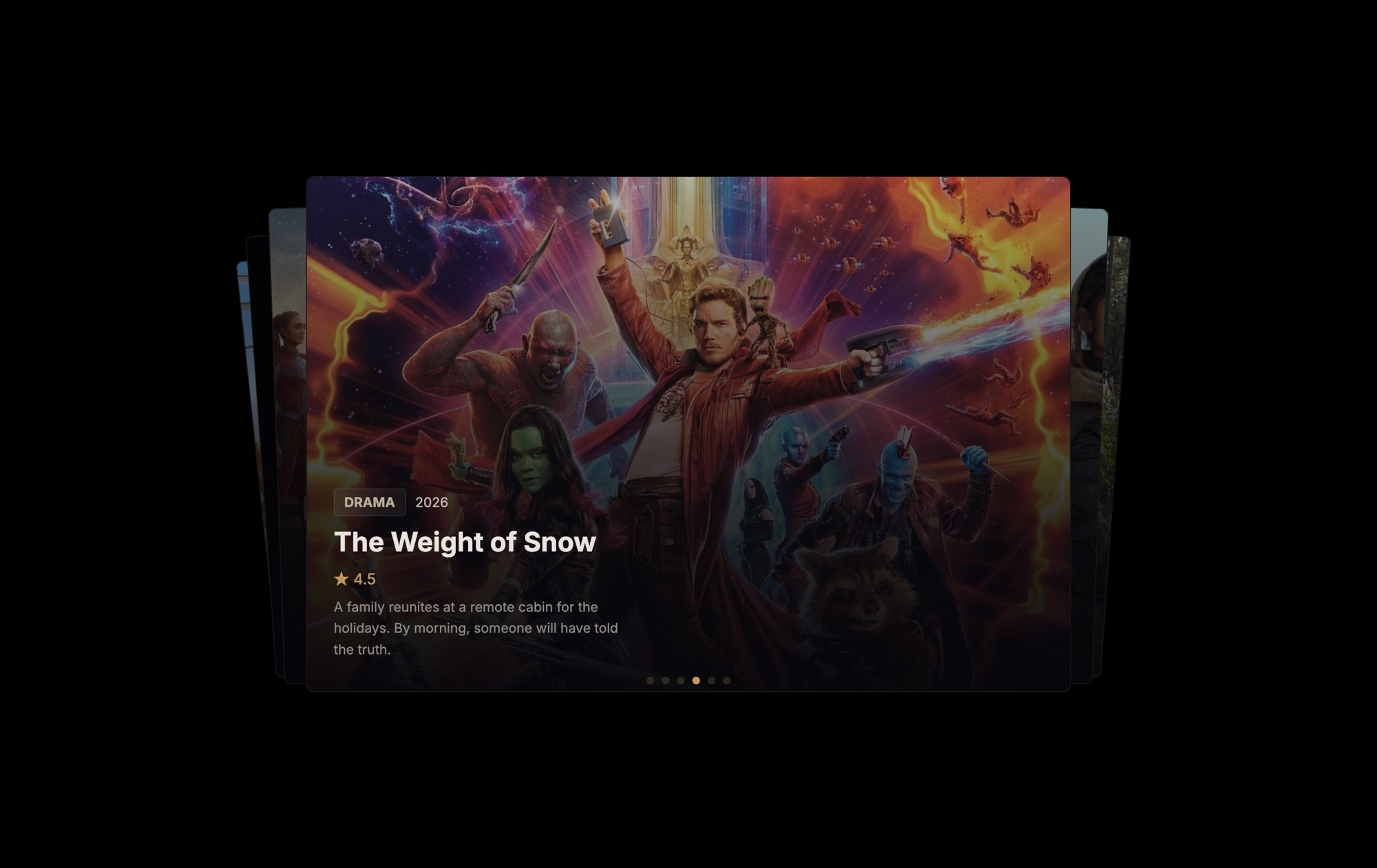
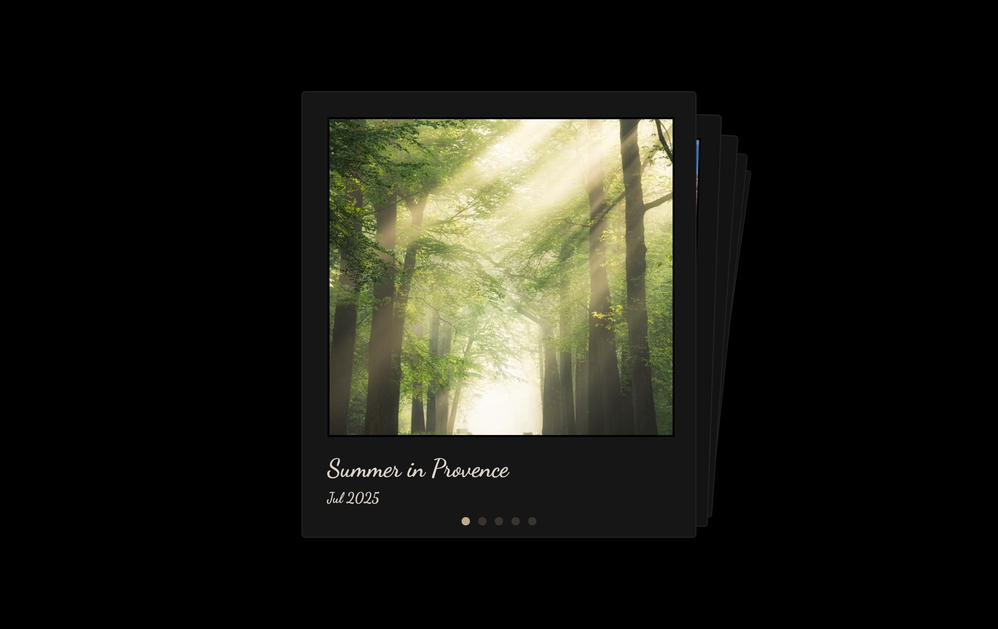
A stacked card deck slider where you swipe to dismiss the top card and reveal the next one underneath. The cards effect layers slides on top of each other like a physical deck — the top card is fully visible, while cards behind it peek out with slight offsets and rotation, signaling that there is more content to discover. It is the same interaction pattern used by Tinder, Apple Wallet, and countless mobile apps, and it works because it turns browsing into a tactile, satisfying gesture.
The fixed-size layout keeps every card perfectly proportioned, and the stacking creates a sense of depth without full 3D transforms. Each swipe produces a natural dismissal animation — the card flies off in the direction of the swipe while the next card rises smoothly into position. Pagination dots track progress through the deck. The overall effect is casual, interactive, and deeply engaging — visitors swipe through the entire stack because the gesture itself is enjoyable.
#What Makes This Template Stand Out
Stacked Deck Interaction
Cards are layered in a visible stack, with each subsequent card offset slightly behind the active card. This creates a physical, tangible feel — visitors can see the deck has depth and content waiting to be revealed. The interaction model is immediately intuitive: see a stack, swipe the top card, discover what is underneath.
Physics-Based Dismissal Animation
Swiping the top card triggers a smooth, physics-driven animation where the card flies off in the direction of the swipe. The motion has weight and momentum — it feels like flicking a real card off the top of a deck. This satisfying micro-interaction encourages visitors to keep swiping through the entire stack.
Fixed-Size Card Layout
The fixed dimensions ensure every card in the stack has identical proportions, so the stacking offsets and rotations are perfectly consistent. No card is larger or smaller than the others. This creates a clean, uniform deck that looks intentional and polished rather than random.
Visible Stack Depth Cues
Cards behind the active card are slightly offset, scaled, and rotated to create visible edges that communicate deck depth. Visitors can see at a glance that there are more cards to discover. This visual hint is a powerful engagement driver — it triggers curiosity and the desire to see what is next.
Mobile-First Touch Experience
The cards effect was designed for fingers and thumbs. The swipe-to-dismiss gesture is one of the most natural touch interactions in modern UI — users understand it instinctively from mobile apps. On desktop, click-and-drag provides the same satisfying dismissal, and keyboard navigation is supported as well.
#Who Should Use This Template
If you are building an experience where users browse through items one at a time — profiles, products, recommendations, flashcards — the cards effect is the perfect interaction model. Unlike horizontal carousels where items blur past each other, the stacked deck gives each card undivided attention. The top card owns the entire viewport until the user actively dismisses it, which means every piece of content gets seen and considered.
Product and marketing teams building landing pages, onboarding flows, or feature tours will find the cards effect creates a focused, step-by-step journey. Each card can present a single message, feature, or value proposition at full prominence. Visitors swipe through at their own pace, and the stacked deck makes it clear how many steps remain. It is a more engaging alternative to static hero sections or tabbed content.
Developers and designers creating interactive UI components will appreciate that the cards effect exports cleanly to React, Vue, or standalone HTML. The physics-based animations and touch handling are production-ready out of the box. Use it for content discovery feeds, flashcard apps, recommendation engines, or any interface where a swipe-to-reveal pattern fits the user experience.
#Best Use Cases
- ✓Profile browsing cards for dating apps, team member directories, or speaker lineups with swipe-to-reveal
- ✓Product recommendation decks where each card showcases a single item with image, description, and price
- ✓Onboarding and feature tour slides that guide new users through key value propositions one card at a time
- ✓Flashcard and quiz interfaces for educational apps where swiping reveals the next question or concept
- ✓Testimonial and review cards presenting customer quotes in an interactive deck format
- ✓Recipe or menu cards for food and restaurant sites where visitors swipe through dishes or meal options
#How to Customize
- Click "Use This Template" to open the cards swiper in Swiper Studio's visual editor1
- Replace the content on each card — click slide backgrounds to swap images, edit text elements for titles, descriptions, and labels2
- Adjust the cards effect settings — modify the per-slide offset, rotation angle, and scale to control the stack appearance3
- Add rich content to each card by inserting text, images, buttons, badges, or nested block elements for complex layouts4
- Add or remove cards by duplicating slides to expand the deck or deleting slides you do not need5
- Set card dimensions per breakpoint to ensure the stack looks proportional on desktop, tablet, and mobile screens6
- Export to HTML, React, Vue, Next.js, Webflow, or publish to CDN and embed the cards slider on your site with a single snippet7
#Frequently Asked Questions
- How does the cards stacking effect work?
- The cards effect layers slides on top of each other like a physical deck of cards. The active slide sits on top at full size, while subsequent slides are slightly offset, scaled down, and rotated behind it — creating visible edges that hint at more content beneath. Swiping dismisses the top card with a natural throwing motion, revealing the next card in the stack.
- Can I customize the card stacking depth and rotation?
- Yes. In the Swiper Studio editor, you can adjust the cards effect settings including the per-slide offset, scale factor, and rotation angle. You can make the stack tighter or more spread out, control how much each card rotates, and adjust the shadow intensity. These settings let you create anything from a neat, tight stack to a loose, fanned-out deck.
- Does the cards effect support touch gestures on mobile?
- Yes. The cards effect is designed around touch interaction. Swiping the top card triggers a physics-based dismissal animation that follows the direction of your finger. The interaction feels natural and tactile on both iOS and Android, with smooth 60fps performance thanks to GPU-accelerated transforms.
- Can I add content to each card beyond just images?
- Each card is a full Swiper slide, so you can add any combination of text, images, videos, buttons, badges, and nested block elements. Build rich card layouts with titles, descriptions, ratings, prices, or call-to-action buttons — the cards effect applies to the entire slide regardless of what is inside it.
- What export formats does this template support?
- You can export the cards swiper as standalone HTML, a React component, a Vue component, a Next.js project, a Web Component, or a native Webflow element. CDN publishing lets you embed the slider on any website with a single code snippet.
#Related Templates

#Related Resources
Ready to Build Your Slider?
Pick a template, customize it visually, and export production-ready code to React, Vue, Next.js, HTML, Webflow, and more. No coding required.