
Tinder Slider Template
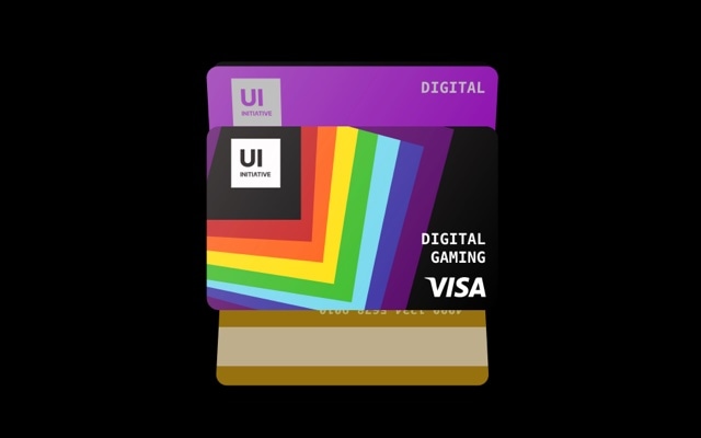
A card-stack slider with the swipe-to-dismiss interaction pattern made famous by Tinder. Cards sit stacked on top of each other, and swiping — or dragging — the top card sends it flying off screen with natural rotation and momentum, revealing the next card underneath. The gesture is instantly familiar to anyone who has used a mobile app in the last decade, and it turns passive browsing into active decision-making. Open this template in Swiper Studio, fill the cards with your own content, and deploy an interaction pattern that users already know and love.
The Tinder-style card swipe is one of the most recognizable UI patterns in modern app design. It works because it maps a physical gesture — flicking a card off a stack — to a digital action, creating an interaction that feels intuitive and satisfying. This template brings that exact interaction to the web, complete with physics-based momentum, rotation during drag, and stacked card depth. No app required — it runs natively in the browser.
#What Makes This Template Stand Out
Swipe-to-Dismiss Card Physics
Cards rotate and accelerate as they are dragged, then fly off screen with momentum when released past the swipe threshold. The physics feel natural and responsive — fast swipes send cards flying, slow drags let users peek and reconsider. It is the same satisfying interaction millions of users already know from mobile apps, now available on the web.
Stacked Card Depth
Behind the active card, subsequent cards are visible with slight scale and offset, creating the illusion of a physical stack. As the top card is dismissed, the next card animates smoothly into the active position. The visual depth makes the interface feel tangible and three-dimensional.
Universal Gesture Recognition
The swipe-to-dismiss pattern has become a universal interaction language. Users do not need instructions or onboarding — they see a card stack and immediately know to swipe. This built-in familiarity means higher engagement rates and lower friction compared to less intuitive carousel navigation.
Works with Touch and Mouse
On mobile, swipe gestures feel native and fluid. On desktop, click-and-drag provides the same physics-based card dismiss with rotation and momentum. You can also add directional buttons for accessibility and for users who prefer tapping over dragging.
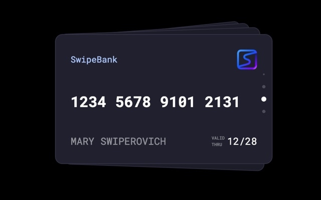
Fully Customizable Card Content
Each card in the stack is a full Swiper slide, so you can place any combination of images, text, buttons, badges, and blocks on it. Build profile cards, product cards, recipe cards, flashcards, or any format where users make decisions one card at a time.
#Who Should Use This Template
This template is perfect for developers and product teams building web applications that need a decision-based browsing interface. Any feature where users evaluate items one at a time — profiles, products, listings, questions, recommendations — maps naturally to the card-swipe pattern. Instead of building the physics and gesture handling from scratch, start with this template, customize the card layout, and export production-ready code.
Web designers and agencies will find the Tinder slider brings an app-like quality to websites that would otherwise feel static. Interactive landing pages, gamified marketing campaigns, and product discovery experiences all benefit from an interaction pattern that turns visitors into active participants. The swipe gesture creates engagement that passive scrolling simply cannot match.
Educators and content creators can use the card-swipe format for flashcards, quizzes, learning modules, and interactive content. The one-card-at-a-time presentation focuses attention, and the swipe gesture creates a satisfying rhythm that keeps users progressing through the deck. It is a more engaging delivery method than scrolling through a list or clicking through paginated content.
#Best Use Cases
- ✓Product discovery and comparison interfaces where users evaluate items one at a time with swipe-to-dismiss
- ✓Interactive landing pages and marketing campaigns that use gamified card-swiping to boost engagement
- ✓Flashcard and quiz applications for education, language learning, or training programs
- ✓Restaurant, recipe, or activity discovery features where users browse options with quick swipe decisions
- ✓Job listing and candidate review interfaces modeled on the familiar card-stack browsing pattern
- ✓Portfolio and showcase presentations where each project gets its own card in a swipeable deck
#How to Customize
- Open the Tinder Slider template in Swiper Studio by clicking 'Use This Template' above1
- Edit the card content — replace images, text, badges, and buttons on each card to match your use case, whether that is products, profiles, recipes, or flashcards2
- Adjust the card effect settings — configure the rotation angle during drag, swipe velocity threshold, stack depth, and card overlap to get the exact feel you want3
- Add or remove cards by duplicating existing slides to maintain consistent card layouts, or deleting cards you do not need4
- Customize colors, typography, and card styling — change background colors, border radius, shadows, and fonts to match your brand5
- Preview on mobile and desktop — ensure the swipe gesture feels natural on touch devices and the click-and-drag interaction works smoothly with a mouse6
- Export to HTML, React, Vue, Next.js, Web Component, or Webflow — or publish to CDN for instant embedding in your web app or website7
#Frequently Asked Questions
- How does the Tinder-style swipe interaction work?
- The slider uses a cards-style effect where the active card sits on top of a stack. When a user swipes left or right (or clicks a direction button), the top card rotates and flies off screen with physics-based momentum — exactly like the swipe gesture in dating apps. The next card in the stack slides into the active position, ready for the next interaction.
- Can I customize the swipe direction and card rotation?
- Yes. You can configure the maximum rotation angle as cards are dragged, the swipe velocity threshold that triggers a dismiss, and whether cards fly off to the left, right, or both directions. All of these settings are accessible from the visual editor without writing code.
- Is this template suitable for non-dating-app use cases?
- Absolutely. While the swipe-to-dismiss interaction was popularized by dating apps, the pattern works brilliantly for any content where users make quick decisions — product browsing, flashcard learning, restaurant discovery, recipe selection, job listings, and more. The familiar gesture lowers the learning curve because most users already know how to swipe through a card stack.
- Does the swipe gesture work with mouse on desktop?
- Yes. On desktop, users can click and drag cards to swipe them away, and the rotation and momentum physics feel just as natural as touch gestures on mobile. You can also add navigation buttons for users who prefer clicking over dragging.
- What export formats does this template support?
- You can export the Tinder slider as standalone HTML, a React component, a Vue component, a Next.js project, a Web Component, or a native Webflow element. You can also publish to CDN for instant iframe embedding on any website or web app.
#Related Templates


#Related Resources
Ready to Build Your Slider?
Pick a template, customize it visually, and export production-ready code to React, Vue, Next.js, HTML, Webflow, and more. No coding required.