
Coverflow Slider with 3D Depth Effect
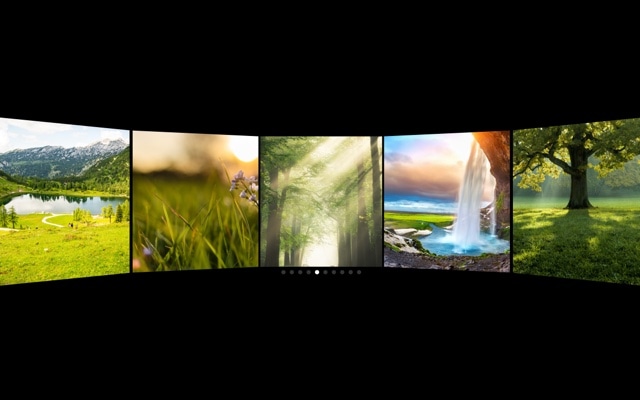
A polished 3D coverflow slider where the center slide commands attention at full size while neighboring slides angle away with perspective depth. This is the same spatial browsing pattern made famous by iTunes and Apple TV — a curved, rack-like arrangement that invites exploration. The template comes preconfigured with responsive breakpoints and autoplay, so it adapts to every screen size and keeps moving even when visitors are just watching.
Multiple slides are visible simultaneously, but hierarchy is crystal clear. The center slide sits front and center — larger, brighter, and facing directly toward the viewer. Slides on either side are rotated, scaled down, and pushed into the background, creating a natural depth-of-field that guides the eye to the active content. Swiping moves the entire arrangement fluidly, with each slide taking its turn in the spotlight.
#What Makes This Template Stand Out
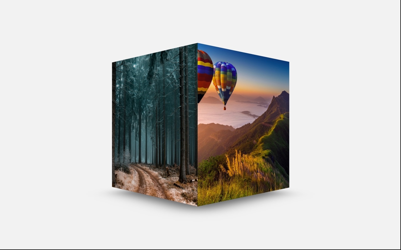
3D Coverflow Depth Effect
The signature coverflow transform creates a spatial, rack-like arrangement where the center slide dominates and adjacent slides recede with perspective rotation. This is not a simple scale difference — the rotation, depth offset, and shadow combine to create a genuine sense of three-dimensional space that makes flat carousels look lifeless by comparison.
Responsive Breakpoints Built In
The template ships with breakpoints for desktop, tablet, and mobile that adjust slide count, spacing, and coverflow intensity. On large screens you see five or more slides in the arrangement. On mobile, the layout tightens to three slides with adjusted rotation. Every breakpoint is fully customizable in the visual editor.
Autoplay with Smart Pausing
Autoplay advances the center slide at a steady interval, keeping the coverflow arrangement in constant, mesmerizing motion. The moment a visitor hovers or touches the slider, autoplay pauses so they can browse manually. It resumes automatically after interaction ends, creating a seamless blend of passive showcase and active exploration.
Configurable Depth, Rotation, and Stretch
The coverflow effect exposes three key controls: depth determines how far adjacent slides recede, rotation controls the angle of the perspective tilt, and stretch adjusts the horizontal spacing between slides. Together, these let you create anything from a gentle parallax to a dramatic carousel with deep perspective.
GPU-Accelerated Smooth Transitions
Every coverflow transform runs on the GPU via CSS 3D transforms. Transitions between slides are fluid at 60fps with no jank or stutter, even on mobile devices. The animation feels physical and weighted — slides do not just snap into position, they glide through 3D space with natural easing.
#Who Should Use This Template
If you have a collection of visual content that you want to present with depth and hierarchy, the coverflow slider is the ideal choice. It works brilliantly for image galleries, product catalogs, portfolio pieces, and any content where you want one item to be the clear focal point while hinting at more content on either side. The 3D arrangement communicates richness — visitors can see there is more to explore, and the spatial layout invites them to swipe.
Photographers, artists, and portfolio owners will find the coverflow effect gives their work a gallery-like presentation. Each image gets its moment in the center spotlight, displayed at full size and prominence, while the surrounding images provide context and continuity. It is the difference between flipping through a photo album and walking through an exhibition — the coverflow effect adds space and breathing room between pieces.
Marketing teams and product managers can use this template on landing pages and product pages where visual browsing drives engagement. The autoplay keeps the coverflow moving to catch the eye of passive visitors, while the responsive breakpoints ensure it looks polished on every device. The result is a slider that works as both a passive hero showcase and an interactive browsing tool.
#Best Use Cases
- ✓Image galleries and photography portfolios where the center image should dominate with adjacent previews visible
- ✓Product catalog pages showcasing multiple items with a 3D browsing experience that highlights the selected product
- ✓App and software landing pages displaying screenshots in a perspective arrangement that suggests depth and richness
- ✓Music and entertainment sites presenting album covers, movie posters, or artist profiles in the classic coverflow layout
- ✓Event and conference sites cycling through speaker headshots or session highlights with autoplay
- ✓Real estate and travel pages displaying property or destination photos with a spatial, immersive browsing feel
#How to Customize
- Click "Use This Template" to open the coverflow slider in Swiper Studio's visual editor1
- Replace the default images — click each slide and upload your own photos, product images, or artwork2
- Adjust the coverflow depth, rotation, and stretch values to control how dramatic the 3D perspective appears3
- Configure autoplay timing — set the delay between slide advances and choose whether to pause on hover or interaction4
- Customize responsive breakpoints to control how many slides are visible and how the coverflow scales on tablet and mobile5
- Add or remove slides to match your content — duplicate existing slides for quick expansion or delete ones you do not need6
- Export to HTML, React, Vue, Next.js, Webflow, or publish to CDN and embed the coverflow slider on your site7
#Frequently Asked Questions
- How does the coverflow 3D effect work?
- The coverflow effect applies perspective transforms to slides on either side of the active slide. The center slide appears at full size and straight-on, while adjacent slides rotate, scale down, and recede in depth. This creates an illusion of a curved surface or display rack, similar to the classic iTunes album browser. The transforms are CSS-based and hardware-accelerated for smooth performance.
- Can I adjust the depth and rotation of the coverflow effect?
- Yes. In the Swiper Studio editor, you can modify the coverflow depth, rotation angle, stretch, and slide shadow settings. Increasing the depth makes adjacent slides appear further away. Increasing the rotation makes them angle more dramatically. These controls let you dial in anything from a subtle parallax to a dramatic 3D display.
- Does this template include responsive breakpoints?
- Yes. The template is configured with responsive breakpoints that adjust the number of visible slides and the coverflow depth for desktop, tablet, and mobile viewports. You can customize these breakpoints in the editor — change the pixel thresholds, slide counts, spacing, and effect intensity at each screen size.
- How does autoplay work with the coverflow effect?
- Autoplay automatically advances the center slide at a configurable interval. As the active slide changes, the entire coverflow arrangement shifts smoothly — the previous center slide rotates and recedes while the next slide moves to center stage. Autoplay pauses on hover and touch interaction, resuming automatically when the user stops interacting.
- What export formats does this template support?
- You can export the coverflow slider as standalone HTML, a React component, a Vue component, a Next.js project, a Web Component, or a native Webflow element. CDN publishing is also available for embedding the slider on any website with a single code snippet.
#Related Templates


#Related Resources
Ready to Build Your Slider?
Pick a template, customize it visually, and export production-ready code to React, Vue, Next.js, HTML, Webflow, and more. No coding required.