Responsive Breakpoints Swiper Template
A responsive Swiper slider that adapts to every screen size. This template demonstrates Swiper's breakpoint system by showing different numbers of slides per view at different viewport widths — one slide on mobile, two on tablet, and more on desktop. It is the essential reference for building sliders that look great on every device, and the perfect foundation for any responsive slider project.
#What Makes This Template Stand Out
Pre-Configured Responsive Breakpoints
The template ships with breakpoints already defined for mobile, tablet, and desktop screen sizes. Each breakpoint adjusts the number of visible slides and the spacing between them, creating a layout that feels intentional at every viewport width. No guesswork about which pixel values to use — the sensible defaults are already in place.
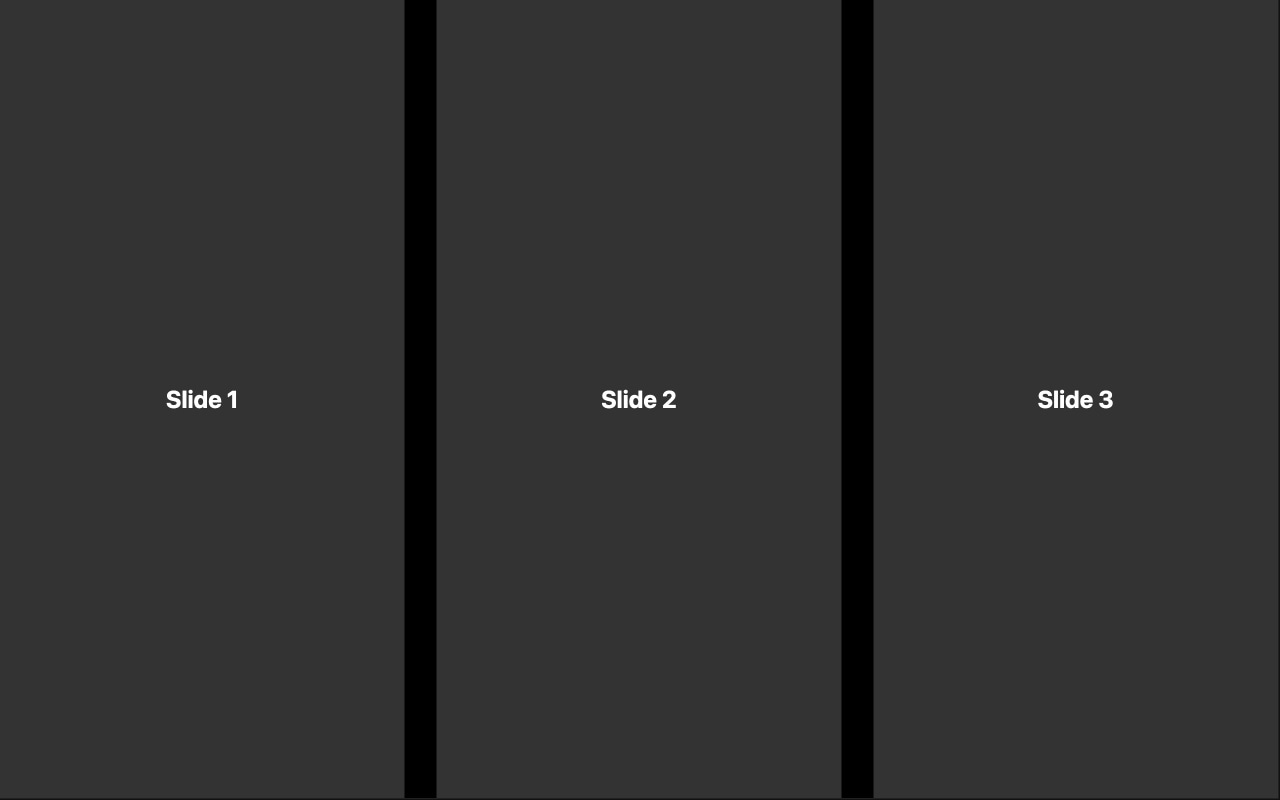
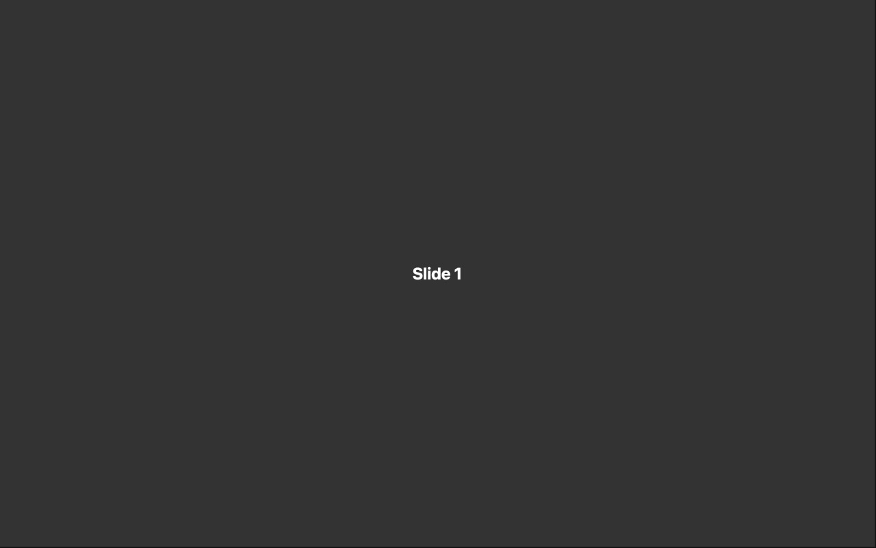
Slides Per View Scaling
Watch the slider transform as the viewport changes. On a phone, you see one slide with the next peeking in. On a tablet, two slides sit side by side with comfortable spacing. On desktop, multiple slides fill the wider viewport. The transition between breakpoints is seamless and automatic — no jarring layout shifts.
Optimized Spacing at Every Size
Spacing between slides is not just reduced on smaller screens — it is recalibrated. The template uses proportional gaps that feel visually balanced whether you are viewing one slide on a 375px phone or four slides on a 1440px monitor. This attention to spacing detail is what separates professional responsive sliders from ones that just shrink.
Visual Breakpoint Editing
Swiper Studio lets you preview and edit each breakpoint independently. Switch to the tablet view, adjust the spacing, switch to mobile, change slides per view — all in real time without writing a single media query. You see exactly what your visitors will see at each screen size.
Mobile-First Architecture
The base slider configuration targets mobile screens, with breakpoints progressively enhancing the layout for larger viewports. This follows responsive design best practices and ensures your slider is optimized for the majority of web traffic, which comes from mobile devices.
#Who Should Use This Template
Every developer building a slider for a responsive website should understand breakpoints, and this template is the clearest demonstration of how they work. If your site has visitors on phones, tablets, and desktops — and it does — your slider needs to adapt. Starting from this template means the responsive foundation is already solid, and you can focus on content and design.
E-commerce teams building product carousels need breakpoints more than anyone. A product grid that shows four items on desktop needs to gracefully reduce to two on tablet and one on mobile without breaking the layout or hiding products. This template provides that exact pattern, pre-configured and ready for your product images and data.
Web designers creating client deliverables will appreciate having a responsive reference they can customize visually. Instead of explaining breakpoint behavior to a client in the abstract, you can open this template, resize the preview, and show them exactly how their slider will behave on different devices. Then customize it together in real time.
#Best Use Cases
- ✓Product carousels on e-commerce sites that need to show different numbers of items per screen size
- ✓Card-based content sliders — blog posts, team members, testimonials — that reflow responsively
- ✓Image galleries where the number of visible thumbnails scales with available screen width
- ✓Feature highlight sections that show one feature at a time on mobile but multiple on desktop
- ✓Portfolio grids that transition from a single-column mobile view to a multi-column desktop layout
- ✓Any slider on a responsive website where the layout must adapt gracefully across all devices
#How to Customize
- Click 'Use This Template' to open the breakpoints slider in Swiper Studio's visual editor1
- Review the pre-configured breakpoints by switching between mobile, tablet, and desktop preview modes in the editor toolbar2
- Adjust slides per view at each breakpoint — increase or decrease the number of visible slides to match your content density and layout goals3
- Fine-tune the spacing between slides at each breakpoint — use tighter gaps on mobile and more generous spacing on desktop4
- Add your own slide content: product images, card layouts, text blocks, or any combination of elements5
- Add or modify breakpoint thresholds if your design requires custom pixel values beyond the pre-configured defaults6
- Export to HTML, React, Vue, Next.js, Web Component, or Webflow — breakpoint configuration is included automatically in every format7
#Frequently Asked Questions
- How do Swiper breakpoints work?
- Swiper breakpoints let you define different parameter values at different viewport widths. For example, you can show one slide on mobile, two on tablet, and four on desktop — all from the same slider instance. When the browser window crosses a breakpoint threshold, Swiper automatically reconfigures itself with the new settings. No page reload, no JavaScript event listeners to write — it just works.
- Can I customize more than just slides per view at each breakpoint?
- Yes. Breakpoints can control virtually any Swiper parameter: slides per view, space between slides, slides per group, grid rows, navigation visibility, pagination style, transition speed, and more. In Swiper Studio, you can switch to any breakpoint preview and adjust settings independently for that screen size.
- How many breakpoints does this template include?
- The template comes pre-configured with breakpoints for common device categories — mobile, tablet, and desktop. Each breakpoint has its own slides per view and spacing values optimized for that screen size. You can add, remove, or modify breakpoints in the editor to match your specific responsive design requirements.
- Is this template mobile-first?
- Yes. The base configuration targets mobile screens, and breakpoints progressively enhance the layout for larger viewports. This mobile-first approach aligns with responsive design best practices and ensures the slider works perfectly on the smallest screens before scaling up.
- What export formats are available?
- All Swiper Studio formats: standalone HTML, React component, Vue component, Next.js project, Web Component, and native Webflow element. The breakpoint configuration is included in every export format, so your responsive behavior works identically regardless of how you deploy.
#Related Templates


#Related Resources
Ready to Build Your Slider?
Pick a template, customize it visually, and export production-ready code to React, Vue, Next.js, HTML, Webflow, and more. No coding required.