Header Gallery with Autoplay and Parallax
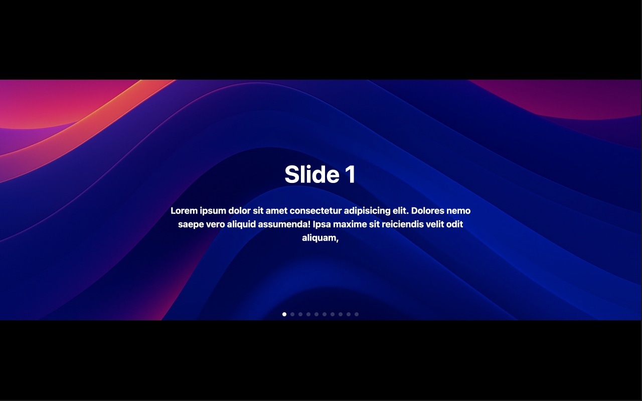
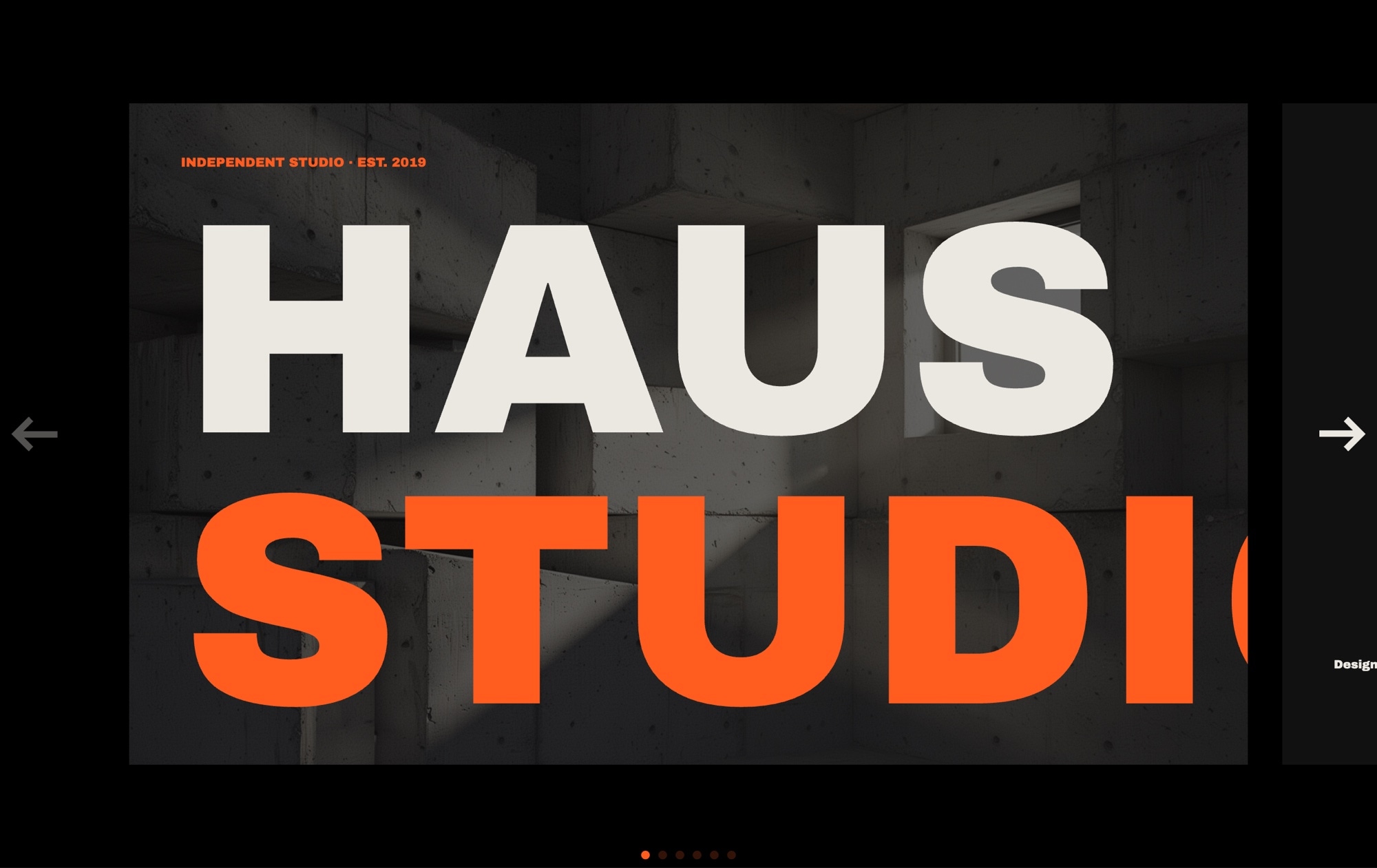
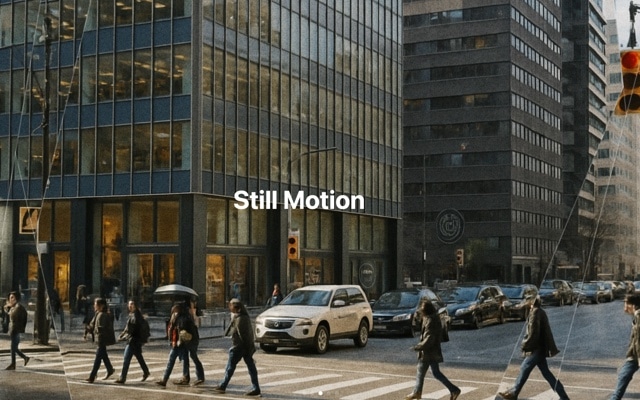
A full-width header gallery designed to sit at the top of your page and immediately draw visitors in. Background images scroll with a parallax effect — the background moves at a different speed than the foreground content during transitions, creating natural depth that makes each slide feel layered and cinematic. Autoplay advances the gallery automatically, and the combination of full-bleed imagery with smooth parallax motion delivers the kind of premium above-the-fold experience that keeps visitors scrolling.
The parallax scrolling effect elevates this template beyond a standard image slideshow. Instead of flat, static transitions where one image replaces another, the background and foreground move independently, producing a sense of dimension that feels polished and intentional. Visitors notice the difference immediately — the motion suggests care and craftsmanship before they read a word of your content. It is a subtle effect with outsized impact on perceived quality.
#What Makes This Template Stand Out
Parallax Background Scrolling
Background images shift at a different rate than foreground text and overlays during slide transitions, creating a convincing sense of depth. The layered motion turns a flat slideshow into a dimensional experience. Parallax is powered by CSS transforms through Swiper's built-in module — hardware-accelerated and smooth at 60fps on every device.
Full-Width Viewport Coverage
The gallery stretches edge to edge across the full viewport width, filling the header area with immersive imagery. No side margins, no padding — your photos or graphics occupy every pixel of the visible screen, making the strongest possible first impression above the fold.
Automatic Slideshow with Smart Pause
Autoplay cycles through the gallery at a configurable interval, ensuring visitors see your best visuals even without interaction. The slider pauses automatically on hover or touch, respecting the visitor's attention when they engage with content. Adjust the timing, or disable autoplay entirely, from the editor.
Layered Content Overlays
Headlines, subtitles, and call-to-action elements are positioned over the background imagery with careful spacing and contrast. Each text layer participates in the parallax motion independently, so the headline might drift at one speed while the subtitle drifts at another — deepening the sense of layered depth across every transition.
Responsive Breakpoints Pre-Configured
The template ships with breakpoints for mobile, tablet, laptop, and desktop that adjust text sizing, parallax intensity, and spacing. On smaller screens the parallax subtly reduces to maintain performance and readability, while on large displays the full cinematic depth is on show. Every breakpoint is independently customizable.
#Who Should Use This Template
This header gallery template is built for anyone who wants their website to open with authority. If you are a web designer building client sites, this gives you a polished, parallax-driven header section that instantly communicates quality. Replace the imagery, update the text, adjust colors to match the brand, and you have a bespoke header gallery that looks like it took days to build — delivered in minutes.
Photographers, creative agencies, and visual brands will find this template perfectly suited to their content. Full-bleed imagery with parallax scrolling is the gold standard for showcasing visual work above the fold. The autoplay ensures every portfolio piece or campaign image gets screen time, while the parallax motion adds a cinematic quality that static grids cannot match. It turns your header into a visual experience rather than just a banner.
Marketing teams and businesses running product pages, corporate sites, or campaign landing pages benefit from the template's conversion-ready layout. The combination of arresting background imagery with strategically placed headlines and CTAs captures attention and directs it toward action. Autoplay keeps the gallery moving for visitors who land and pause, while the parallax depth signals a premium brand experience.
#Best Use Cases
- ✓Corporate and agency homepages that need an immersive, full-width visual introduction above the fold
- ✓Photography portfolio sites showcasing hero images with cinematic parallax depth and auto-advancing slides
- ✓Product launch landing pages where full-bleed imagery and layered text overlays drive conversions
- ✓Travel and hospitality sites displaying destination photography with smooth, atmospheric transitions
- ✓Creative agency showcases featuring campaign visuals, brand imagery, and client work in a premium gallery header
- ✓Real estate and architecture sites presenting property hero shots with parallax depth and autoplay rotation
#How to Customize
- Open the Header Gallery template in Swiper Studio — click "Use This Template" above to load it directly into the editor1
- Replace the background images on each slide — click the slide background and upload your own photos, or paste image URLs from your media library2
- Edit the text overlays — update headlines, subtitles, and CTA button labels by clicking each text element and typing your content3
- Adjust the parallax intensity — control how far and fast background images shift relative to foreground content during transitions4
- Configure autoplay timing — set the delay between slides, choose pause-on-hover behavior, and adjust transition speed5
- Fine-tune responsive breakpoints — switch to mobile and tablet previews to adjust text sizes, spacing, and parallax settings per screen size6
- Export to HTML, React, Vue, Next.js, Web Component, or Webflow, or publish to CDN for instant embedding anywhere7
#Frequently Asked Questions
- How does the parallax effect work in this template?
- The parallax effect moves the background image at a different speed than the foreground content during slide transitions. As slides advance, the background shifts subtly behind the text and overlays, creating a sense of depth and dimension. This is handled entirely through CSS transforms and Swiper's built-in parallax module — no JavaScript scroll listeners or performance-heavy calculations required.
- Can I replace the background images with videos?
- Yes. Each slide supports both image and video backgrounds. Switch the media type in the editor, upload or paste a video URL, and the parallax scrolling effect will apply to the video background in the same way. You can mix image and video slides freely within the same gallery.
- Does autoplay pause when visitors interact with the slider?
- Yes. Autoplay pauses automatically when a visitor hovers over the slider on desktop or touches it on mobile. It resumes after the interaction ends. You can configure the autoplay delay, disable pause-on-hover, or turn autoplay off entirely in the editor settings.
- Is the header gallery responsive on mobile devices?
- Yes. The template includes responsive breakpoints for mobile, tablet, laptop, and desktop. Text sizes, spacing, and parallax intensity adjust at each breakpoint to ensure the gallery looks crisp and performs smoothly on every screen size. You can customize each breakpoint independently in the visual editor.
- What export formats does this template support?
- You can export the header gallery as standalone HTML, a React component, a Vue component, a Next.js project, a Web Component, or a native Webflow element. You can also publish to CDN for instant iframe embedding on any website or platform.
#Related Templates


#Related Resources
- Swiper Studio for Hero Sections
- Swiper Studio for Image Galleries
- Swiper Studio for Web Designers
- Swiper Studio for Photographers
Ready to Build Your Slider?
Pick a template, customize it visually, and export production-ready code to React, Vue, Next.js, HTML, Webflow, and more. No coding required.