Black Friday Blackout
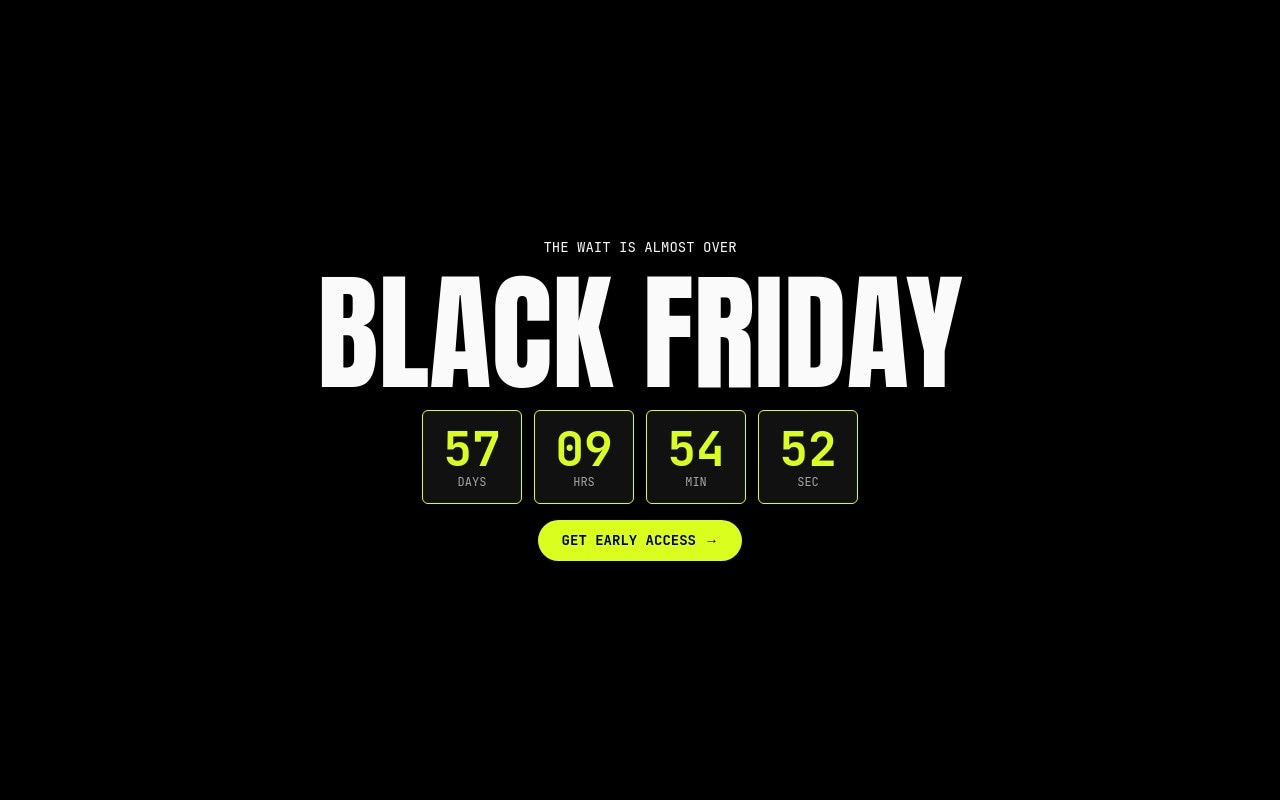
The definitive "BLACK FRIDAY" banner: pure black, huge condensed Anton type, and one electric volt accent reserved for the offers and CTAs. The first slide is a countdown hero - a small mono "THE WAIT IS ALMOST OVER" label, a massive "BLACK FRIDAY" headline, a row of four boxed countdown digits, and a volt "GET EARLY ACCESS" pill. Three deal slides follow: "UP TO 70% OFF" sneakers, "50% OFF" audio, and "40% OFF" watches, each with a product cutout on a dark circle.
The palette is three colors on purpose: black #000000, off-white #fafafa, and volt #dafe1d, with #1a1a1a for the product circles. Anton carries the headlines and offers, JetBrains Mono handles the labels, countdown digits, and buttons. The slider cross-fades at 500ms and autoplays every 5 seconds, pausing on hover, so shoppers get the whole sequence without touching it.
#What Makes This Template Stand Out
Live Boxed Countdown Hero
Four dark boxes with a thin volt border hold live DAYS / HRS / MIN / SEC digits that share one target. Set your Black Friday date and timezone in the Countdown setting and the banner ticks down in real time on your store - after export or publish, with no code. The whole countdown row pops in after the headline lands.
One Accent, Used Only Where It Counts
Volt #dafe1d appears on the countdown digits, the offer percentages, the pagination bullets, and the pill CTAs - nothing else. Everything around it is black and off-white, so the eye goes straight to the deal and the button on every slide.
Letter-Scale Headline and Number-Roll Offers
The giant BLACK FRIDAY headline builds in with letter-scale, and each deal percentage rolls up with number-roll when its slide enters. Cutouts pop in on their circles and the CTA fades in last, so the offer is readable before the animation even finishes.
Deal Slides With Alternating Layout
Each deal slide pairs an offer column (mono DEAL 01/02/03 label, Anton percentage, category name, pill CTA) with a product cutout on a #1a1a1a circle. The audio slide mirrors the layout so the sequence does not feel repetitive, and the watch slide adds a small 'Sitewide · Online only · While stocks last' footnote.
Banner Proportions for Store Homepages
4:5 on phones, 2:1 from 768px, and 21:9 from 1024px. The type scales with it - BLACK FRIDAY runs from 68px on mobile to 128px on desktop - so the banner reads at every size without pushing your product grid below the fold.
#Who Should Use This Template
This template is built for Shopify and ecommerce stores running a Black Friday sale that want a banner shoppers recognize in one glance. The countdown hero builds anticipation in the days before November 27, 2026, and the deal slides take over as the sale goes live. Swap the three categories for your best-selling ones and the structure fits almost any catalog.
Streetwear, electronics, and accessories brands will get the most out of the black and volt look - it matches the high-contrast product photography those categories already use. For a softer brand, change the volt to your own accent and keep the black field.
Agencies and Webflow designers building holiday campaigns for several clients can use it as a fast starting point: new cutouts, new percentages, a new countdown date, and the banner is ready. After the weekend, retitle it for Cyber Monday, an end-of-season clearance, or any other countdown-driven sale.
#Best Use Cases
- ✓Black Friday homepage hero banners with a live countdown to launch
- ✓Early access and VIP sign-up banners in the week before the sale
- ✓Category deal rotators for sneakers, audio, watches, or any top sellers
- ✓Shopify theme hero sections added through the Swiper Studio app
- ✓Cyber Monday or end-of-season clearance banners reusing the same layout
- ✓Product launch drops that need a countdown and a single strong CTA
- ✓Agency holiday campaign templates reskinned per client
- ✓Landing pages for paid Black Friday ads that point to one offer
#How to Customize
- Open the Black Friday Blackout template in Swiper Studio - you will see four slides: the countdown hero and three deal slides (sneakers, audio, watches).1
- Select any of the four countdown digits, open the Countdown setting, and set your real target date, time, and timezone - for example 00:00 on November 27, 2026. All four boxes share the same target.2
- Choose what the countdown does when it expires: hold at zeros, swap to custom text, or hide.3
- Retype the hero copy - "THE WAIT IS ALMOST OVER" and "BLACK FRIDAY" - and point the "GET EARLY ACCESS" link block at your sign-up or sale page.4
- Replace the sneaker, headphones, and watch cutouts with your own transparent product images in the media panel.5
- Update each offer ("UP TO 70% OFF", "50% OFF", "40% OFF"), category name, and footnote, and link each "SHOP" CTA to the matching collection.6
- Change the volt #dafe1d accent to your brand color if needed, then check the 4:5, 2:1, and 21:9 layouts in the responsive preview.7
- Publish to CDN and add it to Shopify with the Swiper Studio app, paste it into Webflow, or export to HTML, React, Vue, Next.js, or a Web Component.8
#Frequently Asked Questions
- Is the countdown on the first slide live?
- Yes. The four boxed digits (DAYS, HRS, MIN, SEC) are live countdown texts that share one target date. In the template the countdown starts about a week from when you open it. Select any digit, open the Countdown setting, and set your real launch moment - for example midnight on Black Friday, November 27, 2026 - with your store timezone. It keeps ticking after you export or publish, with no extra code.
- What happens when the countdown reaches zero?
- By default the boxes hold at 00 once the target passes. You can change the expiry behavior per text to swap in custom copy such as "LIVE NOW" or hide the text entirely. Because the four boxes are separate texts, you can hide the digits and keep the "BLACK FRIDAY" headline and CTA working as a regular sale banner.
- Can I change the product cutouts and discounts?
- Yes. The three deal slides use transparent cutouts - a white sneaker, black over-ear headphones, and a black wristwatch - sitting on #1a1a1a circles. Replace them in the media panel with your own transparent PNGs and retype the "UP TO 70% OFF", "50% OFF", and "40% OFF" offers. The percentages use a number-roll animation, so the new values count up on every slide change.
- How big is the banner on desktop and mobile?
- The slider uses aspect-ratio sizing per breakpoint: 4:5 on phones, 2:1 from 768px, and 21:9 from 1024px. That keeps it a wide homepage banner on desktop instead of a full-screen takeover, while the stacked mobile layout still has room for the countdown and CTA. Each ratio is editable in the responsive panel.
- How do I add it to Shopify, Webflow, or WordPress?
- On Shopify, install the official Swiper Studio Shopify app and add the published slider to any page as a native theme block from the theme editor. In Webflow, use Paste into Webflow to add it as native elements. For WordPress, Squarespace, Wix, or any other site, publish to CDN and paste the embed snippet. You can also export HTML, React, Vue, Next.js, or a Web Component.
#Related Templates
#Related Resources
- Swiper Studio for Ecommerce Stores
- Swiper Studio for Shopify
- Swiper Studio for Hero Sections
- Swiper Studio for Marketers
Ready to Build Your Slider?
Pick a template, customize it visually, and export production-ready code to React, Vue, Next.js, HTML, Webflow, and more. No coding required.