Custom Color Navigation and Pagination Template
A minimal Swiper slider that shows how to customize the color of navigation arrows and pagination dots to match your brand. Out of the box, Swiper controls use a default blue that rarely matches any design system. This template demonstrates the fix — custom-colored navigation and pagination that integrate seamlessly with your site's visual identity. No CSS overrides, no trial and error, just pick your colors in the editor and export clean code.
#What Makes This Template Stand Out
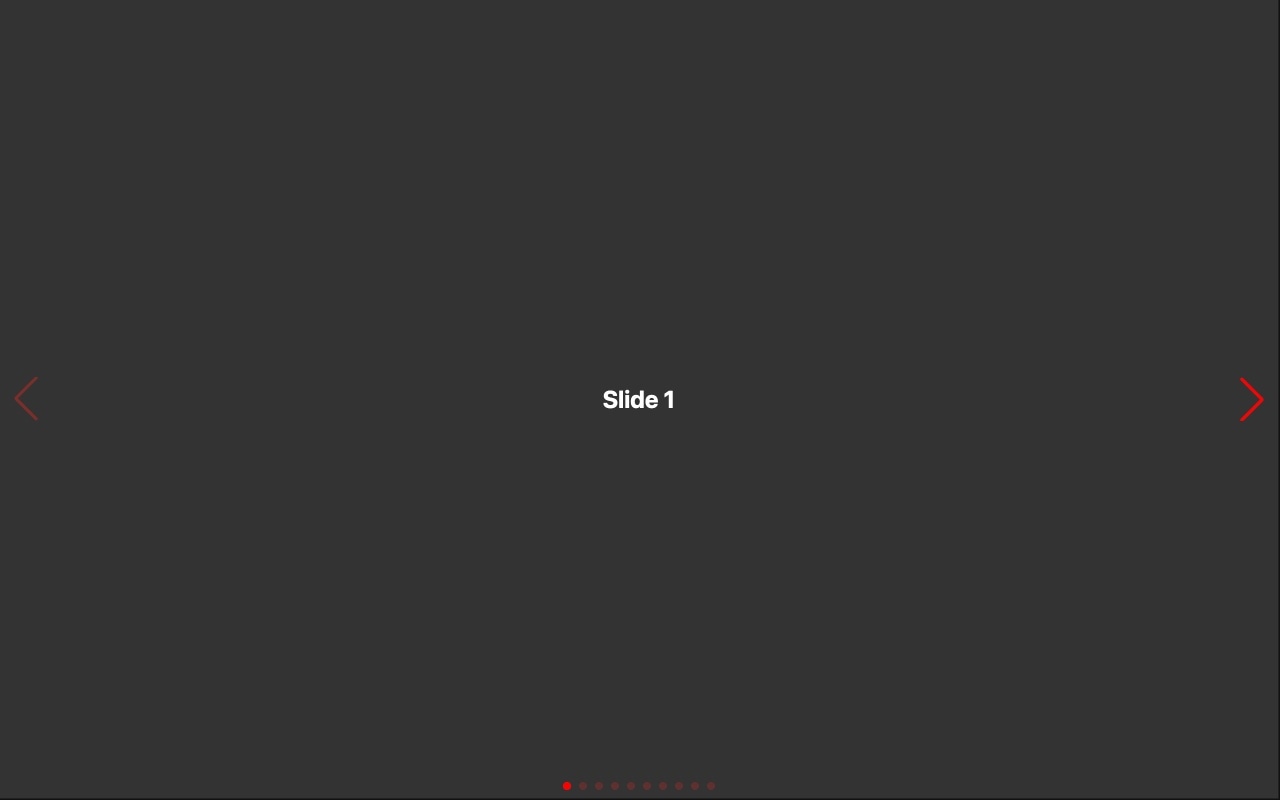
Brand-Matched Navigation Arrows
The navigation arrows in this template use custom colors instead of Swiper's default blue. This is one of the first things every developer needs to change when integrating Swiper into a branded website. The template shows you exactly how it looks and lets you pick your own arrow colors with a visual color picker.
Custom Pagination Dot Colors
Pagination bullets are styled with custom active and inactive colors that create clear visual contrast. The default Swiper pagination is functional but generic — this template demonstrates how branded pagination dots elevate the entire slider's appearance and make the active state immediately obvious to visitors.
No CSS Required
Traditionally, customizing Swiper control colors means writing CSS overrides for deeply nested selectors. This template eliminates that entirely. Swiper Studio applies color changes through the visual editor, and the exported code includes all necessary styles generated automatically. You never touch a CSS file.
Real-Time Color Preview
Every color change is visible instantly in the editor preview. Pick a navigation arrow color and see it applied immediately. Adjust pagination dot opacity and watch it update in real time. This feedback loop means you can iterate on your color scheme in seconds, not minutes of save-refresh-inspect cycles.
Clean, Maintainable Output
The exported code uses properly scoped styles rather than brute-force CSS overrides. Colors are applied through clean, readable CSS that is easy to maintain and update later. No !important hacks, no deeply nested selectors, no fragile specificity battles.
#Who Should Use This Template
Anyone integrating a Swiper slider into a branded website needs custom control colors — it is not optional. Swiper's default blue navigation and pagination almost never match an existing design system. This template shows you the fastest path from default blue to on-brand colors, and it demonstrates the approach visually so you can apply the same technique to any slider you build.
Designers who care about visual consistency will appreciate that this template treats slider controls as first-class design elements. Navigation arrows and pagination dots are part of your UI, and they deserve the same attention to color, size, and spacing as every other component. This template makes that easy to achieve without writing code.
Developers who are tired of CSS override gymnastics will find this template refreshingly straightforward. If you have ever spent twenty minutes hunting for the right CSS selector to change a Swiper arrow color, or fought specificity issues with deeply nested pagination styles, you will appreciate an approach that handles it all through a visual interface and generates clean output.
#Best Use Cases
- ✓Any branded website where slider controls must match the site's color palette and design system
- ✓Landing pages where navigation arrows and pagination dots need to stand out against custom backgrounds
- ✓Portfolio and gallery sliders where subtle, on-brand controls complement the visual content without competing with it
- ✓E-commerce product carousels where control styling needs to match the store's theme and branding guidelines
- ✓Dark-themed websites where the default blue controls are invisible or visually jarring against dark backgrounds
- ✓Client projects where delivering pixel-perfect branded slider controls is a requirement
#How to Customize
- Click 'Use This Template' to open the custom color controls slider in Swiper Studio's visual editor1
- Select the navigation arrows and use the color picker to set them to your brand's primary or accent color2
- Customize the pagination dot colors — set both the active dot color and the inactive dot color for clear visual hierarchy3
- Adjust the control sizes if needed — make arrows larger for better touch targets on mobile, or smaller for a more subtle desktop appearance4
- Replace the slide content with your own images, text, and media to see how your custom controls look against real content5
- Preview at different breakpoints to verify the control colors remain visible and on-brand across screen sizes6
- Export to HTML, React, Vue, Next.js, Web Component, or Webflow — your custom color styles are included automatically7
#Frequently Asked Questions
- Can I use any color for the navigation and pagination?
- Yes. Swiper Studio supports full hex color values including alpha transparency. You can set navigation arrows and pagination dots to any color that matches your brand — solid colors, semi-transparent overlays, or fully custom values. The color picker in the editor makes it easy to dial in the exact shade you need.
- Do I need to write CSS to change the control colors?
- No. The entire point of this template is to demonstrate that Swiper Studio handles control styling visually. You pick colors from a color picker, adjust sizes with sliders, and see the changes in real time. The editor generates all the necessary CSS for you, so the exported code includes properly scoped styles with no manual CSS work required.
- Can I customize more than just colors?
- Absolutely. Beyond colors, you can adjust the size, position, and opacity of navigation arrows and pagination dots. You can change pagination from bullets to a fraction counter or a progress bar. You can also control whether controls are visible on specific breakpoints — for example, hiding arrows on mobile where swiping is the primary interaction.
- Will the custom colors work in all export formats?
- Yes. Whether you export as HTML, React, Vue, Next.js, Web Component, or Webflow, the custom color styles are included in the generated code. The colors are applied through CSS custom properties and scoped styles, so they work consistently across every framework and platform.
- Can I have different control colors on different breakpoints?
- Yes. Swiper Studio supports per-breakpoint styling, so you can set different navigation and pagination colors for mobile, tablet, and desktop. This is useful when your slider sits on different background colors at different screen sizes and the controls need to remain visible and on-brand.
#Related Templates


#Related Resources
Ready to Build Your Slider?
Pick a template, customize it visually, and export production-ready code to React, Vue, Next.js, HTML, Webflow, and more. No coding required.