Cozy Winter Collection
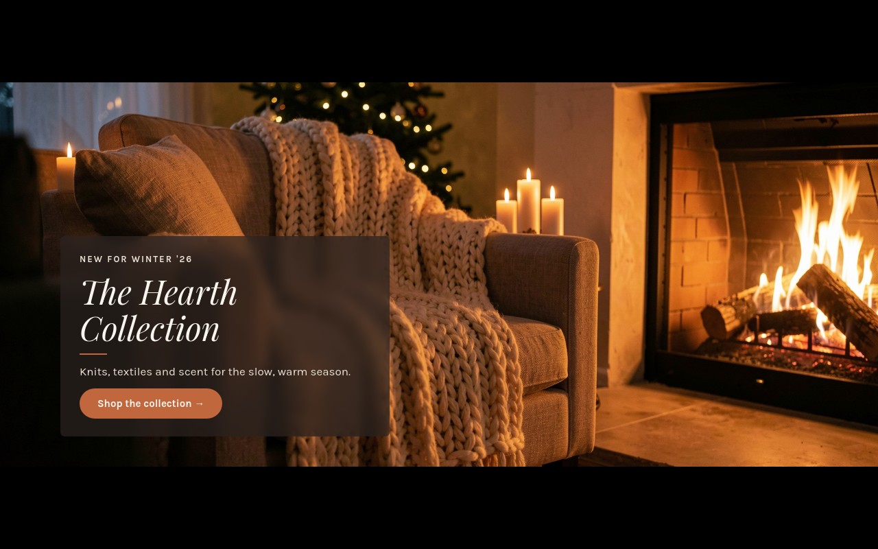
A seasonal collection launch for brands whose holiday story is about the product, not the percentage. The cover opens on a firelit living room - a chunky oat knit throw over a linen armchair, candles, a Christmas tree in soft focus - with "NEW FOR WINTER '26" and "The Hearth Collection" set in Playfair Display italic. Three product slides follow: "Made for Firelight" for knitwear (from $98), "Wrapped in Wool" for throws and blankets, and "The Scent of Home" for hand-poured amber candles. The closing slide, a snowy cabin at blue hour, offers free gift wrapping on every order through Dec 24.
Every slide cross-fades over 1200ms while its photo slowly zooms in, so the slider feels like a short film rather than a banner rotation. The palette comes from the photography: espresso #2b2320, oat #e9dfd3, ember #c0673d, and warm white #f8f4ee. Copy sits in the same espresso panel bottom-left on every slide, with a short ember rule and an ember pill button, so swapping photos never breaks the layout.
#What Makes This Template Stand Out
Ken Burns Zoom on Every Slide
Each background photo runs a slow zoom animation while it is on screen, and slides change with a 1200ms cross-fade on a 6-second autoplay. The motion is slow enough to feel calm and steady enough to keep the eye on the product. No video files needed - it works with the still photos you already have.
Playfair Display Italic With Karla
Headlines are set in Playfair Display italic at up to 48px on desktop, with Karla for the tracked uppercase labels, body copy, and buttons. The pairing reads like a catalog cover: soft and editorial, but still clear at a glance on a store homepage.
One Consistent Text Panel
An espresso panel at 72% opacity holds the label, headline, a 40px ember rule, one line of copy, and the CTA in the bottom-left corner of every slide. It keeps text legible over firelight, snow, or dark stone, and it gives the whole collection a consistent frame.
Product Stories, Not Product Grids
Numbered labels (01 Knitwear, 02 Home Textiles, 03 Candles & Scent) walk shoppers through the collection one category at a time, each with its own lifestyle photo, a short line like "Chunky cable knits in undyed wool. From $98." and a link to the matching collection.
Taller Banner for Photography
4:5 on mobile, 16:9 at 768px, and 16:7 at 1024px. The desktop proportion is a little taller than a standard sale banner, giving lifestyle photography the room it needs without taking over the full viewport.
#Who Should Use This Template
This template is built for home goods, knitwear, candle, and lifestyle brands launching a winter or holiday collection. If your December message is "our new collection is here" rather than "40% off", this slider tells that story with the pacing of a lookbook.
Shopify merchants who skip Black Friday discounting can run this as their seasonal homepage hero and still give shoppers a reason to buy now - the closing slide carries the free gift wrapping offer and a "Shop all gifts" link.
Agencies and Webflow designers producing seasonal campaigns get a structure that fits many clients: swap the photos and product lines, keep the panel, and the collection launch is ready. The same template also works for autumn, spring, or any seasonal drop.
#Best Use Cases
- ✓Winter and holiday collection launches for home and lifestyle brands
- ✓Knitwear and apparel seasonal lookbook heroes
- ✓Candle, fragrance, and home scent brand homepages
- ✓Hotel, cabin, and ski lodge winter stay promotions
- ✓Shopify homepage heroes for brands that do not run holiday discounts
- ✓Free gift wrapping and holiday service announcements
- ✓Seasonal email landing pages that continue a collection campaign
- ✓Autumn or spring collection launches reusing the same structure
#How to Customize
- Open the Cozy Winter Collection template in Swiper Studio - you will see five slides: The Hearth Collection cover, Knitwear, Home Textiles, Candles & Scent, and the Free Gift Wrapping closing slide.1
- Rename the collection - replace "The Hearth Collection" and "NEW FOR WINTER '26" with your own collection name and season.2
- Replace each background photo in the media panel. Warm, low-light lifestyle shots with the subject toward the center or right keep the bottom-left panel clear.3
- Edit the three product stories - labels, headlines, the one-line descriptions, and the "From $98" starting price - to match your categories.4
- Update the closing offer - change "Free Gift Wrapping" and "through Dec 24" to your own holiday service or deadline.5
- Point each ember link block ("Shop the collection →", "Shop knitwear →", and the rest) at the matching collection URL.6
- Adjust the espresso panel opacity or the ember accent in the style panel if your photos are brighter or your brand color differs, then check the 768px and 1024px breakpoints.7
- Publish to CDN and paste the embed snippet, add it to Shopify with the Swiper Studio app, use Paste into Webflow, or export to HTML, React, Vue, Next.js, or a Web Component.8
#Frequently Asked Questions
- Is this a sale template?
- No, and that is on purpose. It is built for brands launching a holiday or winter collection rather than running a discount. The five slides introduce "The Hearth Collection", three product stories (knitwear, home textiles, candles and scent), and close with a free gift wrapping offer through Dec 24. If you do run a sale, the closing slide is the place for it.
- How does the slow zoom effect work?
- Every slide background uses a zoom image animation, so the photo slowly pushes in while the slide is on screen, like a Ken Burns pan in a film. Slides change with a 1200ms fade and autoplay every 6 seconds, pausing on hover. The panel fades in and the Playfair Display headline enters with letter-fade, so the text settles after the image.
- Will my own photos stay readable behind the text?
- The copy sits in an espresso #2b2320 panel at 72% opacity in the bottom-left corner, so it stays legible over bright firelight, snow, or dark interiors. Replace each photo in the media panel and keep the main subject toward the center or right so the panel does not cover it. Warm, low-light lifestyle shots match the original mood best.
- What proportions does the banner use on each device?
- The slider is 4:5 on mobile, 16:9 from 768px, and 16:7 from 1024px, a little taller than a typical sale banner so the photography has room. Navigation arrows appear from 768px up; on phones shoppers swipe and use the pagination bullets.
- Can I add it to Shopify or Webflow?
- Yes. On Shopify, install the official Swiper Studio Shopify app and add the published slider to any page as a native theme block from the theme editor. In Webflow, use "Paste into Webflow" to add it as native elements. For Squarespace, Wix, WordPress, or any other site, publish to CDN and paste the embed snippet, or export to HTML, React, Vue, Next.js, or a Web Component.
#Related Templates

#Related Resources
- Swiper Studio for Hero Sections
- Swiper Studio for Ecommerce Stores
- Swiper Studio for Shopify
- Swiper Studio for Landing Pages
Ready to Build Your Slider?
Pick a template, customize it visually, and export production-ready code to React, Vue, Next.js, HTML, Webflow, and more. No coding required.