Hero - App Launch Template
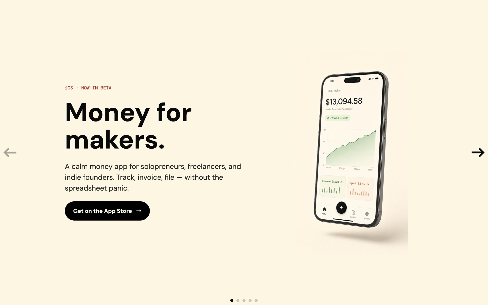
The Hero - App Launch template is built for the moment your iOS or Android app crosses from build to public beta - the homepage where the App Store badge has to feel earned, the screens have to feel polished, and the feature copy has to land in three lines or fewer. The default theme is "Money for makers" - a finance app for independent creators - which is a working example, not a constraint. Replace the copy and the palette and the same structure ships any consumer or prosumer app launch.
The slider opens with a cover slide ("Money for makers - iOS now in beta"), runs through three feature highlights ("Track every cent", "Get paid faster", "Tax-ready exports"), and closes on an App Store CTA. The visual centerpiece is the phone mockup floating against a cream backdrop. The placeholder UI inside each phone is intentionally abstract - real app screens go in once your build is ready to ship.
#What Makes This Template Stand Out
Phone Mockups Designed to Hold Real Screens
Each slide places the phone device frame in the same position with the same scale, so when you swap the placeholder screen for a real export from your iOS or Android build, no layout adjustment is needed. The cream backdrop and soft shadow remain consistent across slides for that signature app-launch look.
Cream Backdrop, Quiet Premium Mood
Cream #fdf6e3 instead of pure white is the small detail that separates premium app launches from generic ones. It softens the page, reads warm rather than clinical, and makes the phone mockups pop without screaming for attention. The black text and CTA give crisp contrast, and the small red accent dot adds a single point of visual energy.
DM Sans and DM Mono Typography Stack
DM Sans at 700 weight handles display headlines and at 500 handles body. DM Mono handles small labels - badges, version pills, beta tags. The combination is calm, modern, and appropriate for consumer apps that want to feel like considered products rather than aggressive marketing.
Five-Slide Launch Arc Built In
Cover slide, three features, App Store CTA - the structure mirrors the actual app marketing pages that convert. You can keep the arc as-is or rebuild it for a different number of features. The 32px space between slides keeps the pacing tight.
App Store and Play Store Ready
The final CTA slide is built for App Store badge placement out of the box. Drop in your App Store and Google Play badges as image children, point them at your store URLs, and the launch page is wired end to end.
#Who Should Use This Template
This template is built for indie app developers, solo founders, and small product teams launching an iOS or Android app. The genre standard for app marketing is a clean, cream-toned hero with phone mockups - it is what users expect to see, and the template gives you that polish without designing from scratch. Whether you are launching a finance app, a productivity tool, a habit tracker, or a journaling app, the structure works.
Product marketing managers at consumer software companies can use this as a launch page template for new app releases or major version updates. The five-slide arc is short enough to scan and complete enough to communicate the full pitch - the App Store CTA at the end is where conversion happens.
Agencies and freelancers building client app marketing sites will find the placeholder workflow especially useful. You can demo the layout in pitch meetings before the client's app screens are final, then swap in the real screens once the build ships. It compresses the gap between mockup and live launch site.
#Best Use Cases
- ✓Indie iOS and Android app launch and beta marketing pages
- ✓Finance, fintech, and money-management app homepages
- ✓Habit tracker, journaling, and wellness app launches
- ✓Productivity app marketing sites with feature highlight slides
- ✓Major version release pages where the hero needs to feel like a fresh launch
- ✓Pre-launch waitlist pages for consumer apps with TestFlight or beta links
- ✓Consumer subscription app marketing with App Store and Play Store badges
- ✓Agency-built client app marketing sites that need to demo before real screens are ready
#How to Customize
- Click "Use This Template" to open the Hero - App Launch slider in Swiper Studio1
- Replace the abstract app UI placeholders with real screen exports from your iOS or Android build - upload PNG screenshots into each phone mockup2
- Edit the cover slide copy - replace "Money for makers" with your app name and category, and update the beta or launch tag3
- Rewrite the three feature highlights to match your app - keep the lines short (three to five words each) for maximum impact4
- Drop App Store and Google Play badge images into the final CTA slide and link them to your store URLs5
- Adjust the cream #fdf6e3 background, black CTA, and red accent dot if your brand uses different colors6
- Set responsive type sizes at the 768 and 1024 breakpoints so headlines stay tight on phones and tablets7
- Publish to CDN for an instant embed, or export to HTML, React, Vue, Next.js, Web Component, or Webflow8
#Frequently Asked Questions
- Can I replace the placeholder app UI with my real app screens?
- Yes - that is the intended workflow. The template ships with abstract finance app UI inside phone-shaped device frames as placeholders because AI image generation cannot reliably render legible app interfaces. Once you have real screen exports from your iOS or Android build, swap each phone image with your screenshot. The cream backdrop, typography, and layout stay the same - only the screen content changes.
- How do I edit the app name, tagline, and feature copy?
- Every text element is editable inline. The default copy walks through a five-slide app launch arc - cover, three feature highlights, and an App Store CTA. The cover line is "Money for makers - iOS now in beta" as a starting point. Replace each line with your app name, category, and feature messaging.
- Does the hero work on phones and tablets?
- Yes. The slider is responsive with breakpoints at 768 and 1024. The phone mockup scales down on small screens so the device frame stays readable, and the cream background fills edge to edge. Headline sizes scale per breakpoint and the App Store CTA stays touch-friendly on mobile.
- Can I change the cream and red color palette?
- Absolutely. The default palette is cream #fdf6e3 with #0a0a0a text, a black CTA, and a small red accent dot at #dc2626. The cream backdrop is what makes the phone mockups feel premium and calm rather than aggressive. Swap any color in the project style panel - the structure works equally well with a soft pink, mint, sand, or any quiet brand palette.
- How do I export or embed this hero on my marketing site?
- Publish to CDN for an instant embed snippet that pastes into Next.js, Webflow, WordPress, or any HTML page. Or export as a React component, a Vue component, a Next.js project, a Web Component, or standalone HTML. The Webflow plugin handles native integration.
#Related Templates

#Related Resources
- Swiper Studio for Hero Sections
- Swiper Studio for Landing Pages
- Swiper Studio for Marketers
- Swiper Studio for Small Businesses
Ready to Build Your Slider?
Pick a template, customize it visually, and export production-ready code to React, Vue, Next.js, HTML, Webflow, and more. No coding required.