Brutalist Pricing Plans Slider Template
Pricing pages decide whether visitors convert or bounce, and a brutalist layout gives you an unfair advantage. Oversized typography, raw contrast, and a single loud accent color stop the scroll, slow readers down, and make each tier feel like a deliberate choice instead of a checkbox exercise. This template leans into that with six slides built around massive Archivo Black display type, JetBrains Mono feature lists, and a single electric-yellow punch.
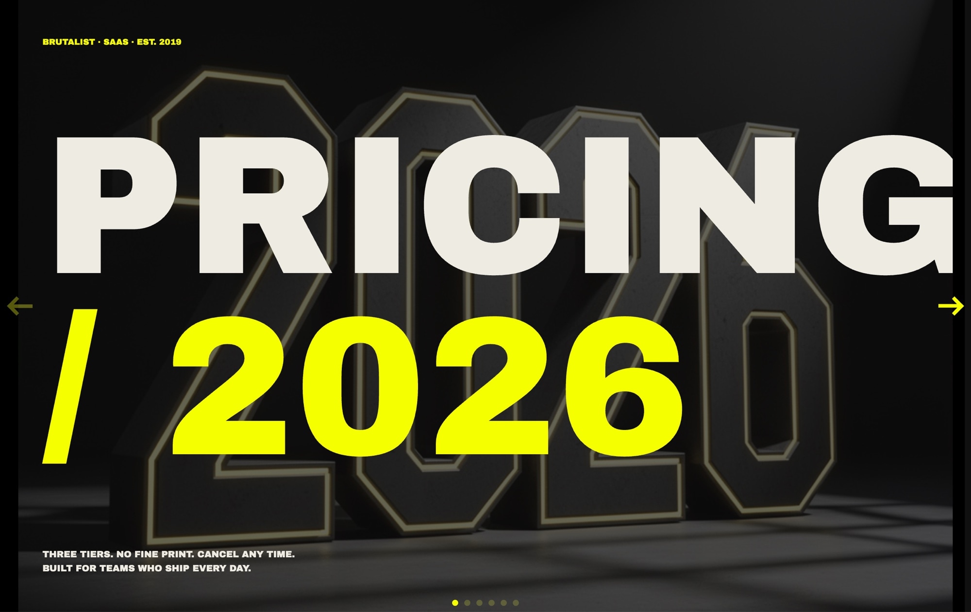
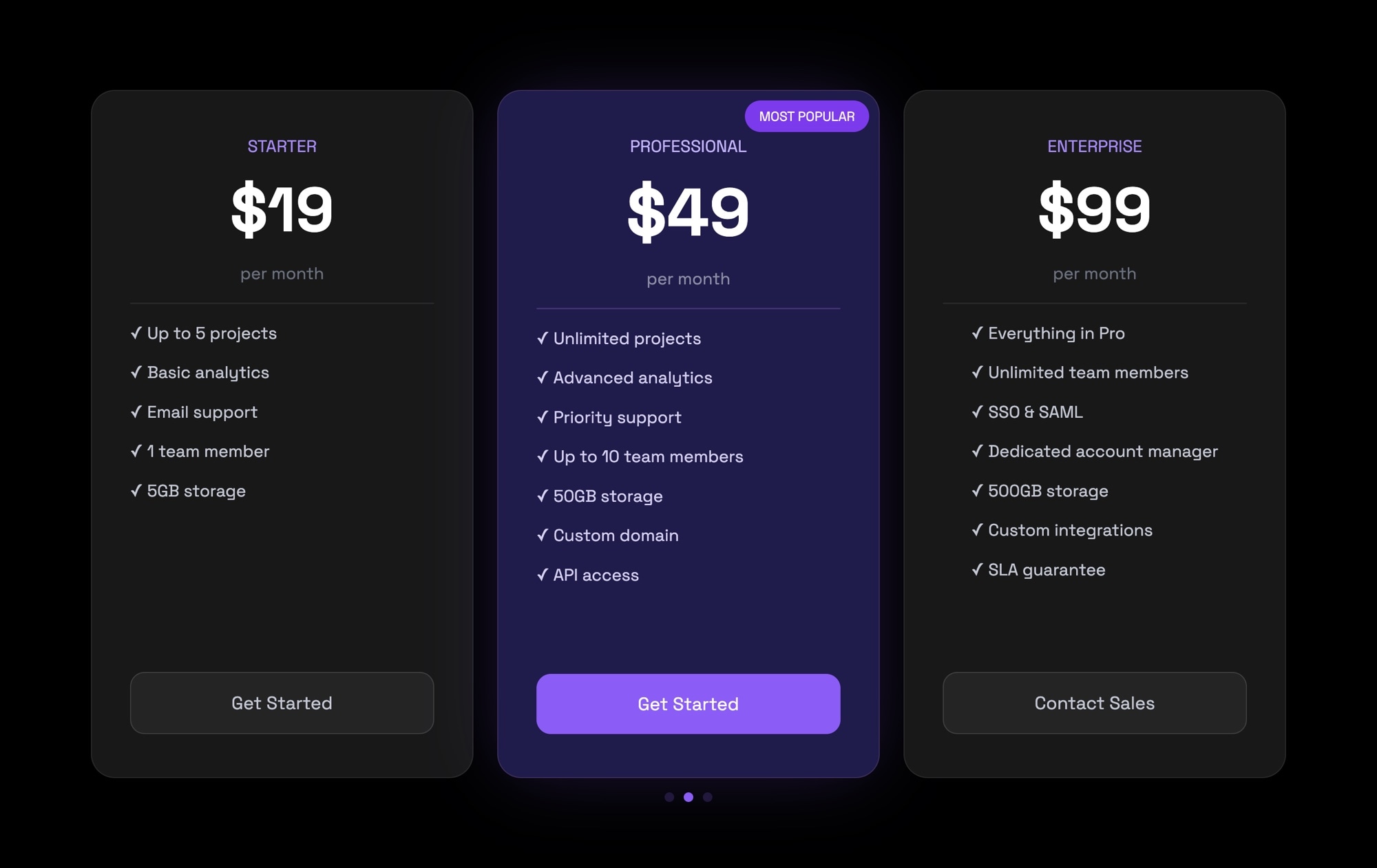
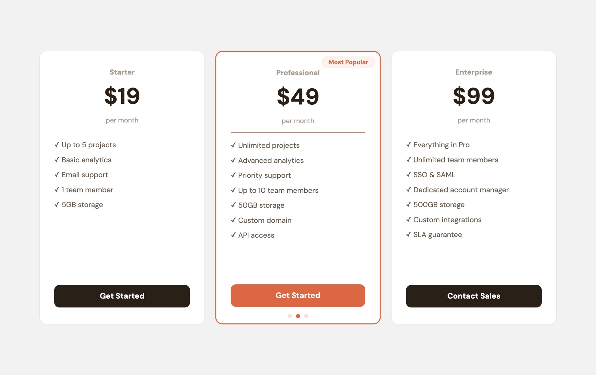
The slider opens with a "PRICING / 2026" title card, then walks through Free, Pro, and Enterprise tiers with huge 120px prices and yellow underlines. A "MOST CHOSEN" badge marks the Pro plan, the Enterprise slide routes to a contact link for custom quotes, a comparison grid lays out every feature side by side, and the final slide closes with an FAQ block and a yellow "Start free" CTA. The palette stays tight - true black, electric yellow #f6ff00, and a bone off-white - so the type and layout do the heavy lifting.
#What Makes This Template Stand Out
Type as the Main Visual
Prices render in 120px Archivo Black with hard yellow underlines, turning numbers into billboard-scale statements. There are no product photos or gradient washes competing for attention - the typography is the design, which keeps load times light and the message unmissable.
Monospace Feature Lists With Real Texture
Every plan's feature list uses JetBrains Mono with tight leading and consistent column widths. The mono spacing makes checkmarks, plus signs, and dashes line up perfectly down the page, giving the tiers a terminal-readout feel that reinforces the brutalist tone without feeling cold.
One Accent Color Does All the Work
Electric yellow appears only where it should convert attention into action - the underline under the Free price, the MOST CHOSEN badge on Pro, and the Start free CTA on the final slide. Everything else stays in the true-black and bone palette, so the eye always knows where to click.
Six Purposeful Slides, Not a Wall of Cards
Instead of stacking three cards on one screen, the slider gives each tier a full slide of room. Visitors focus on one plan at a time, swipe to compare, then land on a consolidated comparison grid and FAQ closer. The pacing is editorial, the storytelling is intentional.
Contact-First Enterprise Handoff
The Enterprise slide replaces a price with a direct contact link, which is how serious buyers expect to be treated. Swap the href to your sales form, Calendly, or mailto and the template handles the rest. No awkward 'Custom' price tag, no forced tiering.
#Who Should Use This Template
This template is for SaaS founders, indie developers, and bold startup brands that want their pricing page to look nothing like the default Stripe-style three-card grid. If your product has a confident point of view - a developer tool, a design app, a creative SaaS, a paid API - the brutalist aesthetic signals that your pricing was written on purpose, not generated from a template.
Design studios and agencies can use this as a distinctive pricing section for their own site or ship it as a deliverable for clients who want something louder than the usual pastel gradients. The type-first layout is also a gift for teams without a full illustration or photography library - you get a striking pricing page using nothing but text and color.
Marketing and growth teams that A/B test pricing presentations will appreciate how fast this template is to edit. Change a price, swap a feature, rename a tier, republish to CDN, and the live embed updates everywhere. You can run a brutalist variant against your existing pricing page and measure whether the attention-grabbing layout actually moves conversions.
#Best Use Cases
- ✓SaaS pricing pages for developer tools, design apps, and technical products
- ✓Indie product launches where a distinctive pricing section needs to stand out
- ✓Startup landing pages that want to signal a strong design point of view
- ✓Agency or studio pricing sections presented as one focused editorial section
- ✓Paid API and infrastructure products with tiered usage plans
- ✓Course creators and membership platforms with Free, Pro, and Enterprise tracks
- ✓Brand refresh projects replacing a tired three-card pricing grid
- ✓Portfolio sites that sell productized services in tiered packages
#How to Customize
- Open the Pricing - Brutalist template in Swiper Studio. You will see six slides: the PRICING / 2026 title, Free, Pro, Enterprise, the comparison grid, and the FAQ plus CTA closer.1
- Update each tier's name, monthly price, and feature list. Prices are plain text elements in Archivo Black, so you can edit them directly and the yellow underline stays in place.2
- Replace the Enterprise contact link with your real URL - point it to your sales form, Calendly booking link, or support mailto address.3
- Adjust the MOST CHOSEN badge if you want to highlight a different tier. Move the badge to another slide, or change the label to WHAT WE RECOMMEND or BEST VALUE to fit your voice.4
- Swap the accent color if electric yellow does not match your brand. Select the underline, badge, and CTA and set a new hex value - hot pink, lime, or safety orange all hold up against the true-black base.5
- Edit the comparison grid to reflect your actual features. Add or remove rows, keep the JetBrains Mono column alignment, and the layout stays legible at every width.6
- Tune the responsive breakpoints so the 120px display type scales down comfortably on tablet and phone. The style panel gives you per-breakpoint font sizes without touching code.7
- Publish to CDN and paste the embed snippet into your pricing page, or export to React, Vue, HTML, or Webflow if you want to ship the template inside a bigger project.8
#Frequently Asked Questions
- Can I change the electric-yellow accent to match my brand?
- Yes. The yellow is applied to the underline on the Free tier price, the "MOST CHOSEN" badge on Pro, and the "Start free" CTA button. Select any yellow element and update its background or text color in the style panel. The true-black and bone palette also accepts any hex value you want.
- Do I need Archivo Black and JetBrains Mono installed to edit this template?
- No. Both fonts are loaded automatically by Swiper Studio when you open the template, and they are included in every export. You can preview, edit, and publish without touching any font settings. If you prefer different typefaces, swap them in the style panel and the brutalist layout still holds up.
- How do I add a fourth pricing tier like Team or Business?
- Duplicate the Pro tier slide, rename it, update the price and feature list, and move it into the order you want. The slider automatically handles navigation and pagination for the new slide. You can also duplicate the comparison grid slide and add a column for the new tier.
- Can the prices and feature lists be linked to real data?
- The template uses static text by default so non-developers can edit prices directly in the visual editor. If you need dynamic pricing, publish the slider to CDN and swap the text nodes with your own CMS or Stripe data in the embed wrapper. All text elements keep stable class names you can target.
- Will the huge display type stay readable on mobile?
- Yes. Each breakpoint has its own font size, so the 120px Archivo Black prices scale down smoothly on tablet and phone while keeping the brutalist character. Adjust the mobile size in the responsive breakpoints panel if you want a tighter or looser feel on small screens.
#Related Templates
#Related Resources
- Swiper Studio for Landing Pages
- Swiper Studio for Developers
- Swiper Studio for Small Businesses
- Swiper Studio for Agencies
Ready to Build Your Slider?
Pick a template, customize it visually, and export production-ready code to React, Vue, Next.js, HTML, Webflow, and more. No coding required.