Slicer Slider Template
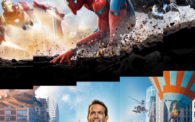
A full-screen image slider where each transition slices the current photograph into vertical strips that animate apart to reveal the next image. The effect is sharp, modern, and unmistakably editorial — like watching a printed page being cut into ribbons to unveil a fresh composition behind it. Open this template in Swiper Studio, replace the images with your own, and deploy a slider that makes every transition a visual event.
The slicer effect turns the moment between slides into the main attraction. Vertical columns fragment and scatter, creating a sense of kinetic energy that flat transitions simply cannot match. Visitors do not just see the next image — they watch it emerge through the dissolving remnants of the previous one. It is the kind of transition that elevates a simple image gallery into something people remember.
#What Makes This Template Stand Out
Vertical Strip Fragmentation
The slicer effect divides each image into vertical columns that animate independently during the transition. Strips can slide, rotate, or scale away in a staggered cascade, producing a fragmented reveal that looks editorial and meticulously designed. No two transitions feel static or predictable.
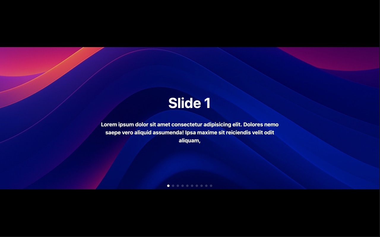
Full-Screen Visual Impact
The slider occupies the entire viewport, giving your images the largest possible canvas. Full-bleed photography combined with the slicer transition creates an immersive experience that dominates the page — ideal for hero sections, portfolio headers, and any context where visuals need to carry the weight.
Customizable Strip Count and Timing
Control the exact look and feel of the slicer animation. Increase the strip count for a fine, intricate fragmentation, or reduce it for bold, sweeping columns. Adjust the stagger delay, duration, and easing to make the transition feel rapid and punchy or slow and cinematic.
GPU-Accelerated Performance
Every strip animates with hardware acceleration, ensuring smooth 60fps transitions on desktop and mobile. The effect remains crisp and fluid regardless of image resolution or device capability — no dropped frames, no visual artifacts, just clean motion.
Responsive and Touch-Ready
The template includes preconfigured breakpoints for mobile, tablet, laptop, and desktop. Touch swipe gestures trigger the slicer transition naturally, and the strip count adapts to smaller viewports so the effect remains visually balanced on every screen size.
#Who Should Use This Template
This template is ideal for photographers, designers, and creative professionals who want their image presentations to feel as thoughtfully crafted as the work itself. A standard carousel treats every transition the same way — the slicer effect makes each reveal a deliberate creative moment. Portfolio sites, gallery pages, and project showcases all benefit from a transition that signals intentionality and design sophistication.
Agencies and studios building client websites will find the slicer slider immediately elevates hero sections and landing pages. The fragmented transition is distinctive enough to differentiate a site from competitors while remaining elegant enough for corporate and premium brand contexts. Use it for homepage heroes, case study headers, or full-screen lookbooks — clients will notice the difference.
Editorial and magazine-style publishers can use the slicer effect to create a dynamic reading experience. Feature articles, photo essays, and visual stories gain a layer of interactivity and motion that keeps readers engaged. The vertical slicing evokes print design — column layouts, die-cut reveals, and editorial typography — translated into a web-native format.
#Best Use Cases
- ✓Photography portfolio hero sections where a distinctive transition reinforces the creative quality of the work
- ✓Agency and studio homepages that need a premium, memorable slider effect above the fold
- ✓Fashion and lifestyle lookbooks with full-screen model or product photography and editorial transitions
- ✓Architecture and interior design showcases where vertical column fragmentation echoes structural lines and proportions
- ✓Editorial and magazine websites presenting feature stories or photo essays with cinematic slide reveals
- ✓Event and campaign landing pages where a bold visual effect creates excitement and anticipation
#How to Customize
- Open the Slicer Slider template in Swiper Studio by clicking 'Use This Template' above1
- Replace the background images — select each slide and upload your own photography or paste image URLs from your media library2
- Configure the slicer effect — adjust the number of vertical strips, stagger delay, animation duration, and easing to match your creative direction3
- Add text overlays if needed — layer headlines, subtitles, or CTA buttons on each slide and apply element animations that complement the slicer transition4
- Preview on mobile and tablet breakpoints — fine-tune text sizes, strip count, and element visibility for smaller screens5
- Enable navigation arrows, pagination dots, or autoplay depending on how you want visitors to interact with the slider6
- Export to HTML, React, Vue, Next.js, Web Component, or Webflow — or publish to CDN for instant embedding anywhere7
#Frequently Asked Questions
- How does the slicer transition differ from a standard slide effect?
- Instead of the entire image sliding or fading as one piece, the slicer effect cuts the current image into vertical strips that animate apart independently. Each strip slides, rotates, or scales away to reveal the next image underneath. The result is a fragmented, dynamic transition that feels editorial and modern — far more visually interesting than a basic horizontal slide.
- Can I adjust the number of vertical strips?
- Yes. The strip count is fully configurable in the visual editor. More strips produce a finer, more detailed slicing effect, while fewer strips create bolder, wider columns that feel more dramatic. You can also adjust the stagger timing between strips to control the cascade speed.
- Does the slicer effect support touch gestures on mobile?
- Yes. Swipe gestures on touch devices trigger the slicer transition seamlessly. The effect is hardware-accelerated and optimized for mobile performance, so the vertical strip animation runs at 60fps on modern smartphones and tablets without any jank or lag.
- Can I combine the slicer effect with text overlays and animations?
- Absolutely. You can layer headlines, subtitles, buttons, and other elements on top of each slide. Each element supports independent entry animations — fade, blur, typewriter, pop, and 20+ more — so you can choreograph text reveals that play in sequence with the slicer transition for a polished, editorial feel.
- What export formats are available for this template?
- You can export the slicer slider as standalone HTML, a React component, a Vue component, a Next.js project, a Web Component, or a native Webflow element. Publishing to CDN is also available for instant iframe embedding on any website.
#Related Templates


#Related Resources
Ready to Build Your Slider?
Pick a template, customize it visually, and export production-ready code to React, Vue, Next.js, HTML, Webflow, and more. No coding required.