Navigation and Pagination Updates
We've just shipped a set of updates to navigation arrows and pagination controls in Swiper Studio, giving you more visual flexibility and fine-grained positioning options for your sliders.
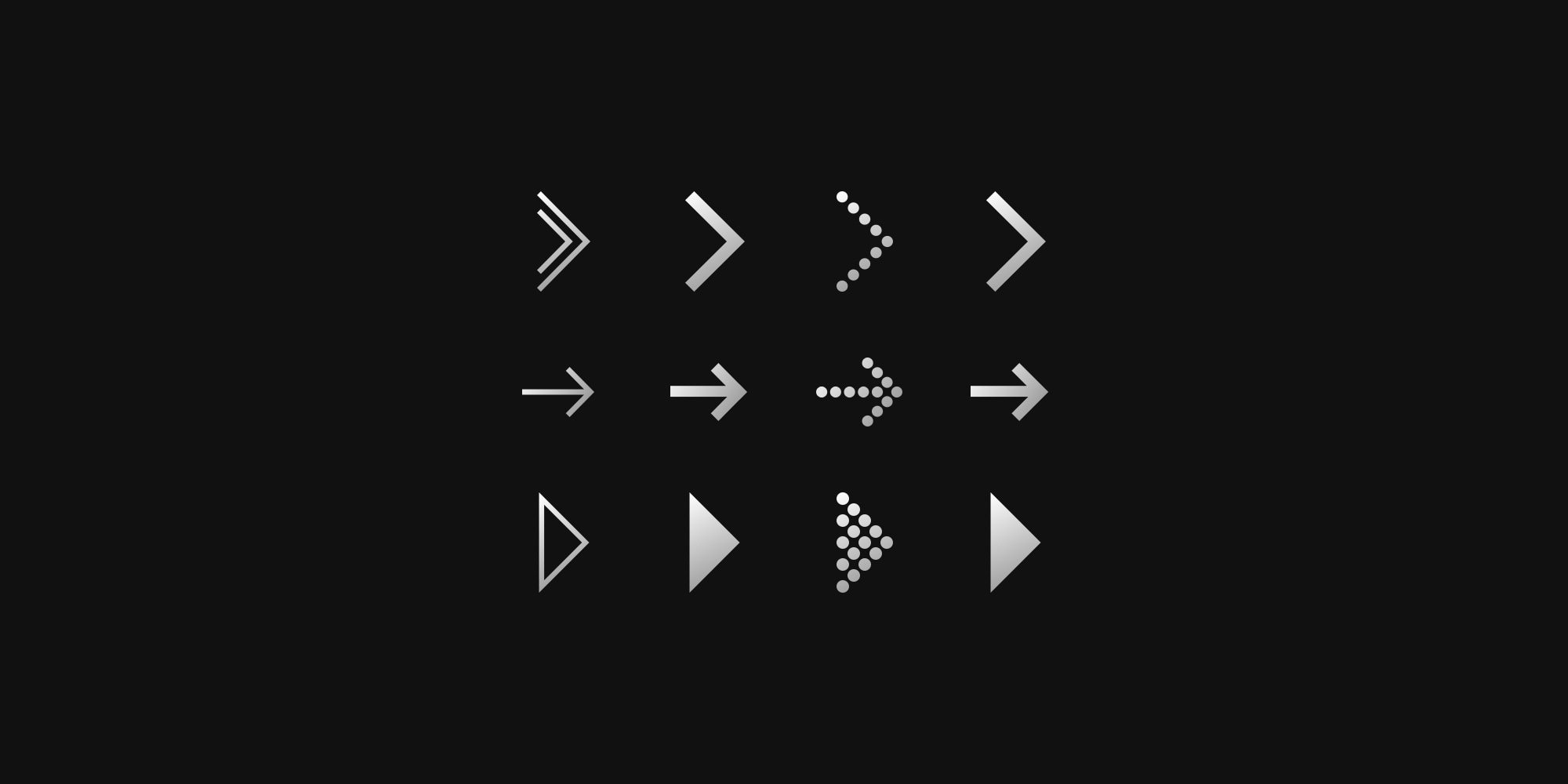
Navigation Arrow Icons
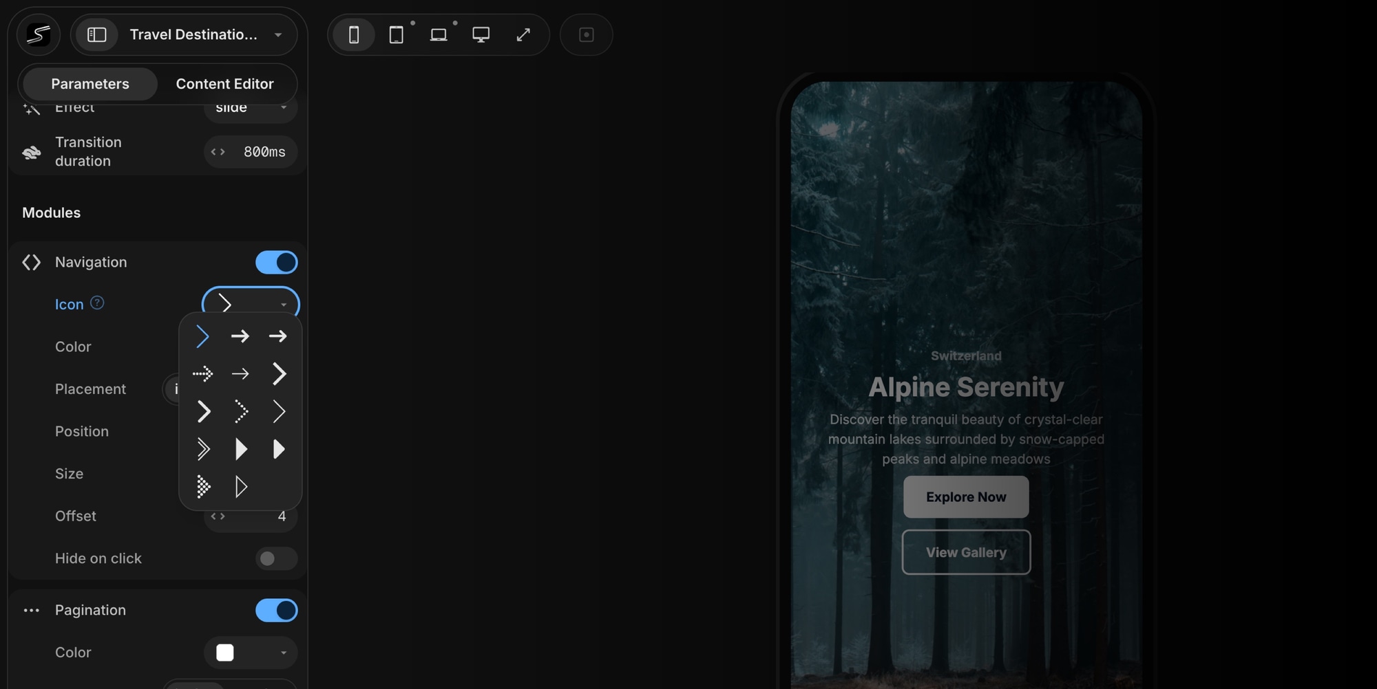
Previously, navigation buttons used a single default chevron icon. Now you can pick from 14 different arrow styles - from thin and minimal to bold and filled, including dotted, rounded, outlined, and double variants.
Just open the Icon dropdown in the Navigation panel and choose the style that matches your design.
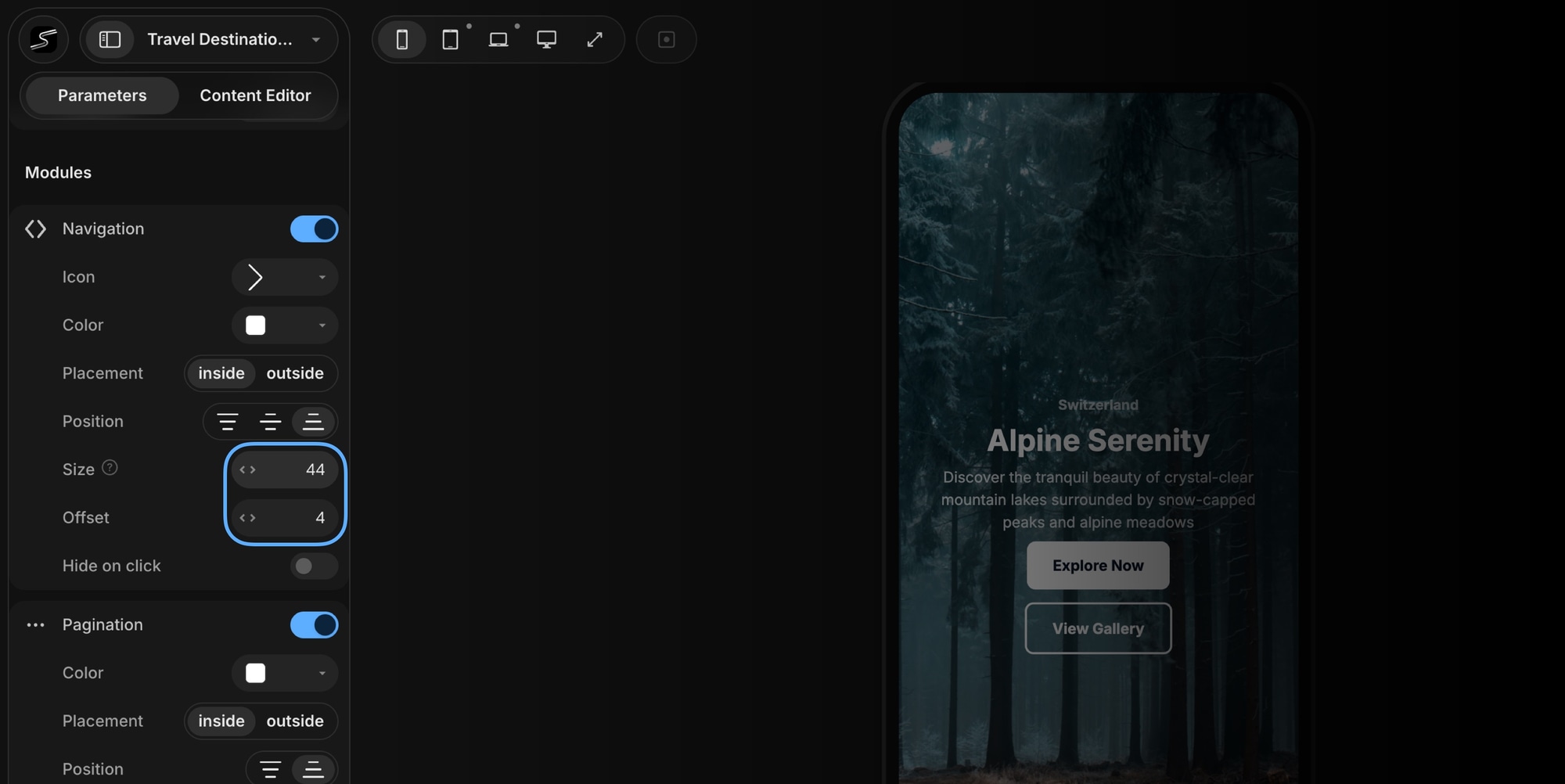
Navigation Size and Offset
You can now control the size of navigation buttons and the side offset - how far the arrows sit from the slider edge . Combined with the existing Placement (inside/outside) and Position (top/center/bottom) options, you have full control over where and how your navigation arrows appear.
Pagination Size, Gap, and Offset
Pagination got the same level of control. Depending on the pagination type you're using, you can now configure:
- Bullets size - set the diameter of pagination bullets
- Bullets gap - adjust spacing between bullets
- Progressbar size - control the height of the progress bar
- Offset - set the side offset from the slider edge for bullets and fraction types
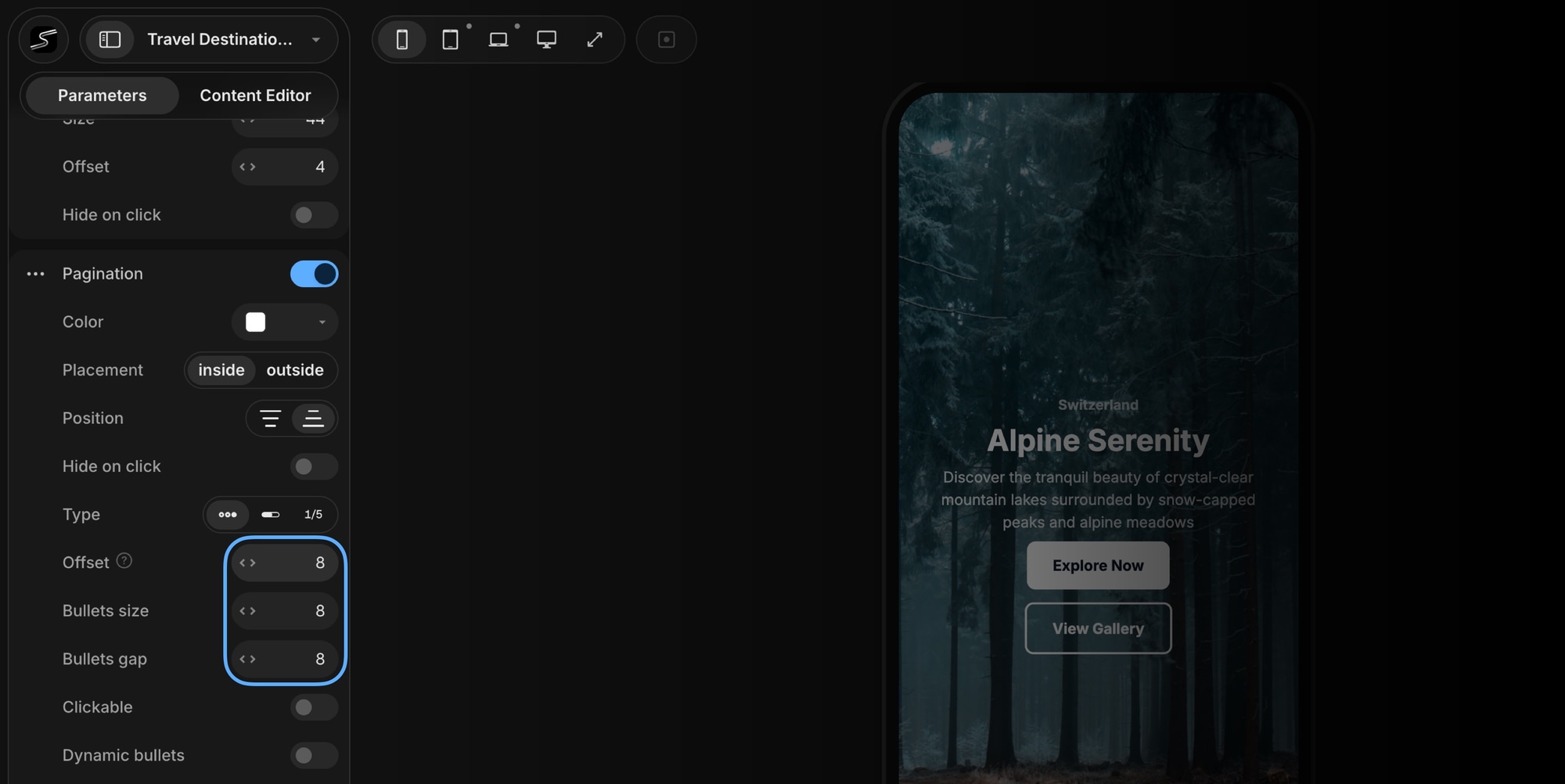
These options make it easy to create compact pagination for small sliders or larger, more prominent controls for hero sections and full-screen carousels.
Try It Now
All of these updates are available now in Swiper Studio. Open any project, enable Navigation or Pagination, and start customizing.